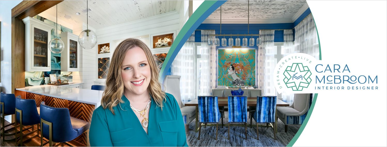
This condo in Miramar Beach’s Grand Dunes is a model that I had a blast getting to furnish and redesign! I wanted to go for a bright, fun and contemporary design, with some natural elements to ground it. I wanted to use my current favorite color (because this changes often): chartreuse! I love the citrus, or tropical flavor it adds! When paired with aqua and green, then contrasted with white, it creates a refreshingly vibrant color palette. This model is currently on the market and up for grabs, so if you are interested, call one of the numbers I’ve listed at the bottom of this post! SOLD!!!
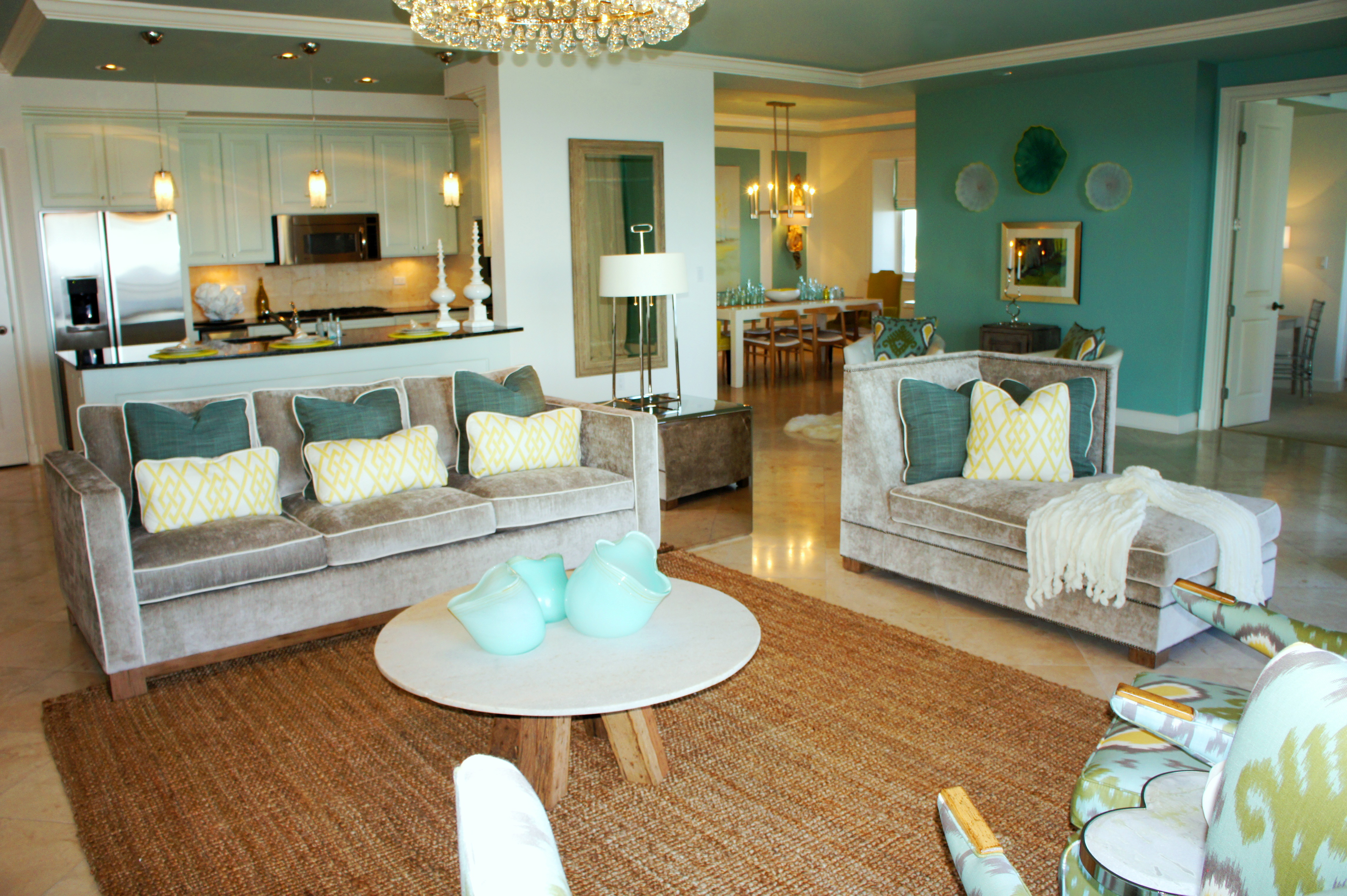
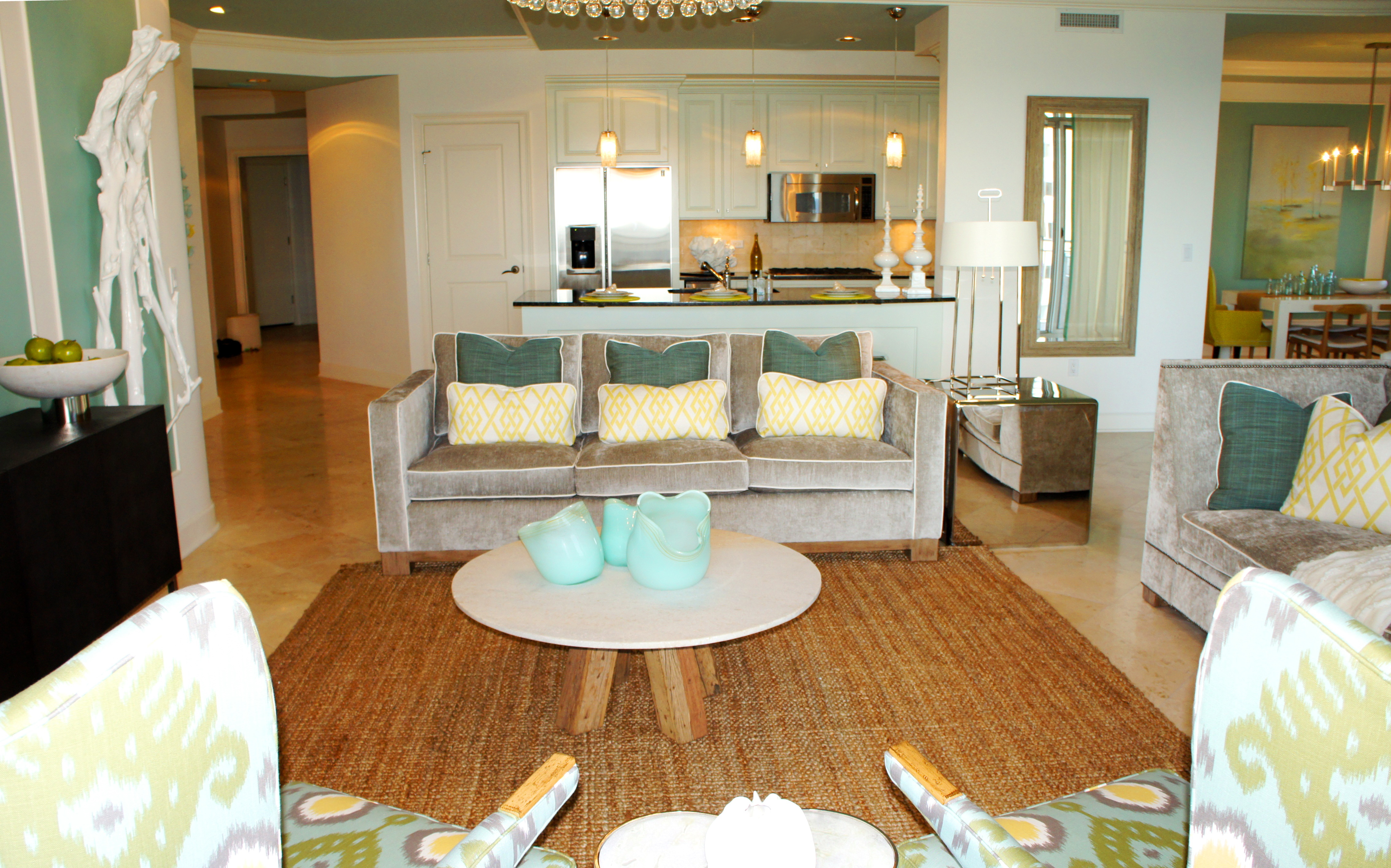
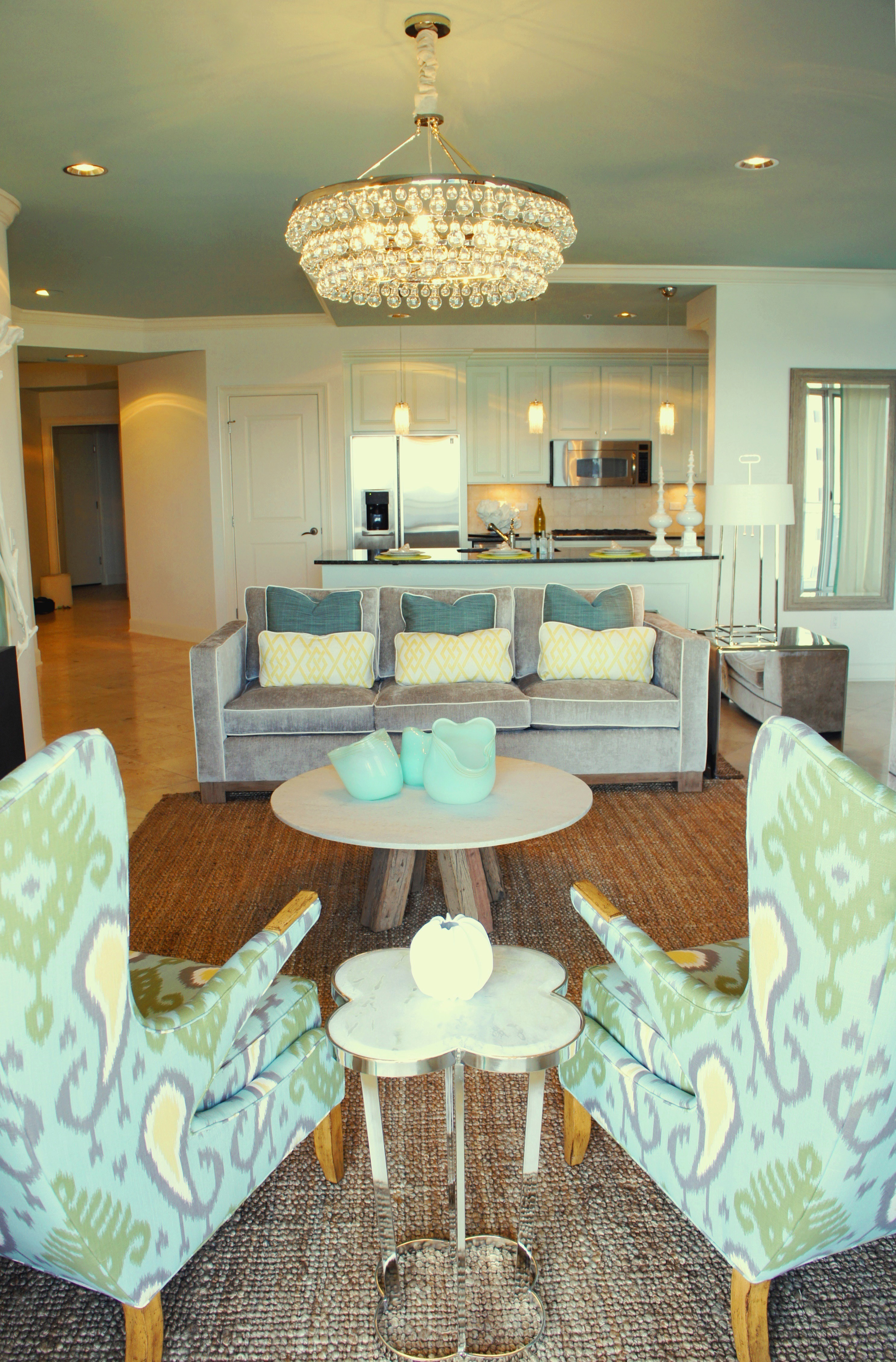
Living Room:
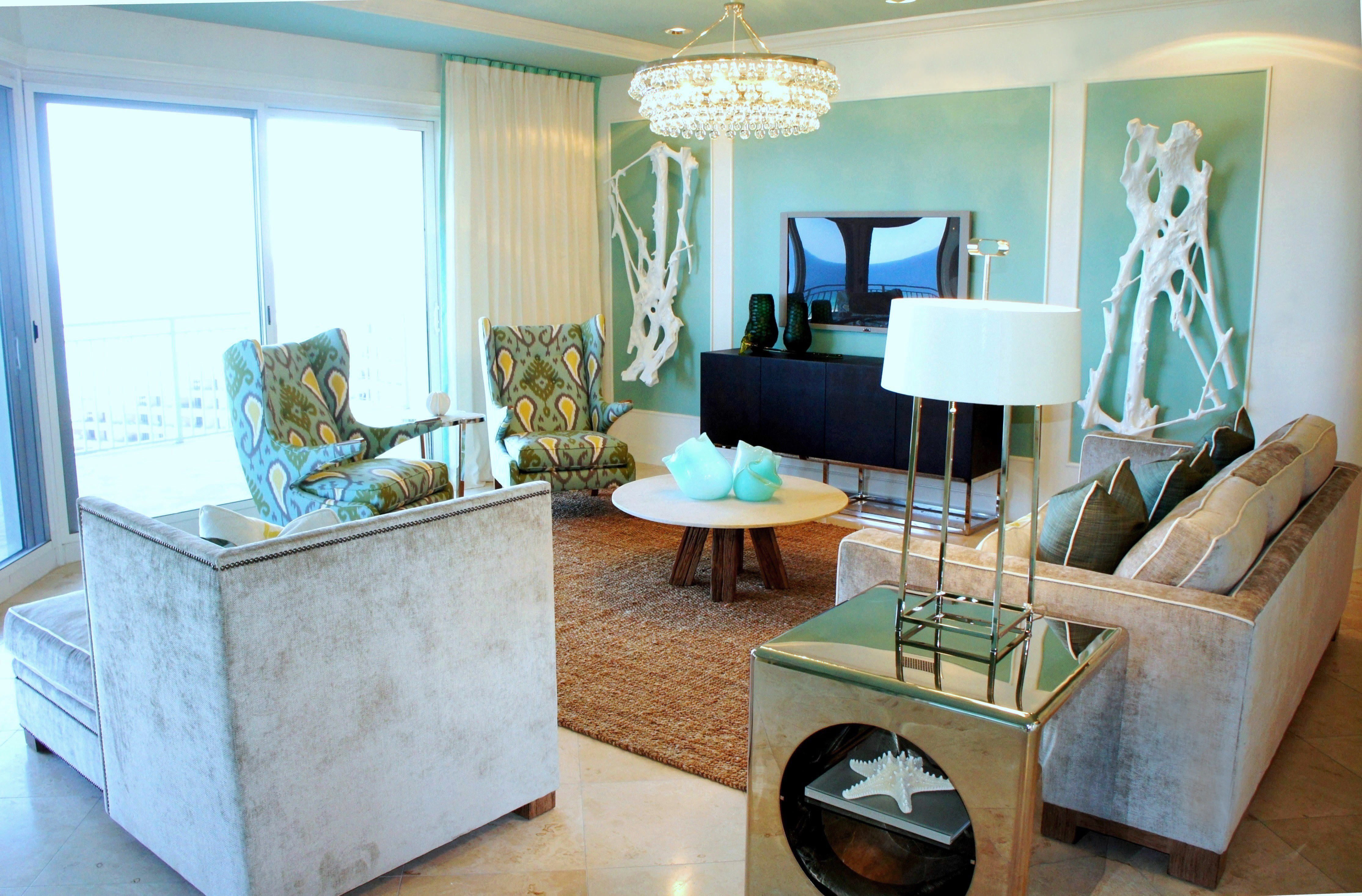
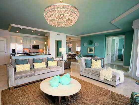
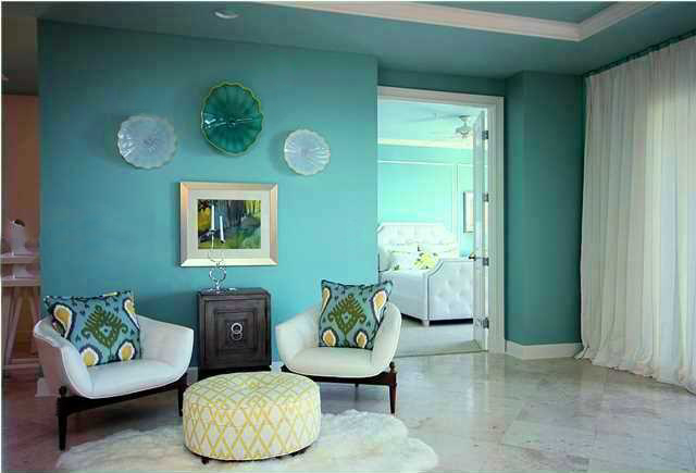
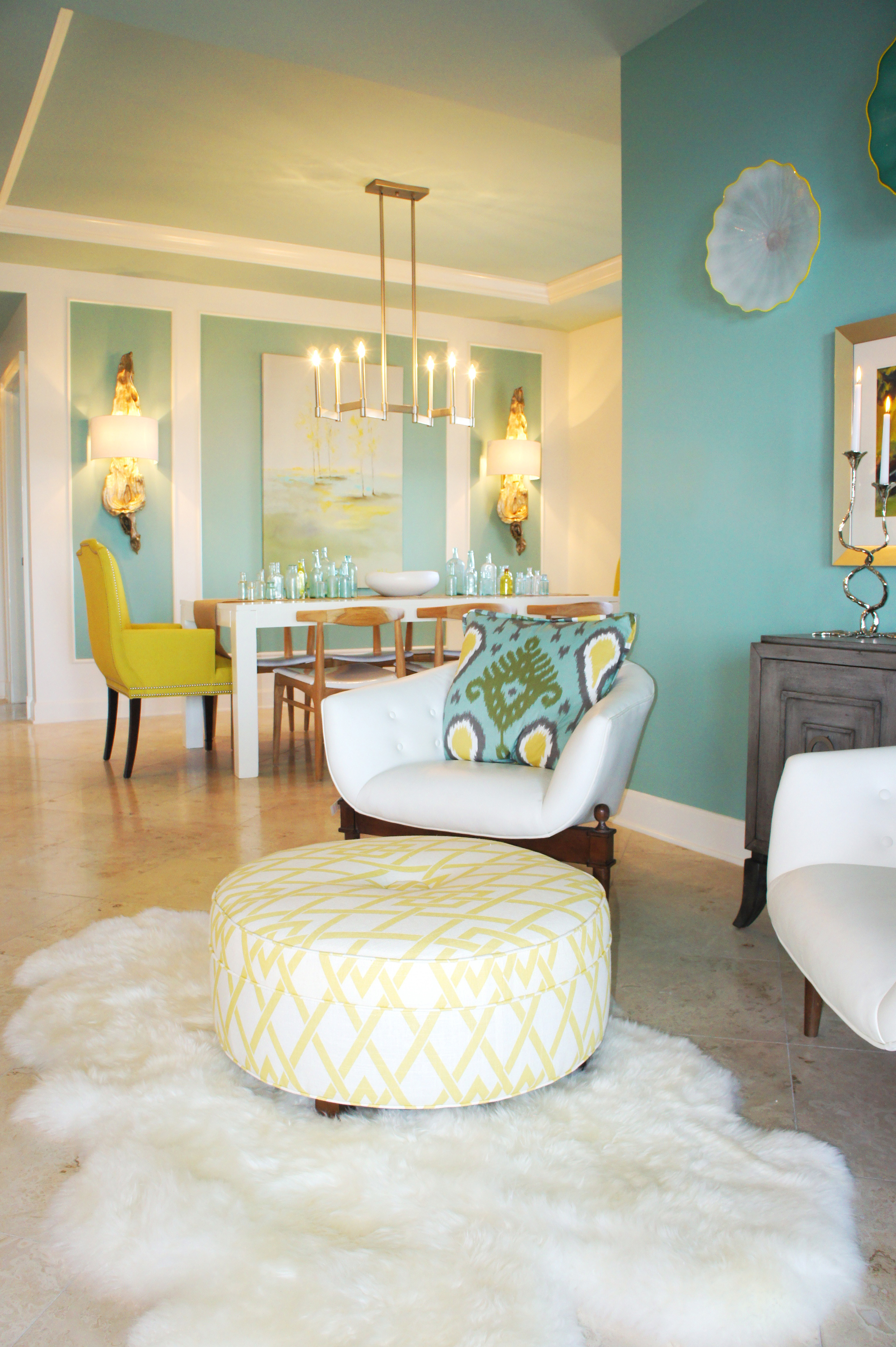
One great way to decorate a large, intimidating blank wall is to create the illusion of wall panels with simple wood trim pieces. Then, you can add a contrasting color or pattern to the center-here I painted them a rich aqua color! The panels not only break up the wall; they also frame the driftwood sculptures and help to liven up the focal wall! The glass chandelier adds some bling to the room, and mimics the round cocktail below it.”
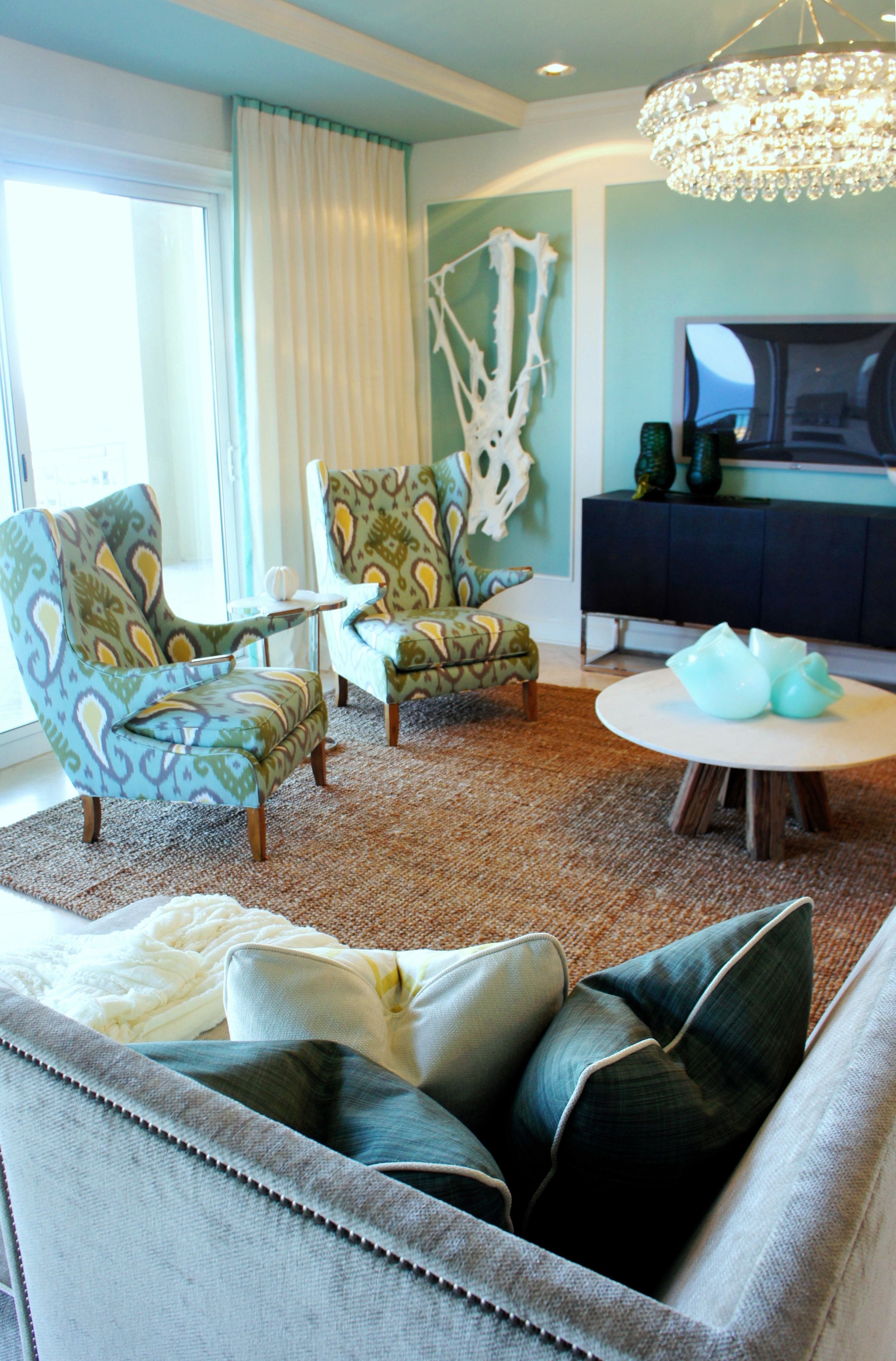
I accented all the heavier upholstery with these two contemporary wing chairs. I absolutely love these chairs! They are so comfortable, too! I chose a colorful Ikat print that pulls together the blue, green and yellow I’ve used throughout the unit. You can also see here what a great vantage point a person lounging on the chaise lounge will have, with a view of the beach, the television, the goings-on in the kitchen, and the other living room seating.
Kitchen:
This kitchen was given a simple facelift, with a paint job, new hardware, and new lighting.
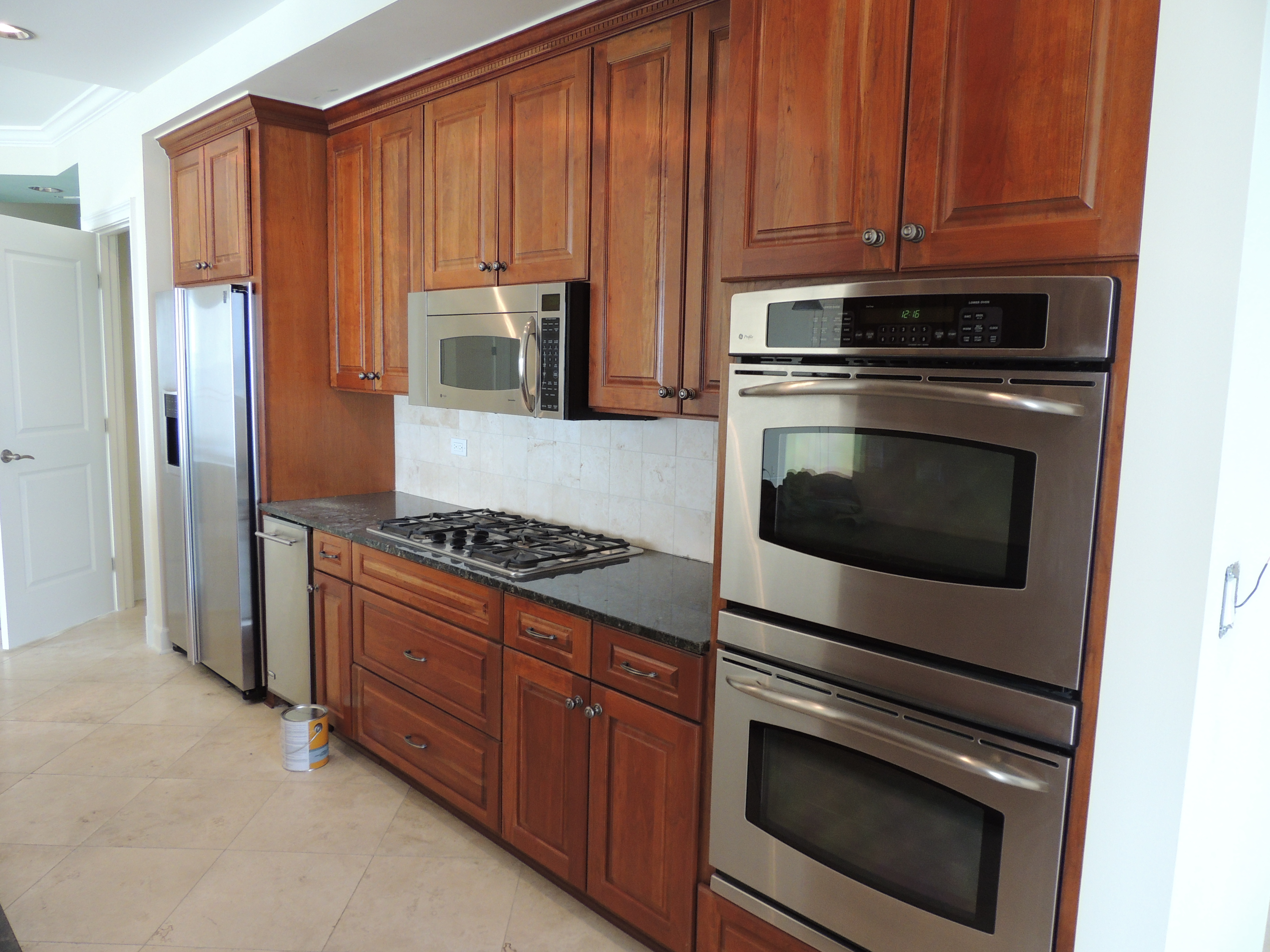
Kitchen Before
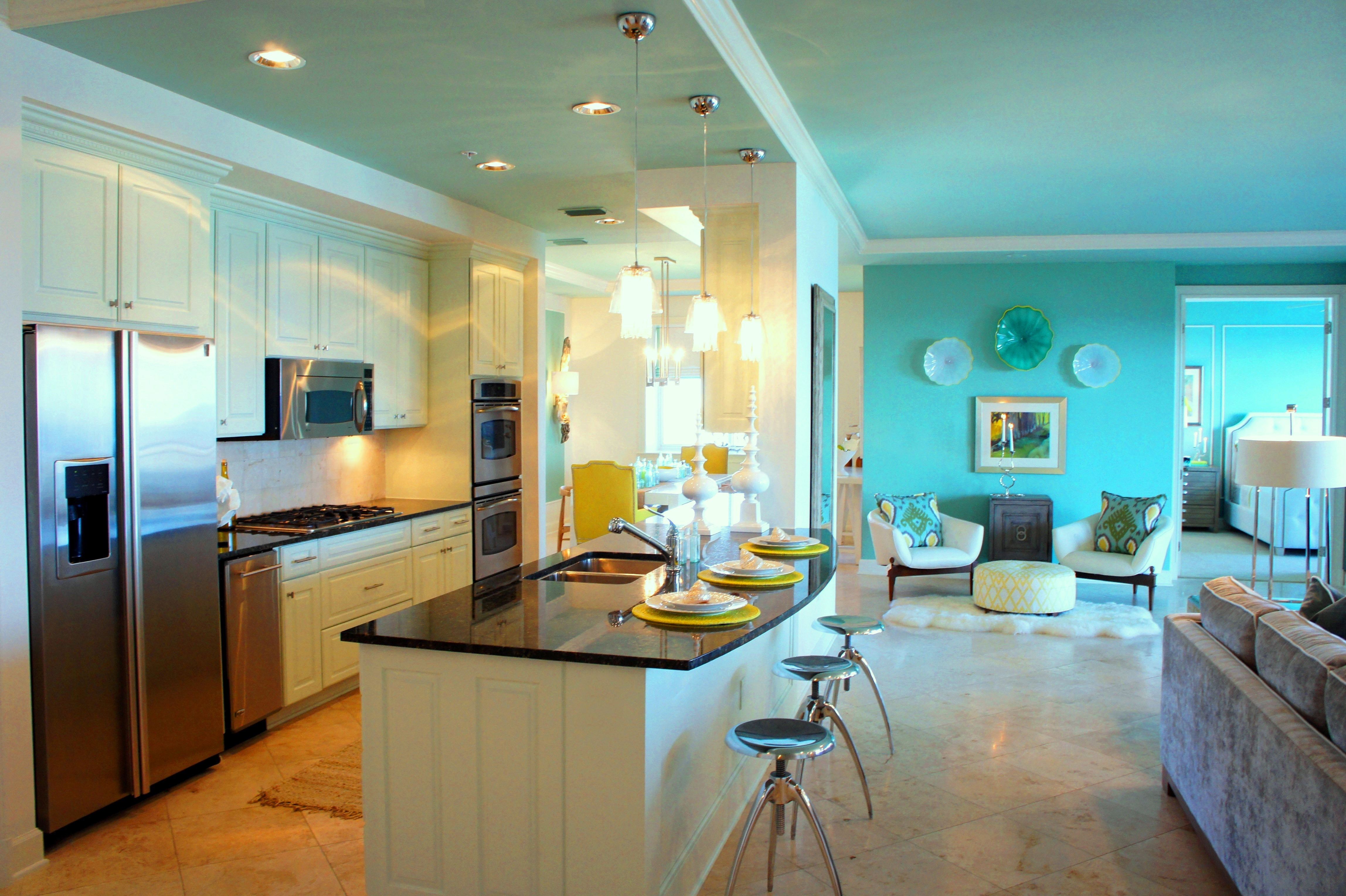
I chose these bar pendants, because they resemble jellyfish!
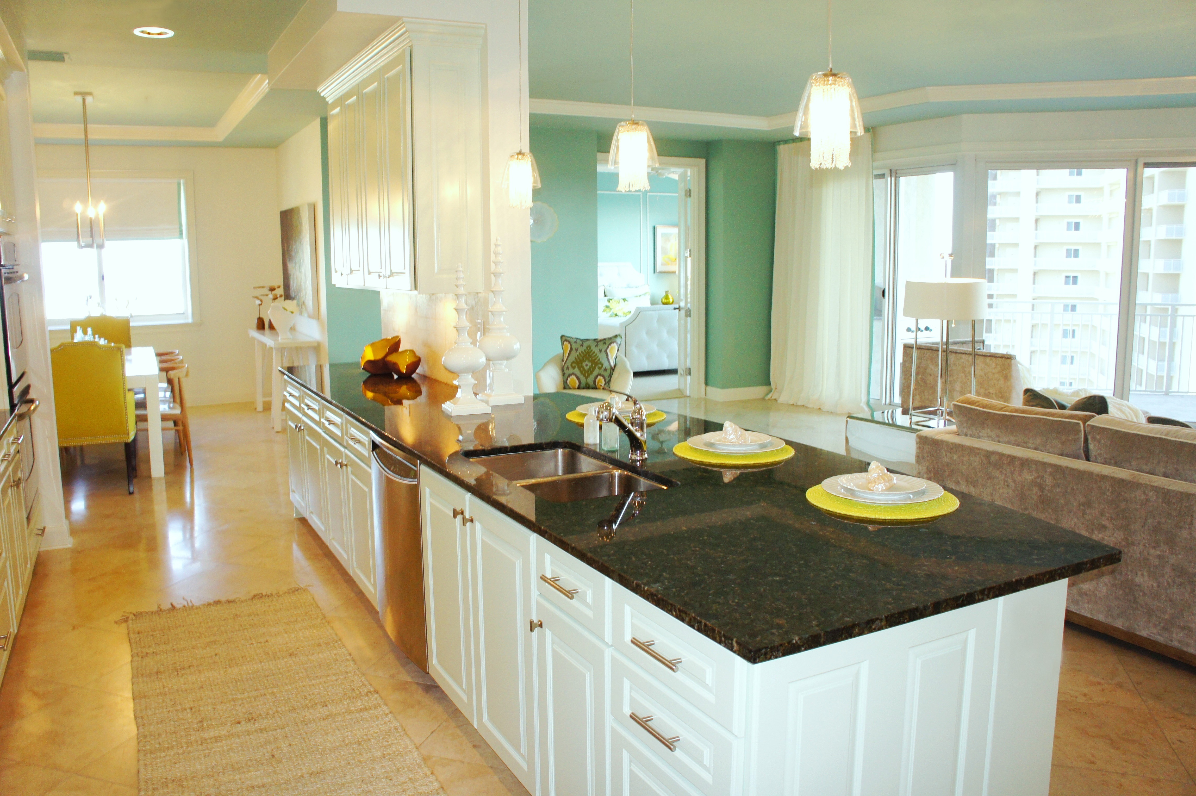
Painting the cabinets a pale ice blue brightened the kitchen and created pleasing contrast with the black granite countertops. I replaced all the bronze knobs with stainless contemporary knobs and pulls for a fresher look.
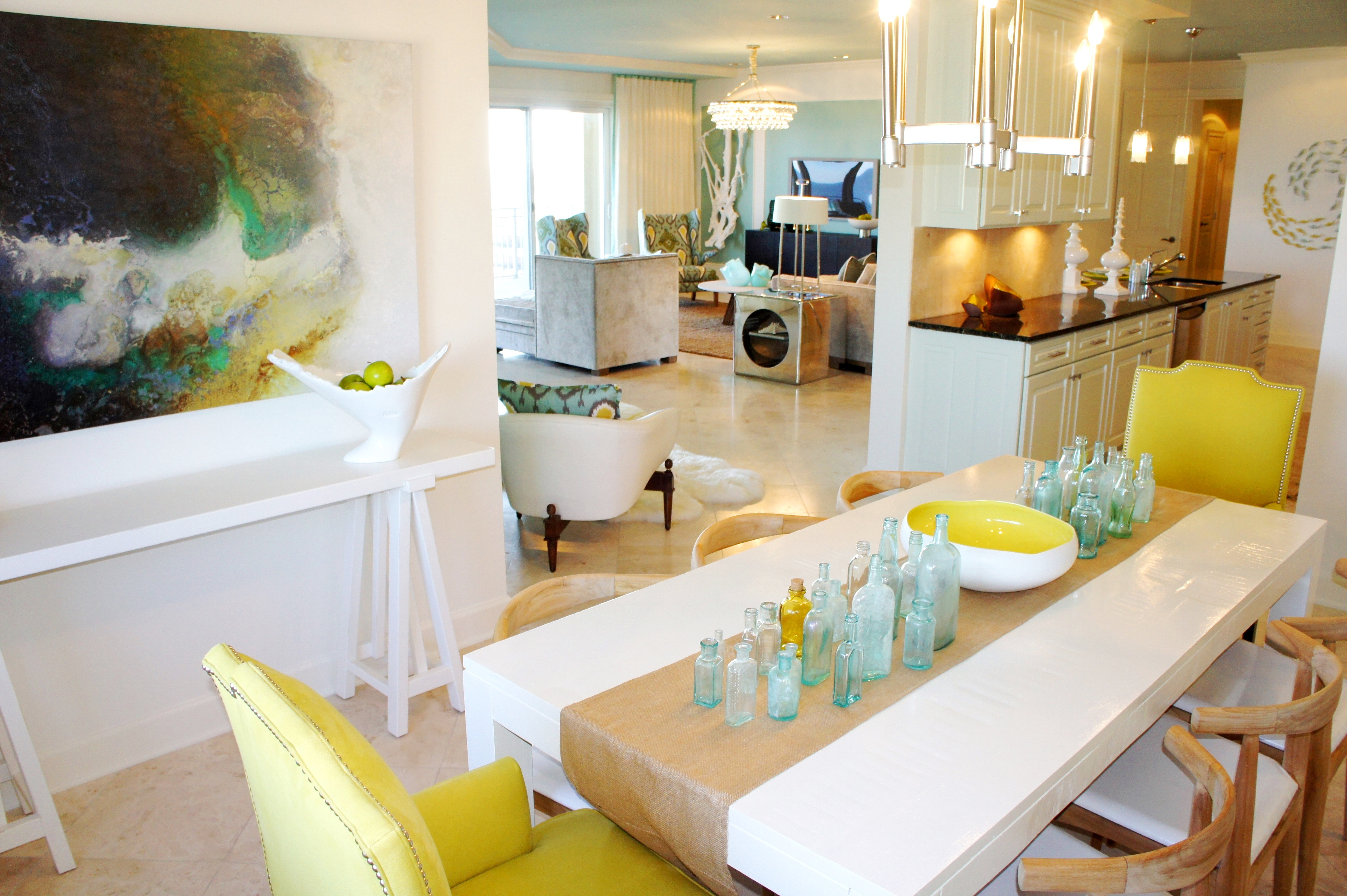
I believe it is important for connected rooms to maintain visual unity, so that when doors are open, everything flows together. Here you can see how the colors in my guest bedroom shine right along with my Living and Lounge.
Dining Room:
I dressed my dining area with more painted wall panels! I hung a large giclee art piece in the center, with silver leaf driftwood sconces on each side. For my finish palette, I mixed white lacquer, with raw teak wood, burlap and bright color pops.
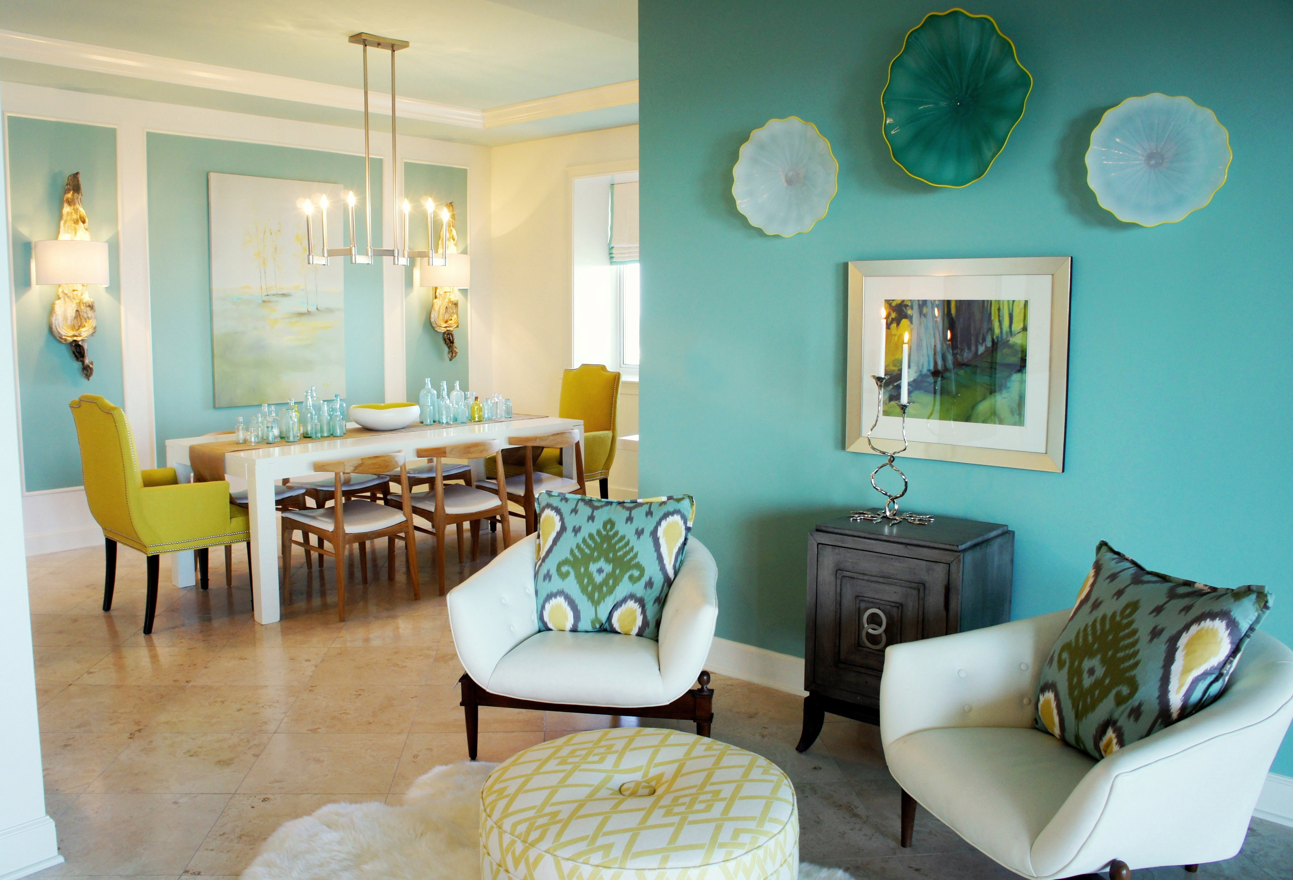
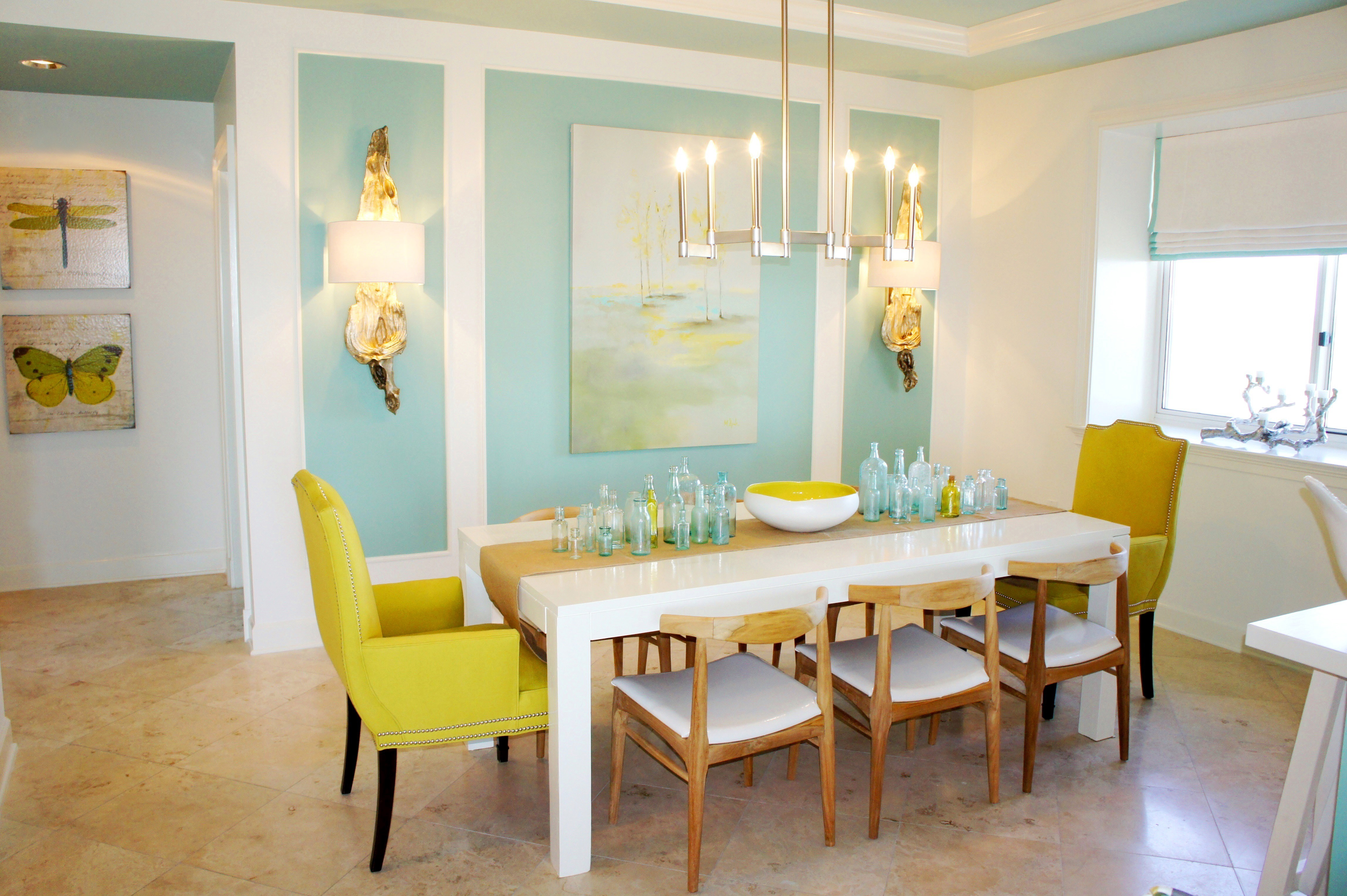
My white lacquer parsons table allowed the vibrant colors around it to stand out. The dining chairs are raw teak, with white patent vinyl seats. I covered the host chairs by C.R. Laine in an exciting shade of chartreuse, which was supported in the artwork and bowl centerpiece!
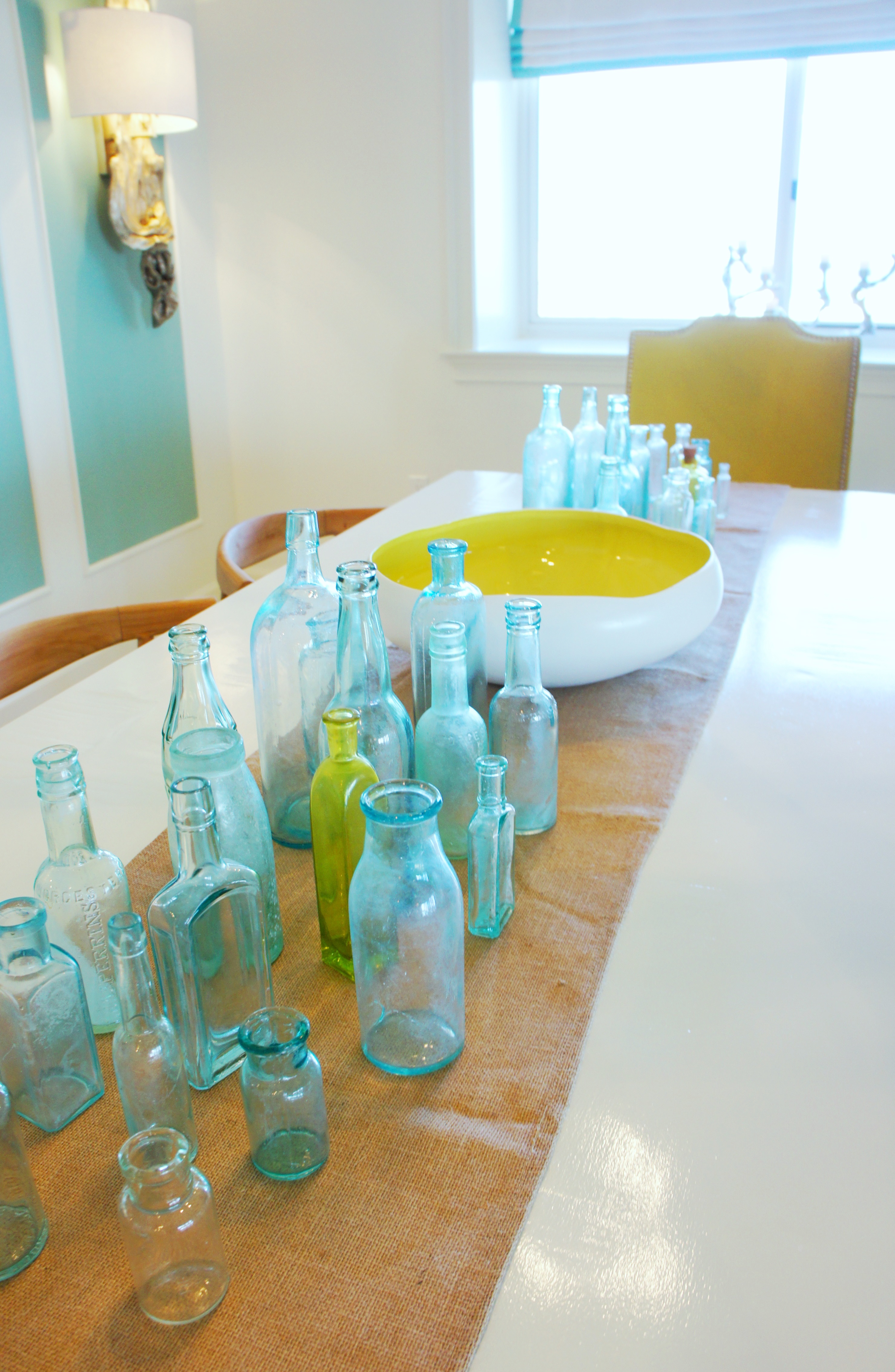
For my centerpiece, like many other details in this condo, I decided to go big or go home! For a vibrant color pop, I found a lot of antique glass bottles and congregated them on my burlap table runner. When entertaining, these bottles would look beautiful with the occasional daisy , and the bowl would look great with floating candles!
I made this niche special by giving it a refreshing splash of color! The hombre pattern of the Designers Guild wallpaper looks hand-painted!
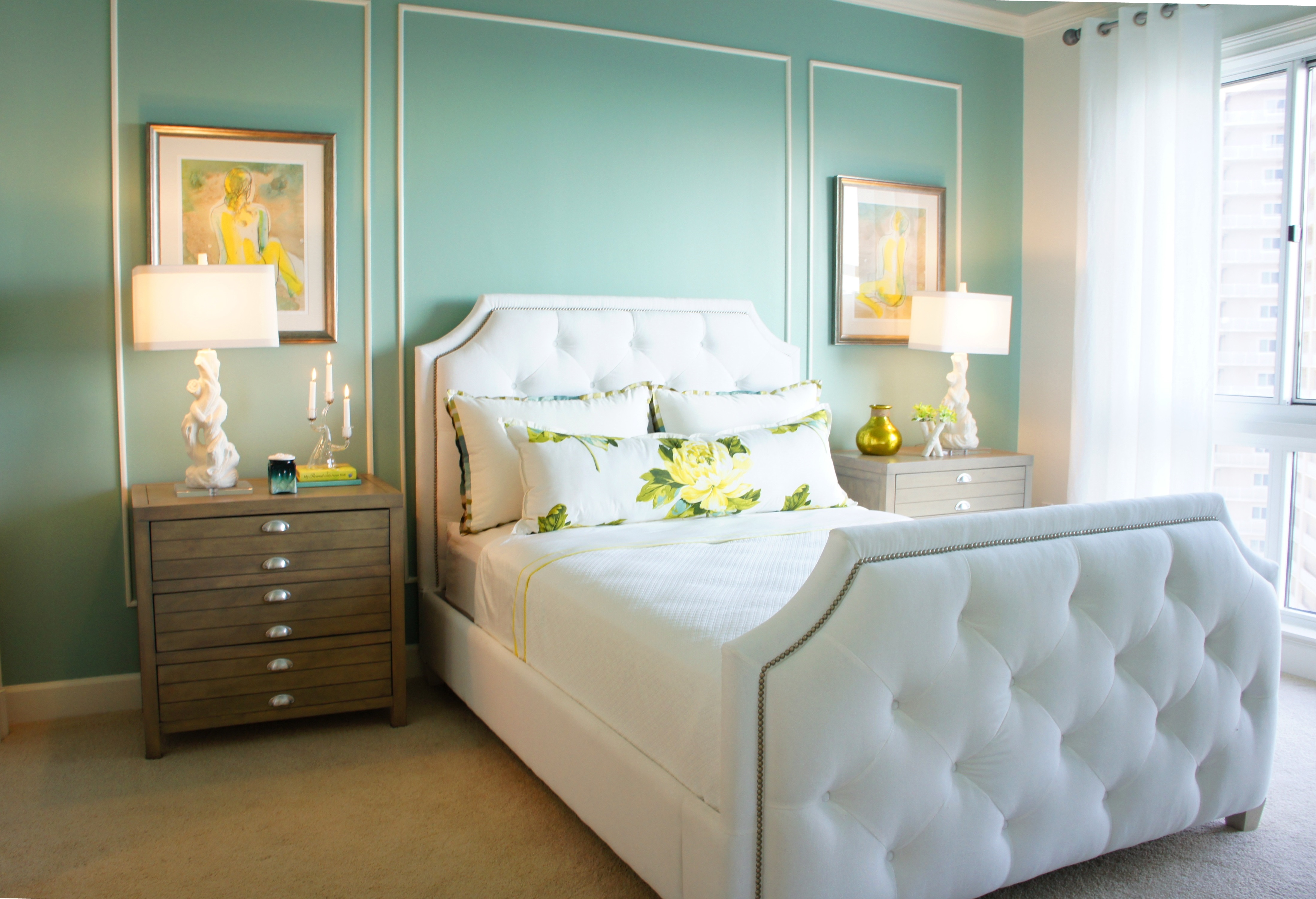
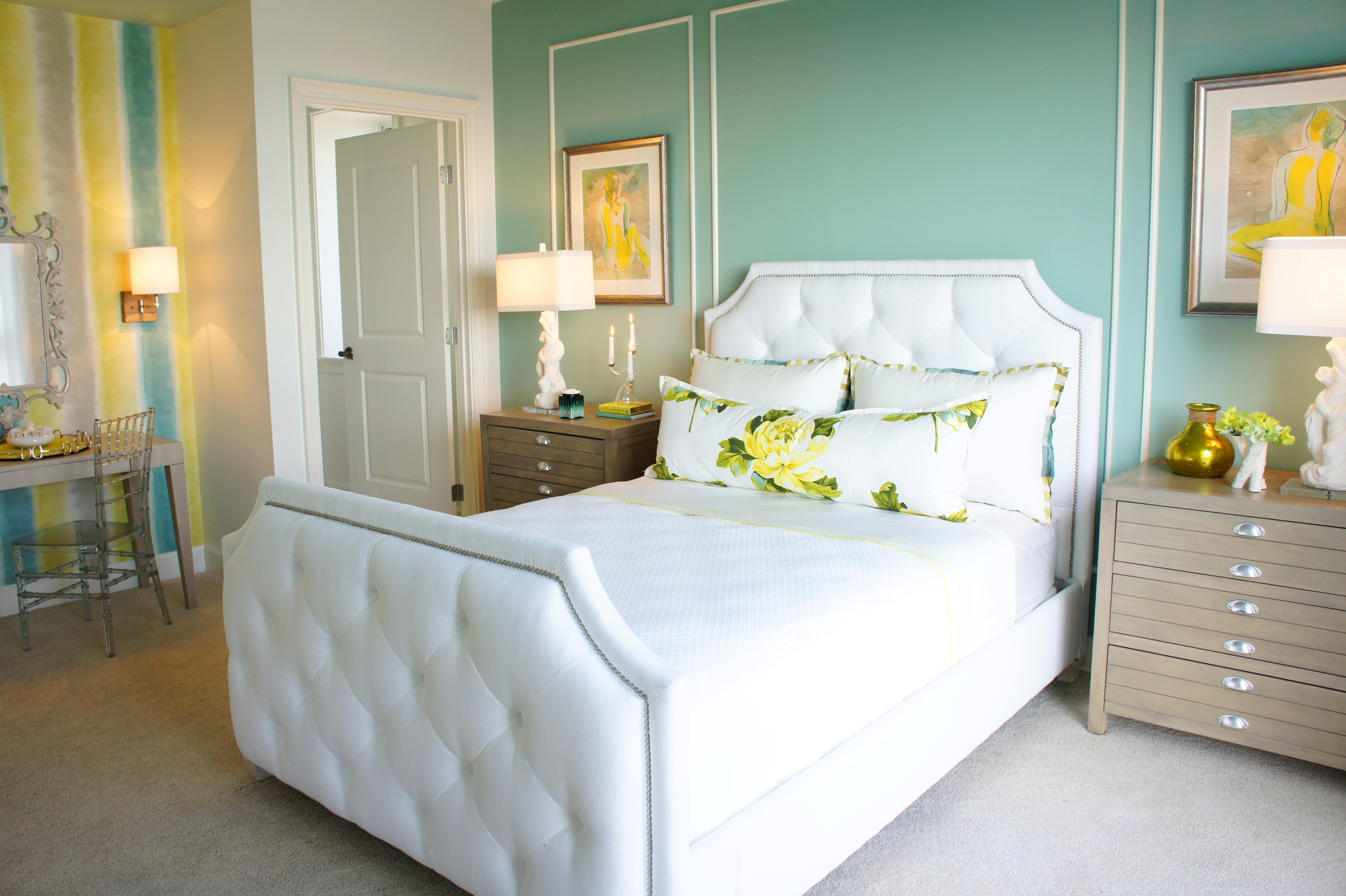
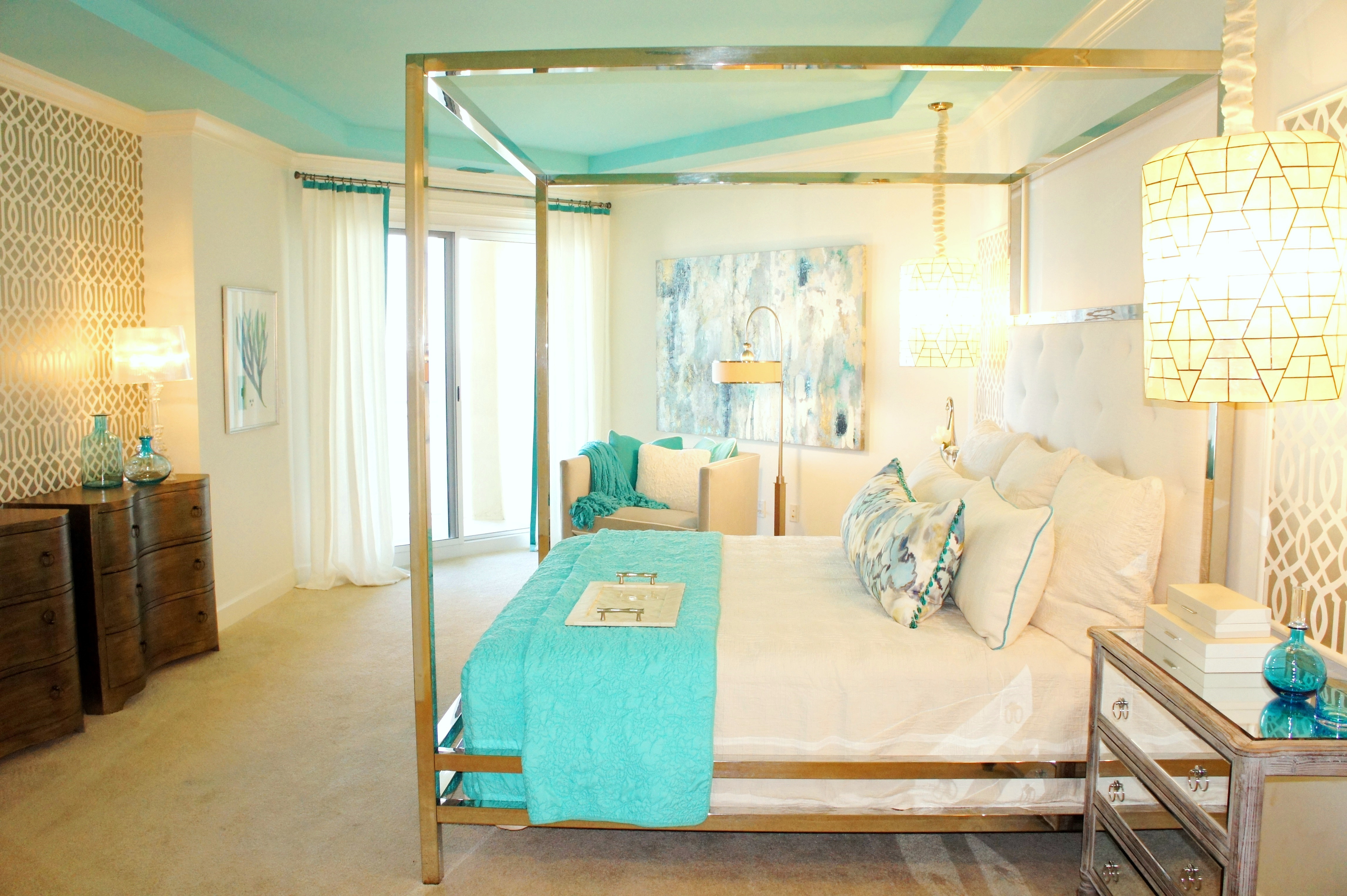
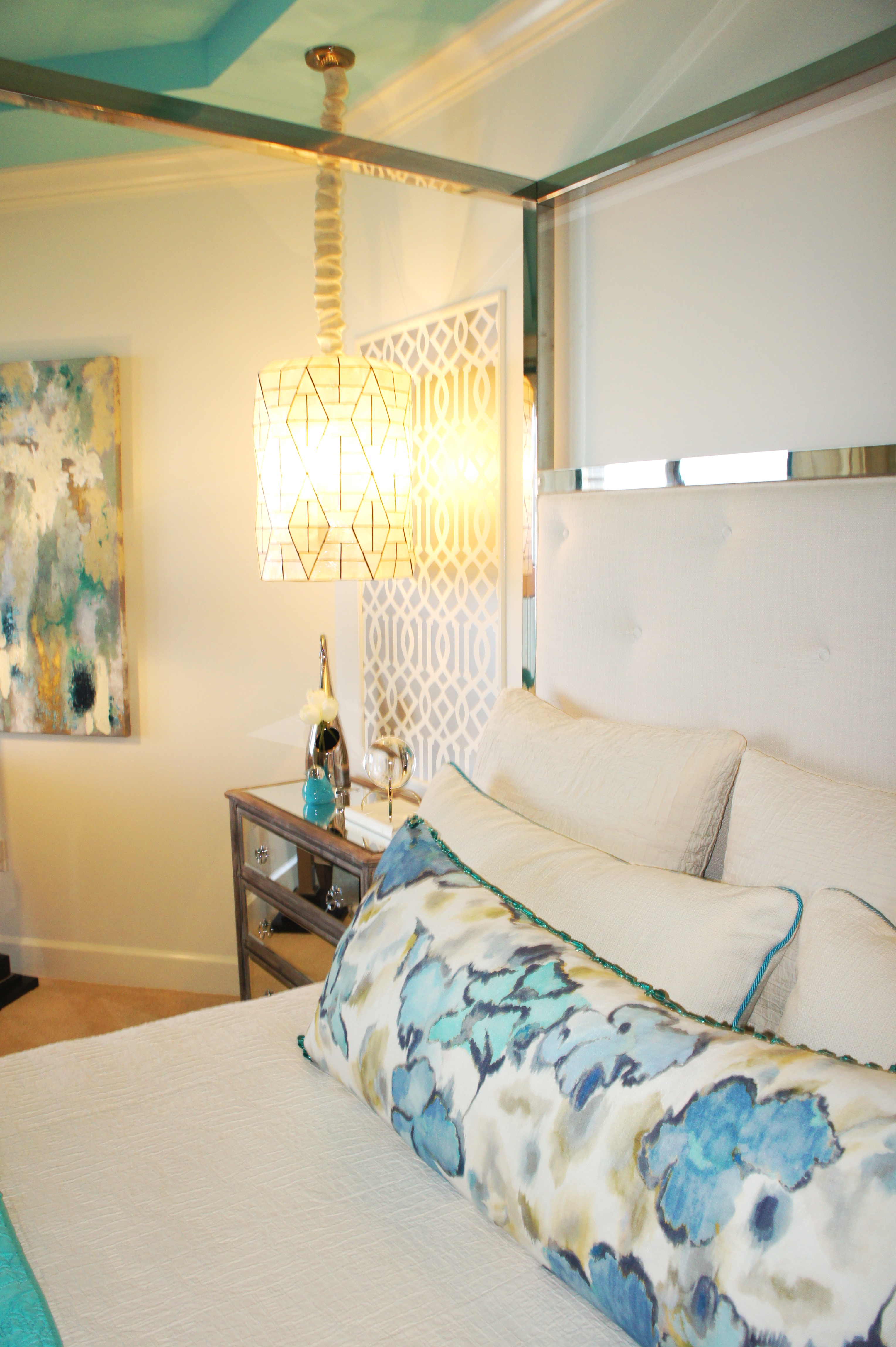
Master Bedroom:
This room is the epitome of sand and sea to me! The walls, bedding, headboard, and wallcovering are all a tone-on-tone soft sand color. Then, I came in with some bright splashes of turquoise with my pillows, foot blanket and pillow trimmings. Finally, I added a rich pool of turquoise to the ceiling for an element of surprise! Because the room is so white, the bright color on the ceiling serves to liven the room up and add some tropical flavor. Sometimes you have to just go for bold color!
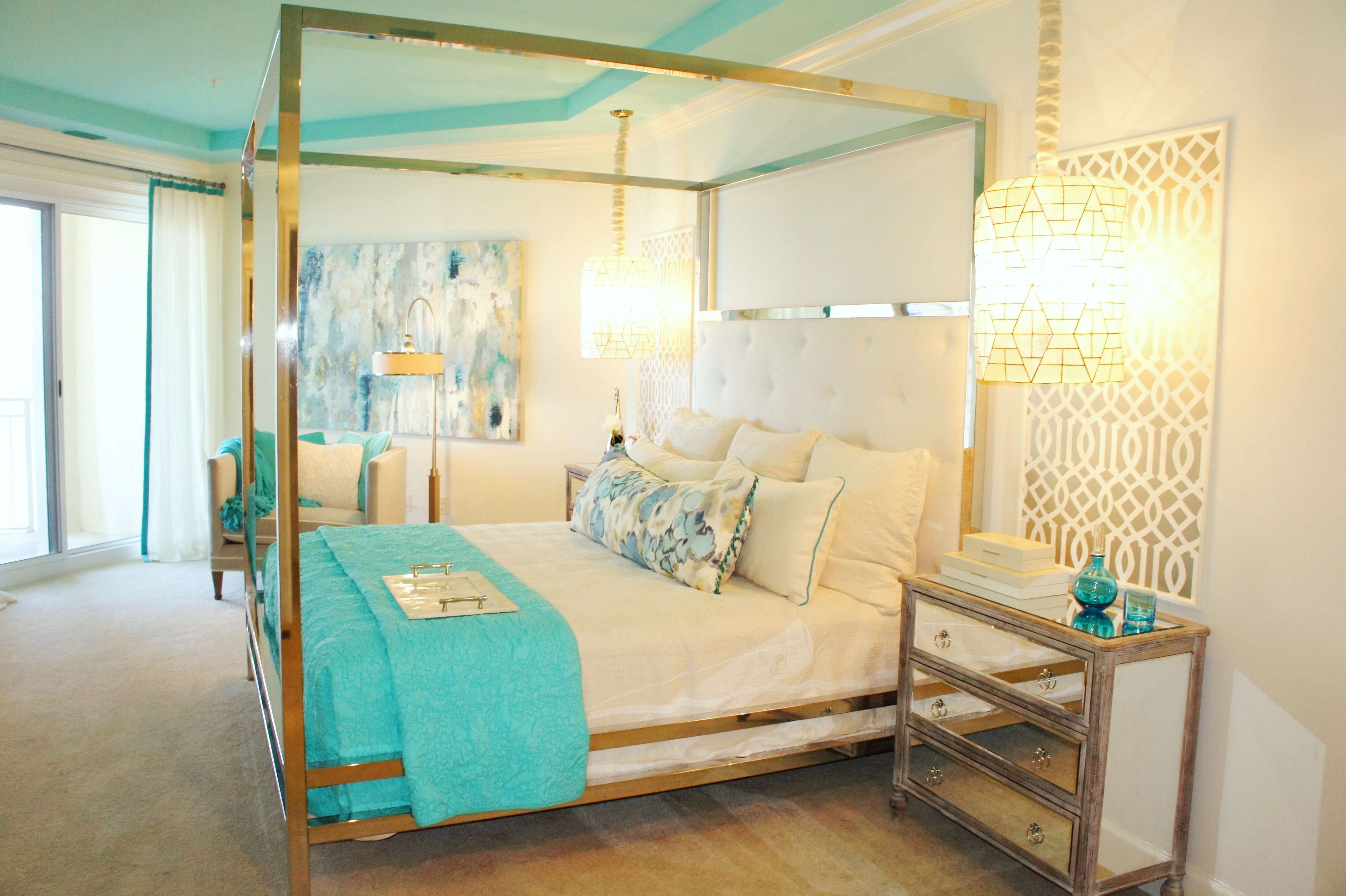
Inset into some trimwork, the geometric metallic wallpaper acts almost as contemporary artwork. I love how the pattern on the pendants plays against the pattern on the walls!
Here you can see how I repeated the metallic geometric wallcovering in the niche across from the bed.
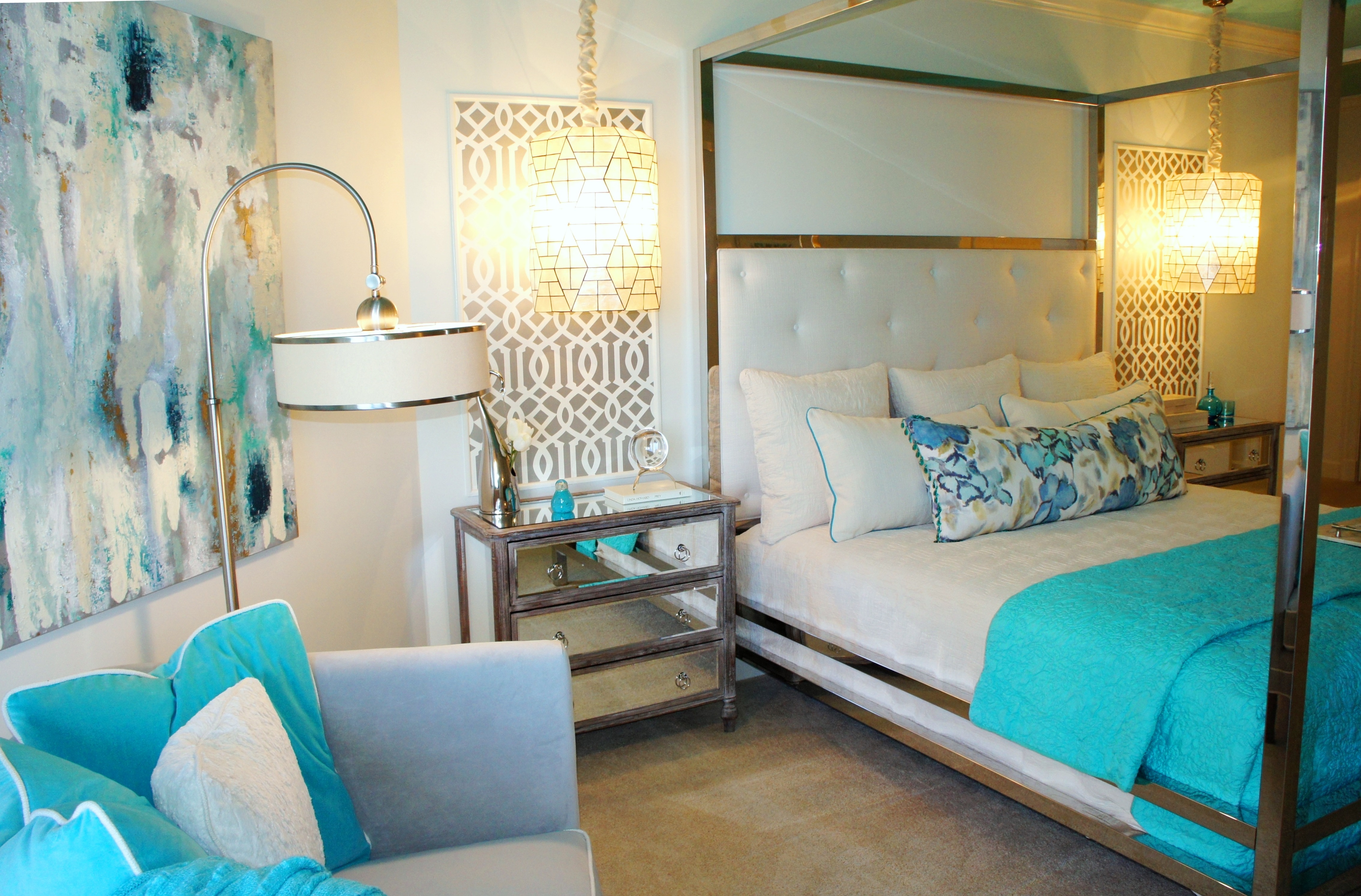
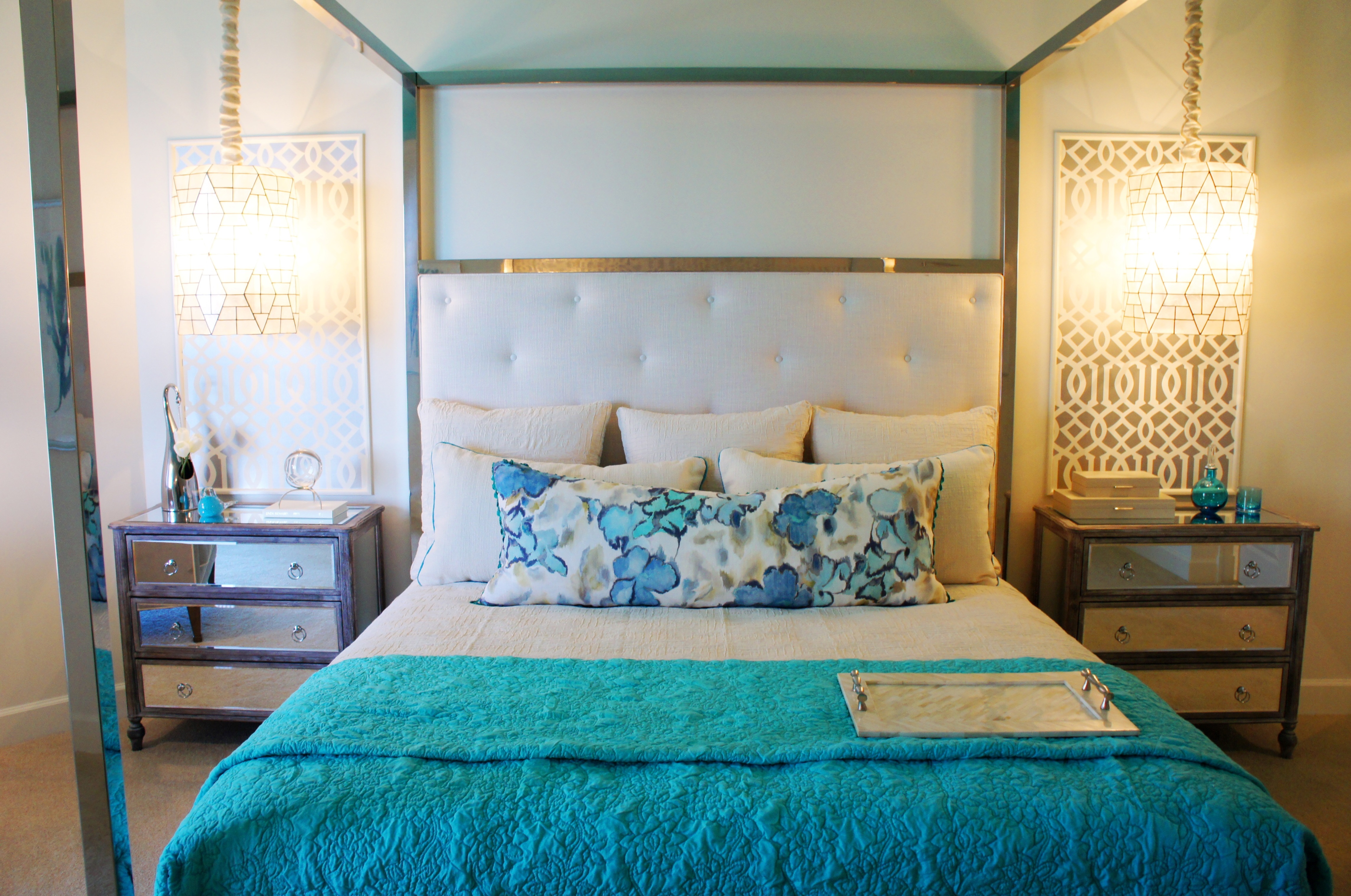
This king chrome canopy bed by Bernhardt has the stunning look and importance that I wanted for this room. It uses the space well, without looking too heavy. I also loved the simple, uncomplicated lines.
Guest Bedroom 2:
This room has a view of the bay and San Destin Marina. I chose a color palette with darker color accents that complements their window view. The star of the show is the Schumacher printed fabric I used on the Queen shams. The accent blue color on the bed wall was pulled directly from this fabric, as well as the varying shades of green and blue used on the striped bolster, wall bowls and accents. The off-white upholstered bed, coverlet and duvet allow these colors to shine!
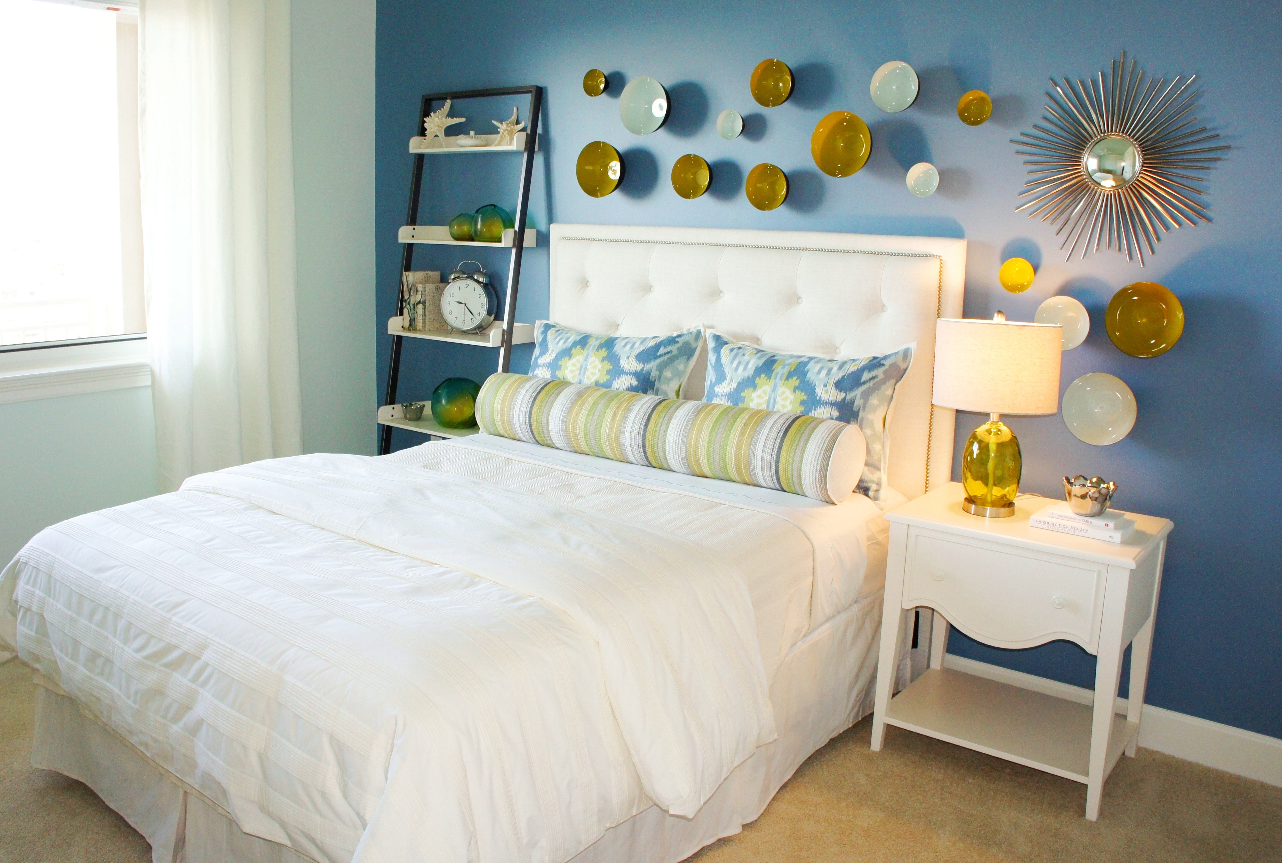
I painted these walls a pale aqua color, then gave the bed wall a dramatic “punch” of blue that contrasts well with the bed and wall décor.
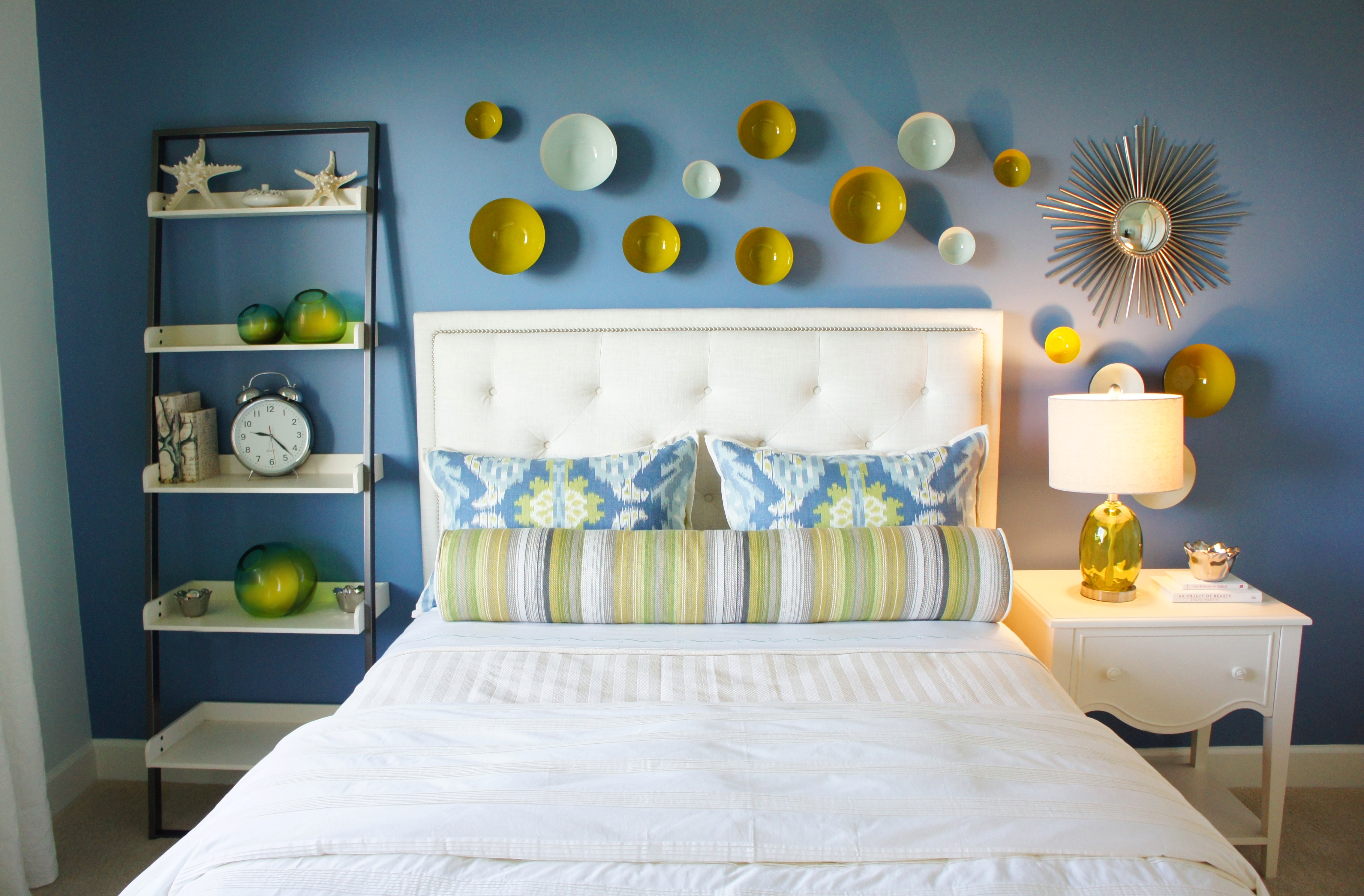
I decided to go for an asymmetrical layout. The colorful wall bowls and star mirror are sprinkled in a way that balances the tall beside shelf.
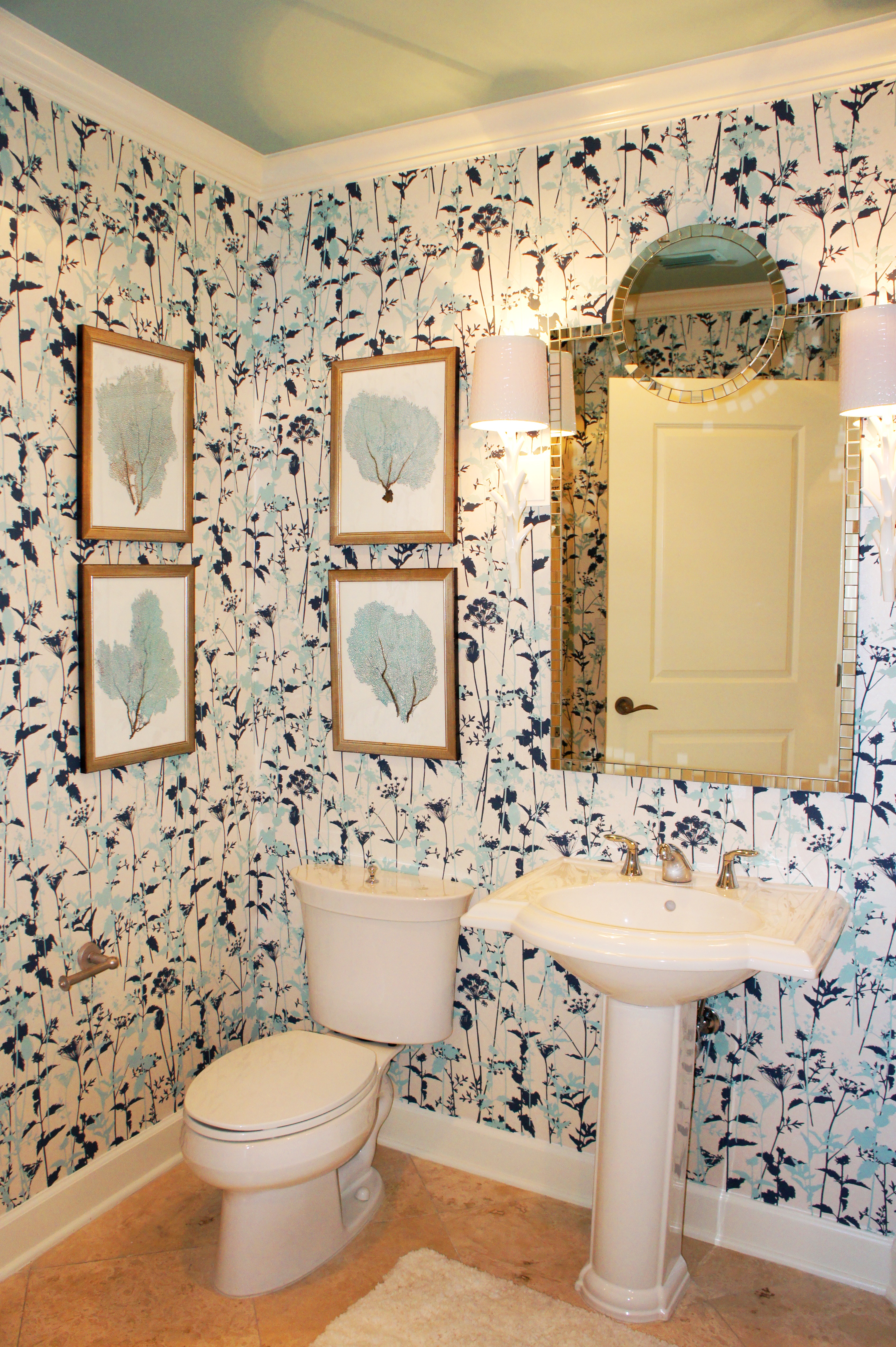
I jazzed up this small bathroom by papering the walls in this fun, blue and white wallcovering and hanging a chic mirror above the pedestal sink. I flanked the mirror with two white coral Regina
Andrews sconces.
<a
Please contact me if you are interested in design services: cara@lovelaceinteriors.com
Call Don Williams (850) 688-0444 or Derrick Ballard (850) 585-6068 at Grand Dunes if you are interested in owning this unit for yourself! owning any other Grand Dunes units!

i love love love the design of this condo! can u share where the nudes in the bedroom came from? in addition to the white and yellow trimmed glass bowls (or plates?) hanging on the den wall? also – where did u find those yellow and white bowls in the guest room? thanks so much!!! well done!