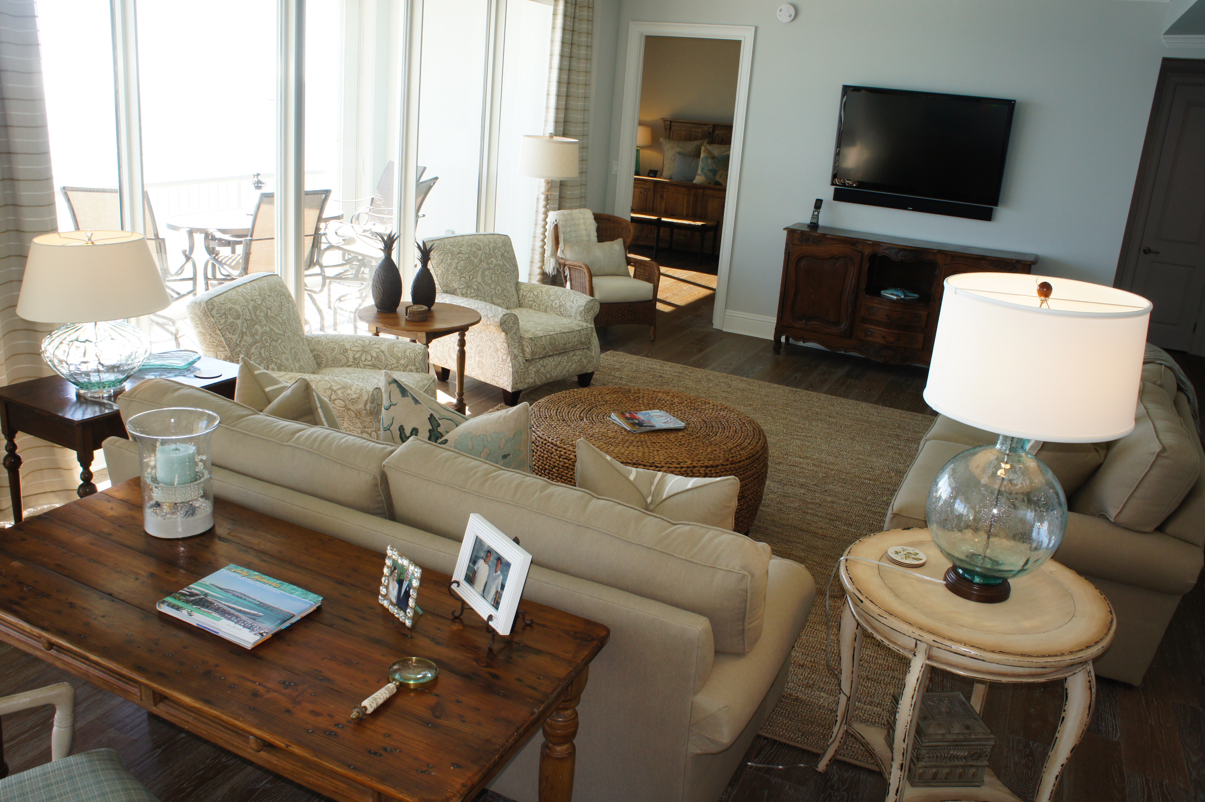
This unit was in serious need of an extreme makeover! Our main goals were to create more space and light, as well as a more updated aesthetic and functional layout. We almost completely gutted this entire unit, and started over with a plan that I knew would do the job!
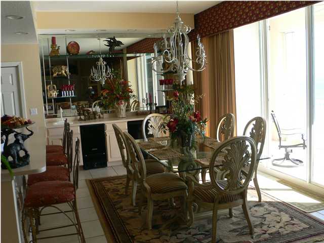
Kitchen/Dining Before
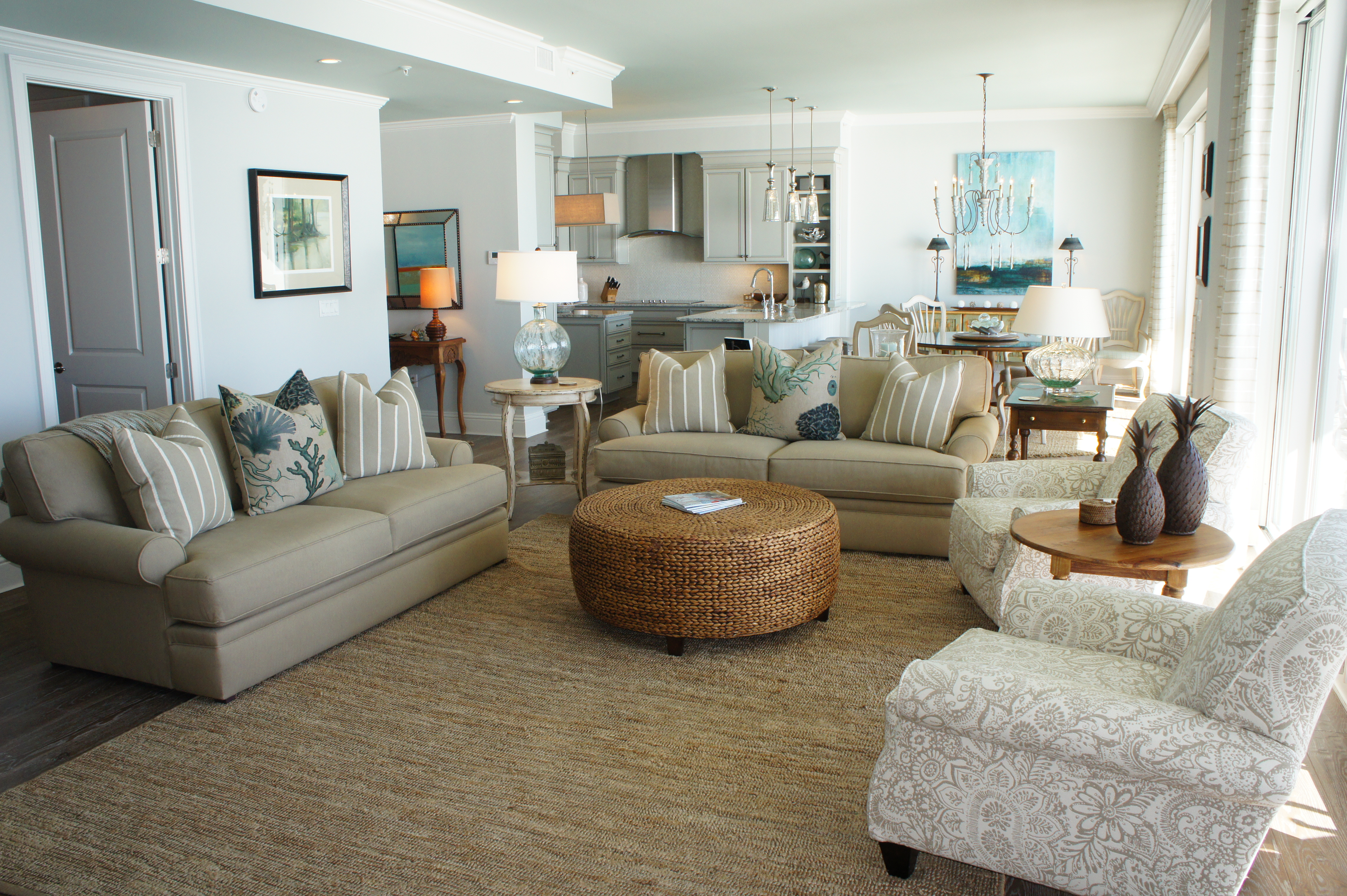
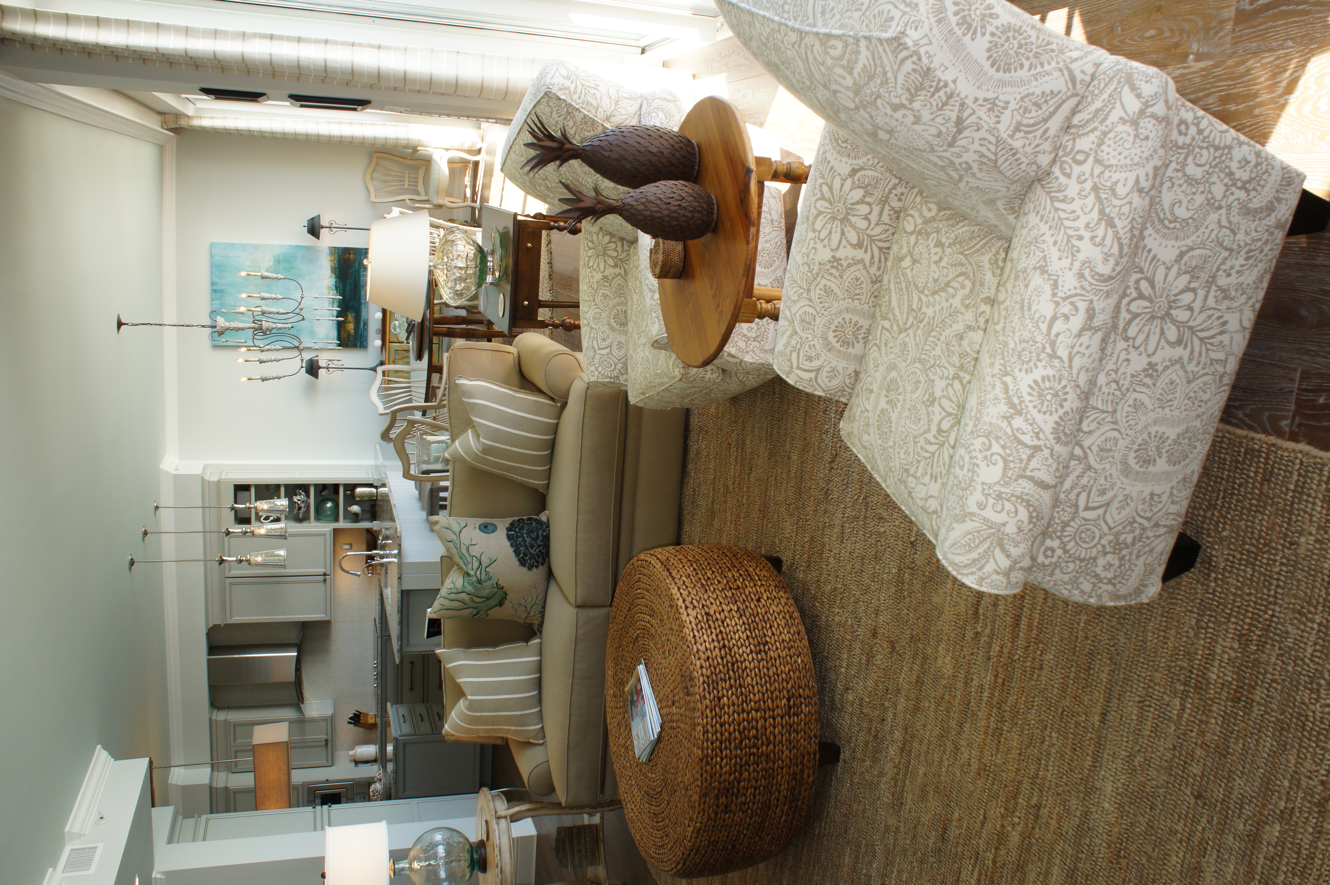
In the Dining Room, we removed the built-ins and cleaned up the mirrored walls. We removed the soffits above the bar, and in the kitchen, and raised the ceilings everywhere that we could. Instead of doing dark, heavy cornice and drapes, we opted for a cleaner approach: a cornice made from crown molding, with light sheers behind them.
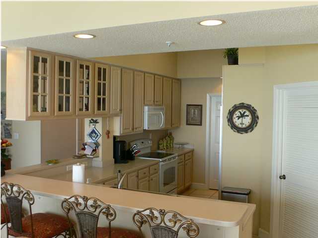
Kitchen Before
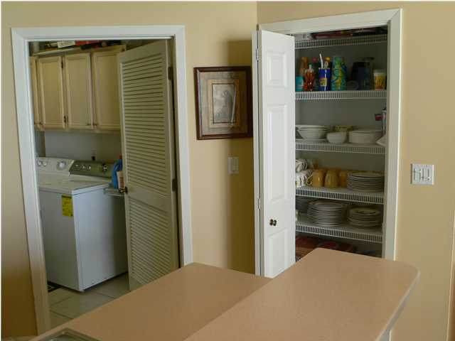
Laundry/Pantry Before
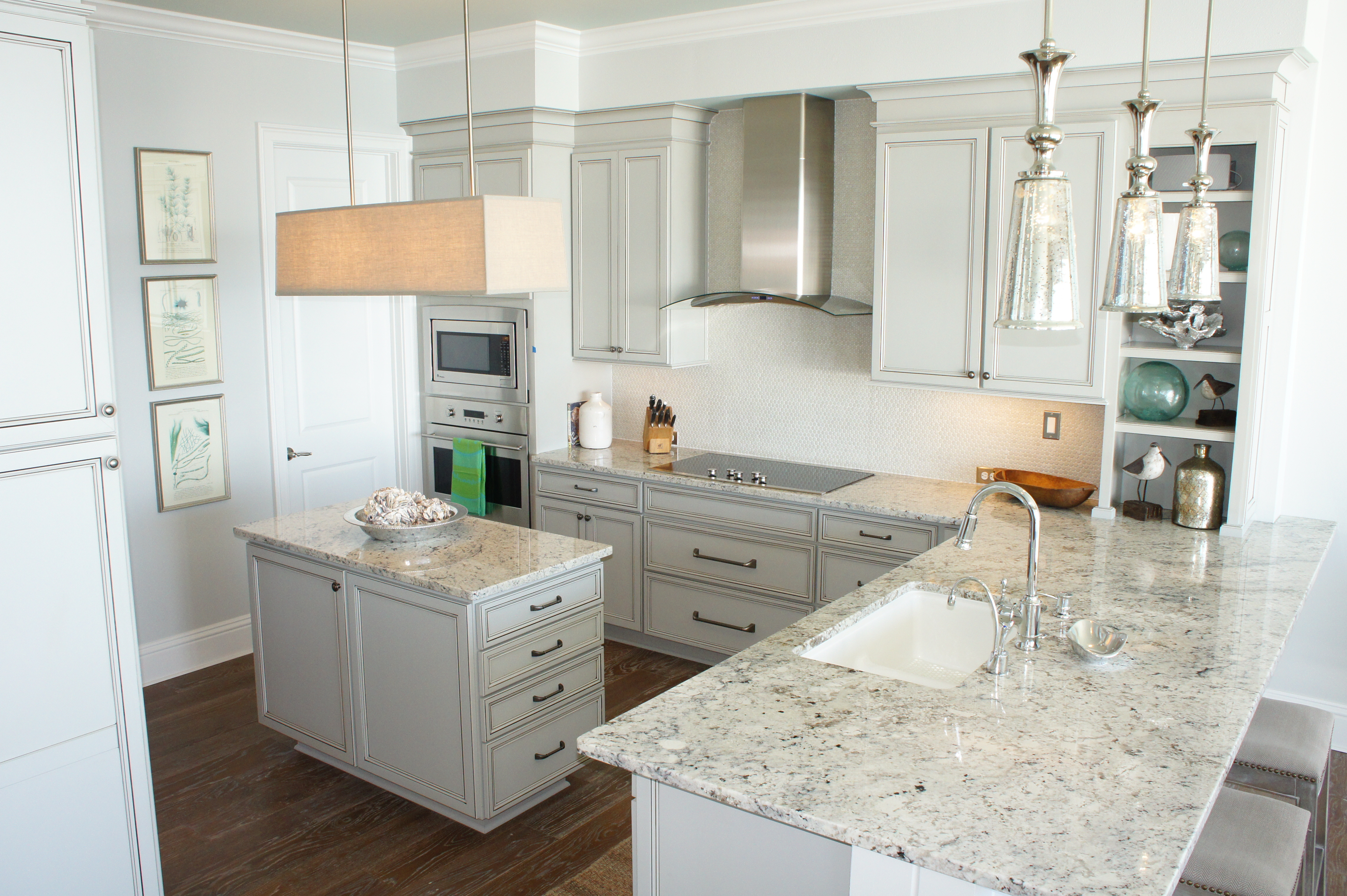
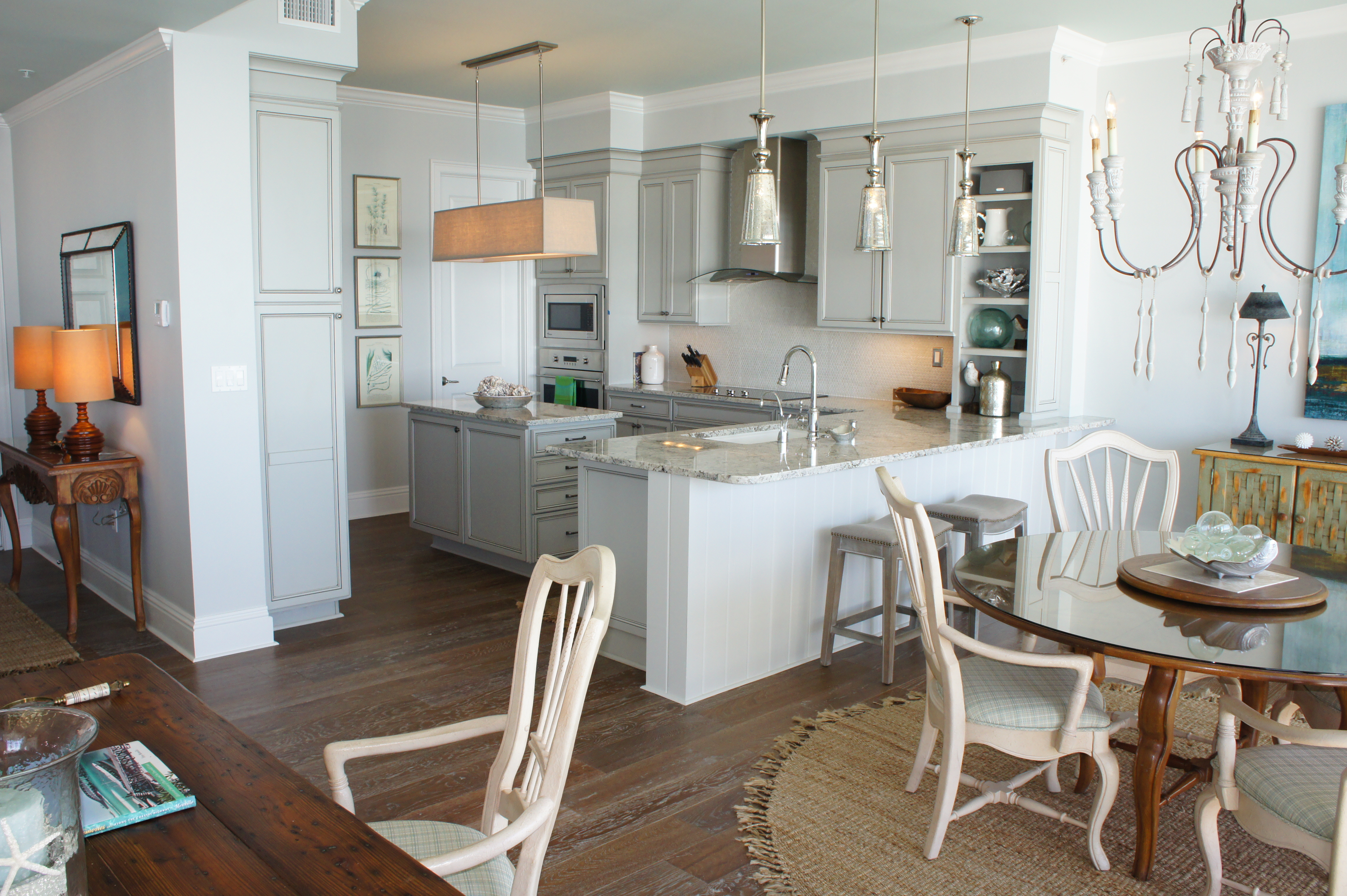
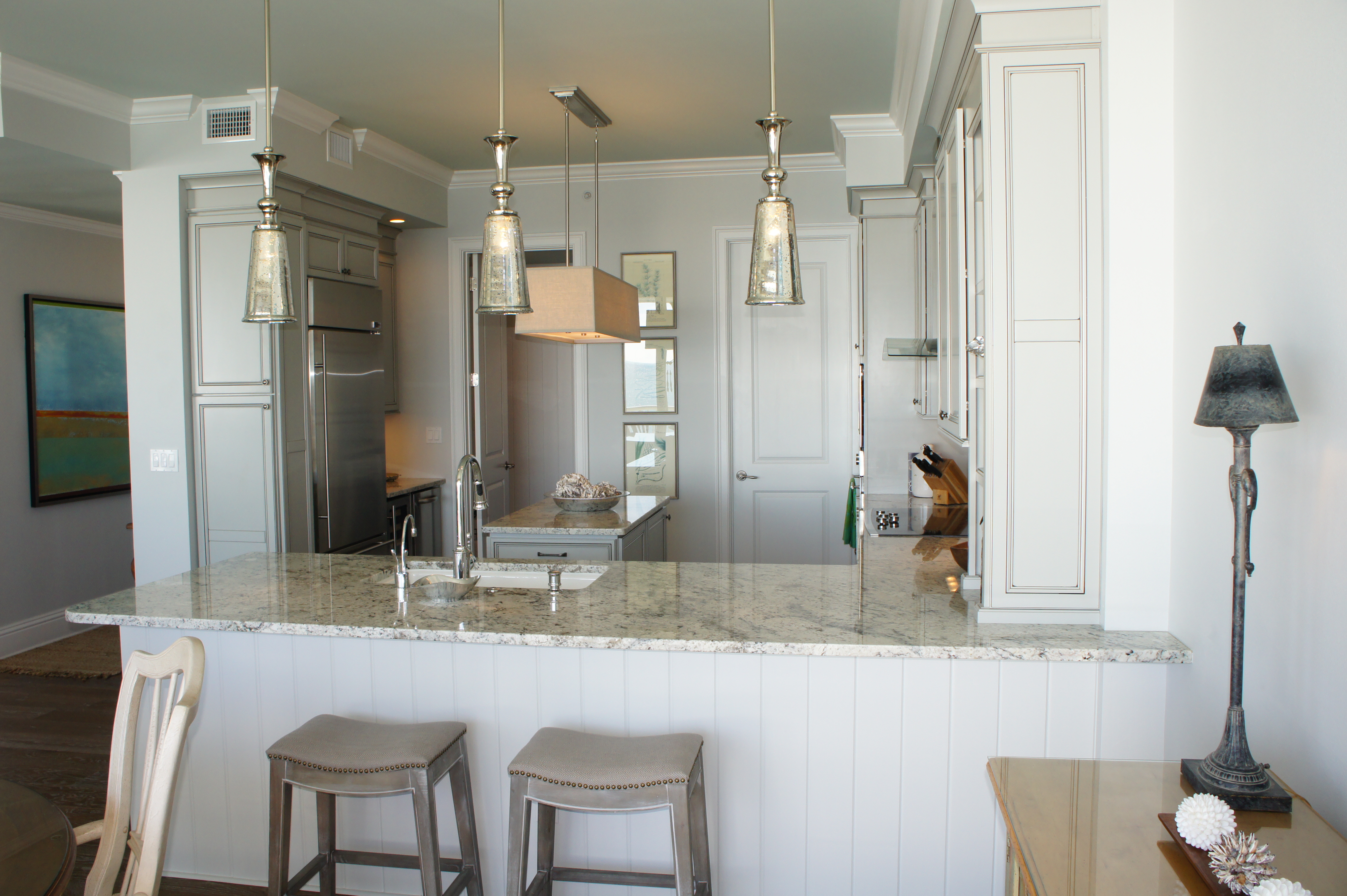
The kitchen was the focus of much of our time in the planning of this remodel. This area needed the biggest change, and required a large amount of problem solving. We completely removed the pantry, soffit and walls, and relocated the hot water heater and laundry room. We moved the laundry room so that it can be accessed from the kitchen and the outside, like a mud room. I chose a gray paint color for the cabinets, with a slight glaze. The rectangular drum chandelier was the perfect size and shape to go over the island. The mercury glass pendants provided extra light, beauty and sparkle, while keeping the feeling open.
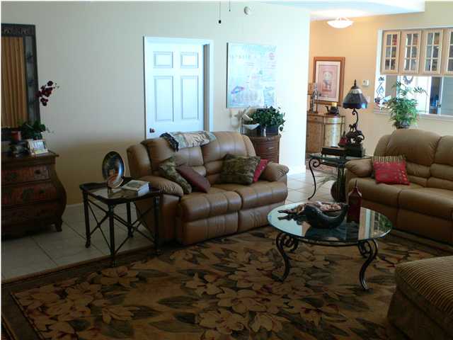
Before
Before
Before
Before
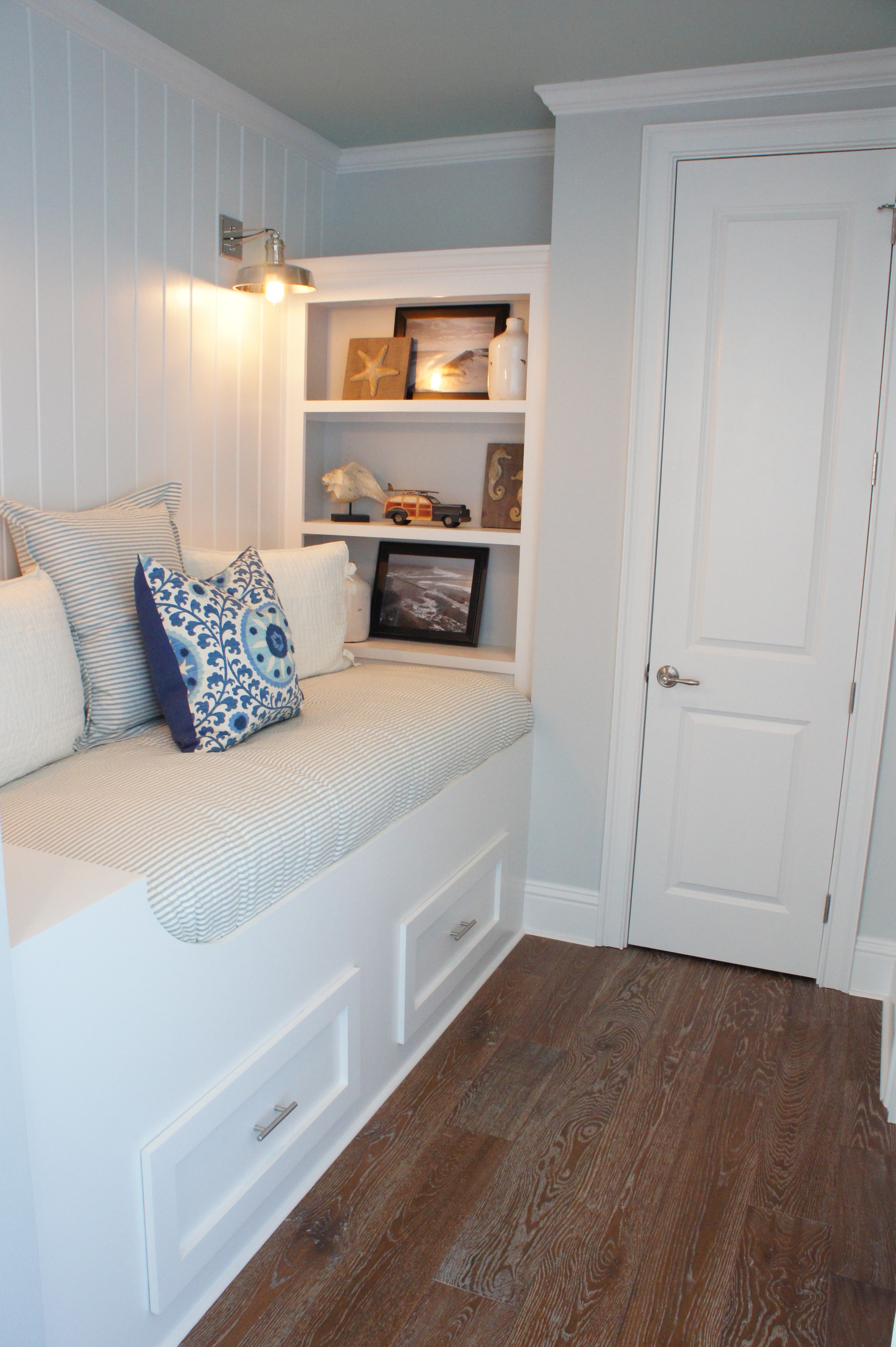
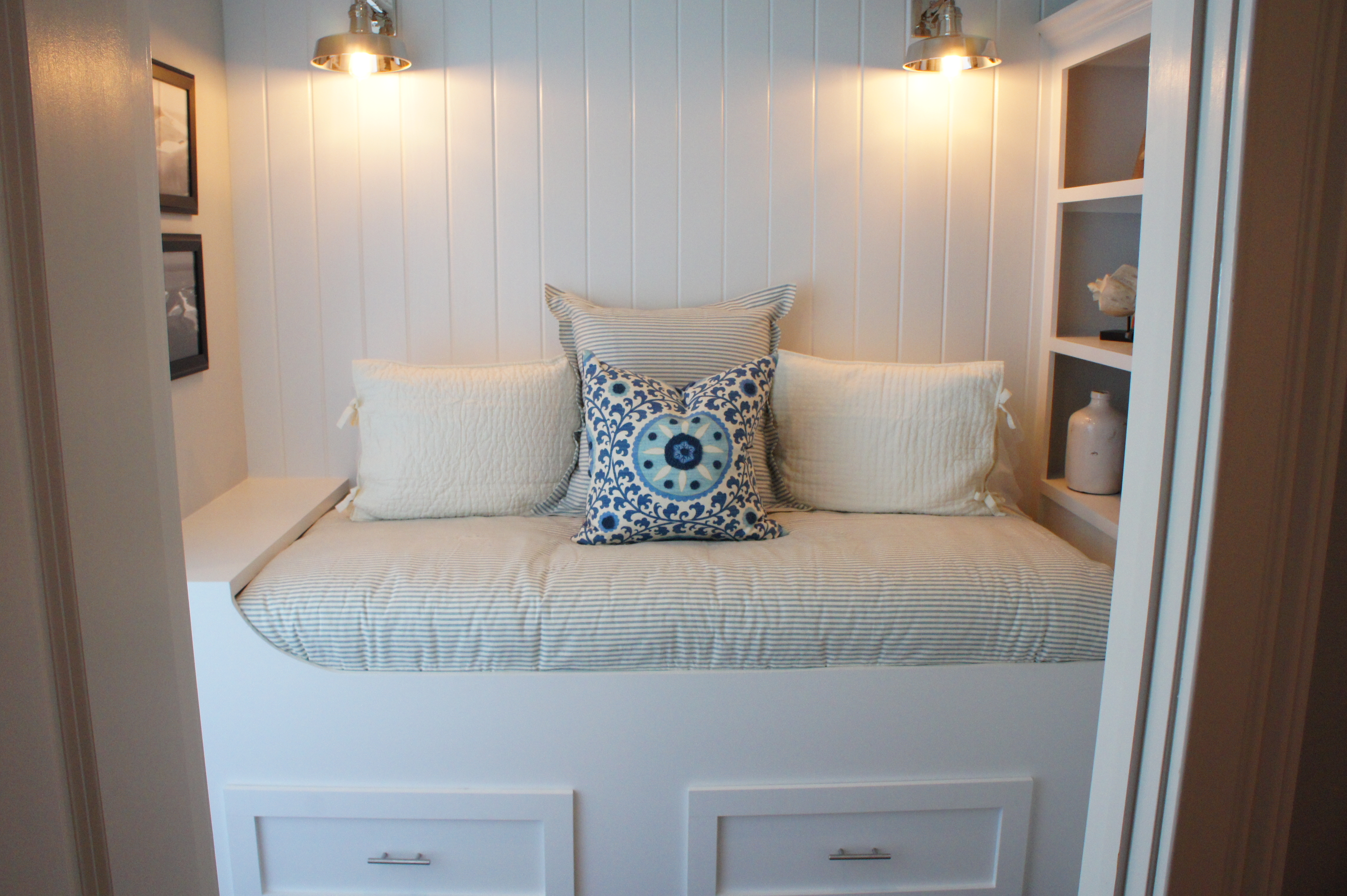
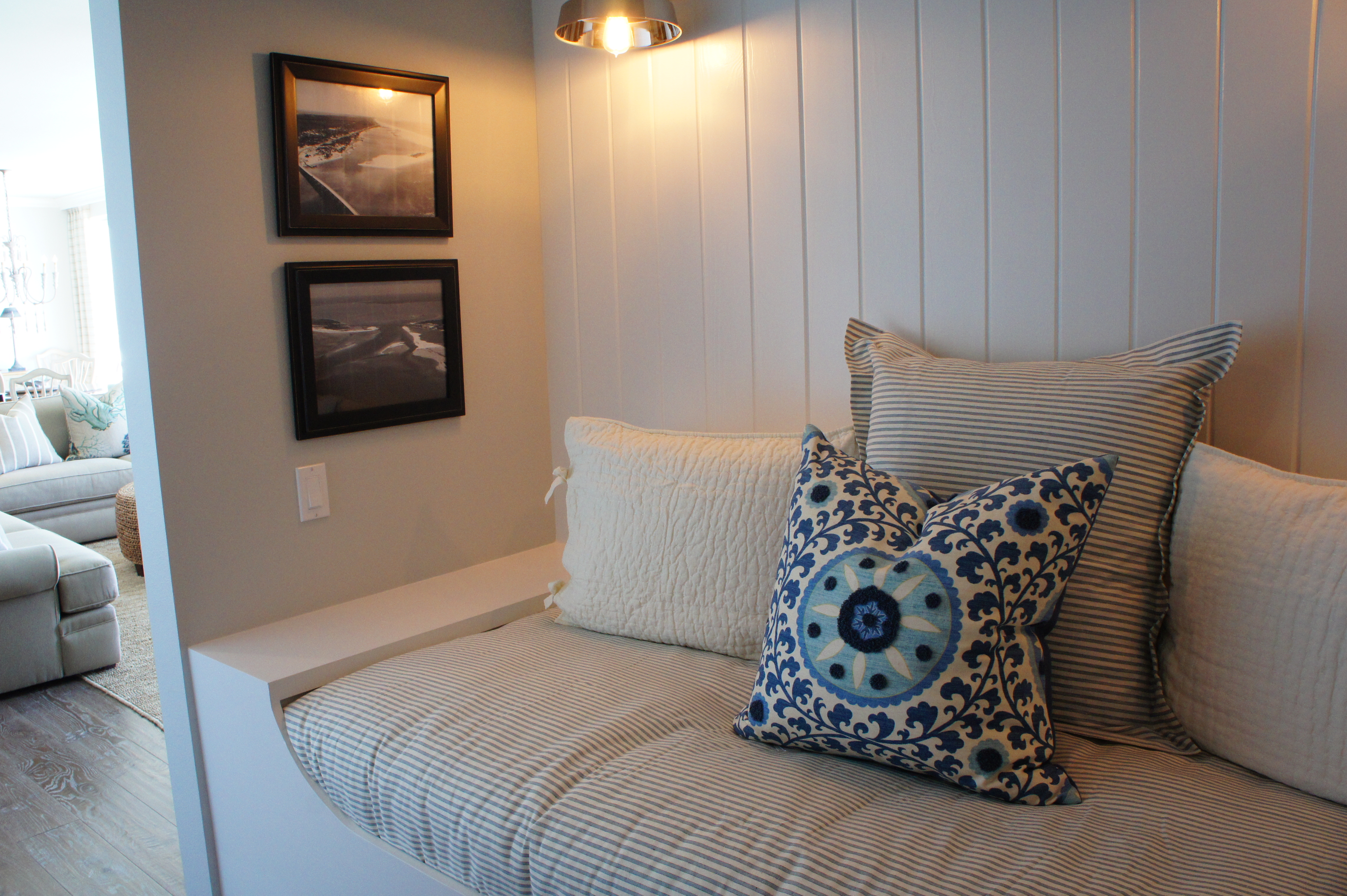
What used to be just a space-eating hallway, or entrance into a bedroom, we widened and converted into a built-in daybed, with storage drawers and shelving. In order to do this, we made the Master Closet slightly more narrow, and changed the entrance from a small door, to a framed opening. To add some coastal flavor and keep the area light, we applied v-grooved wood paneling to the walls, and painted all the paneling and woodwork white.
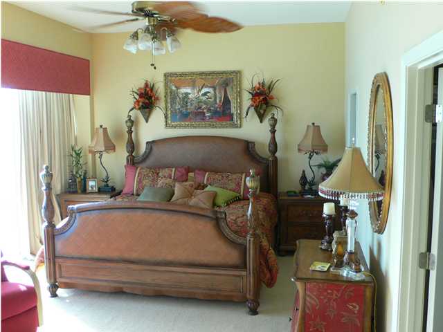
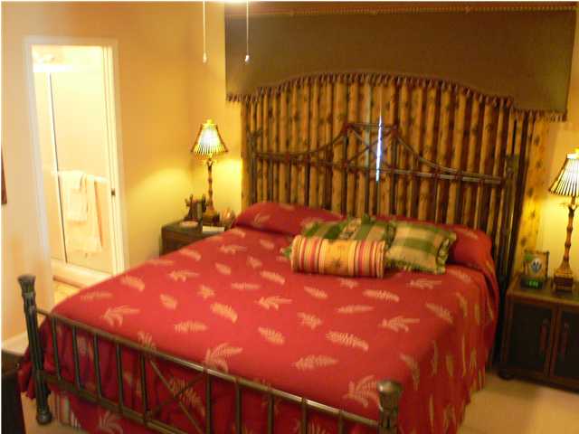
Master Bedroom Before
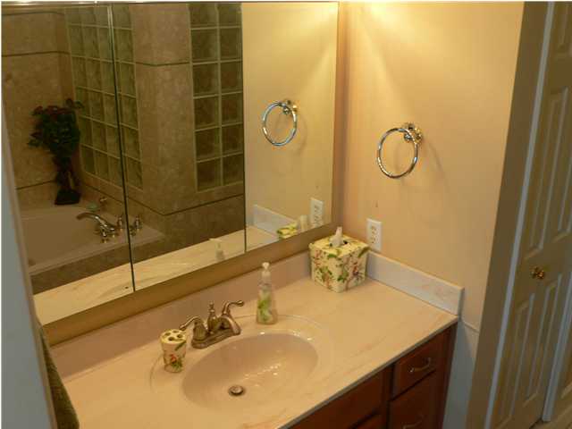
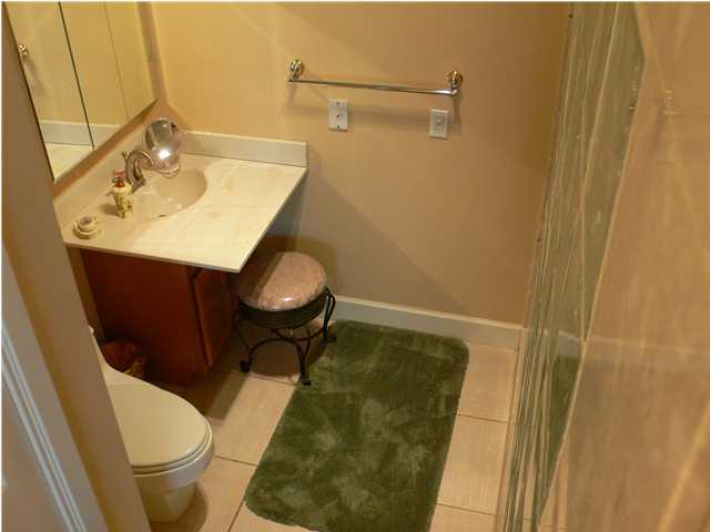
Master Vanity Before
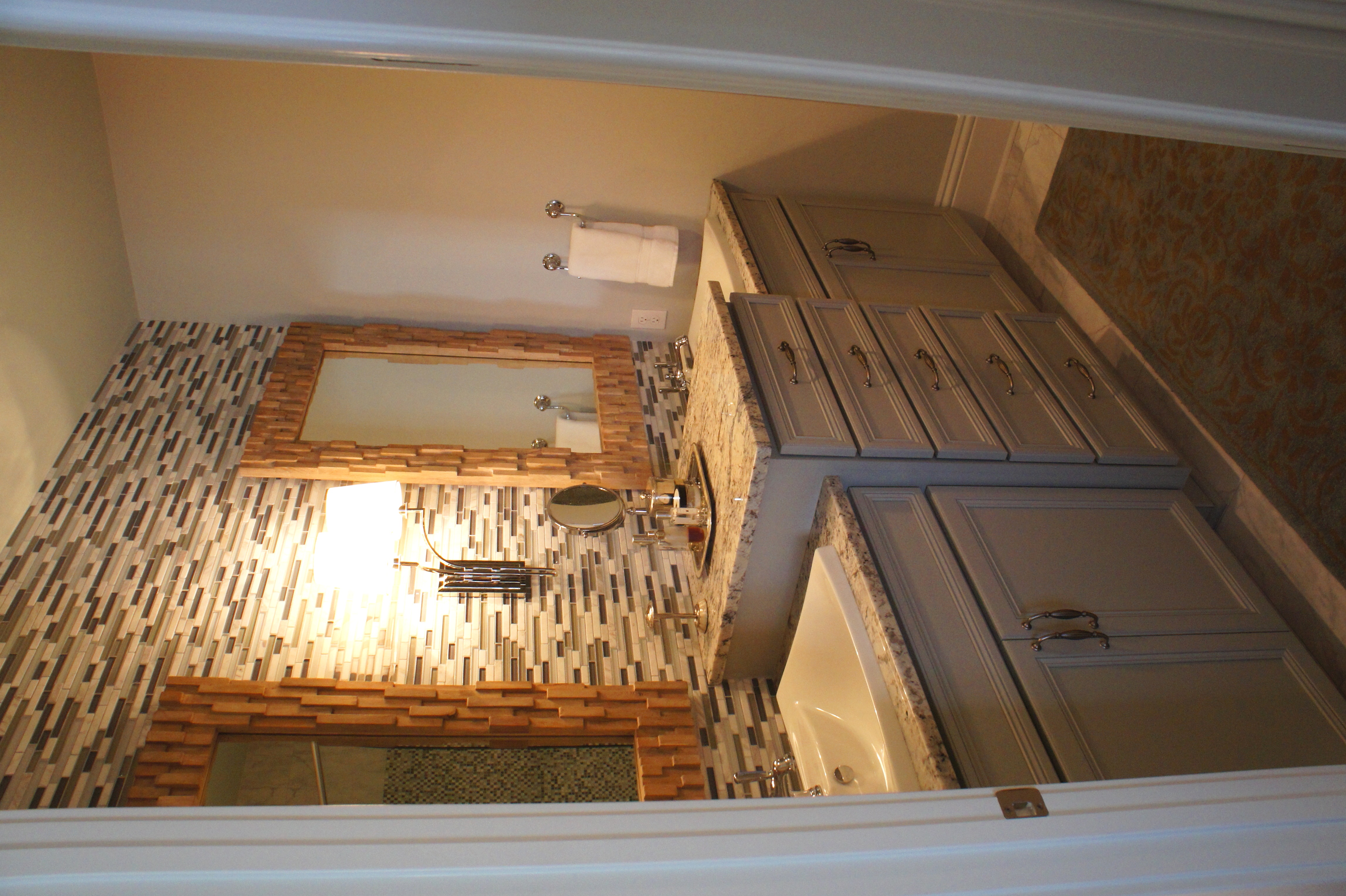
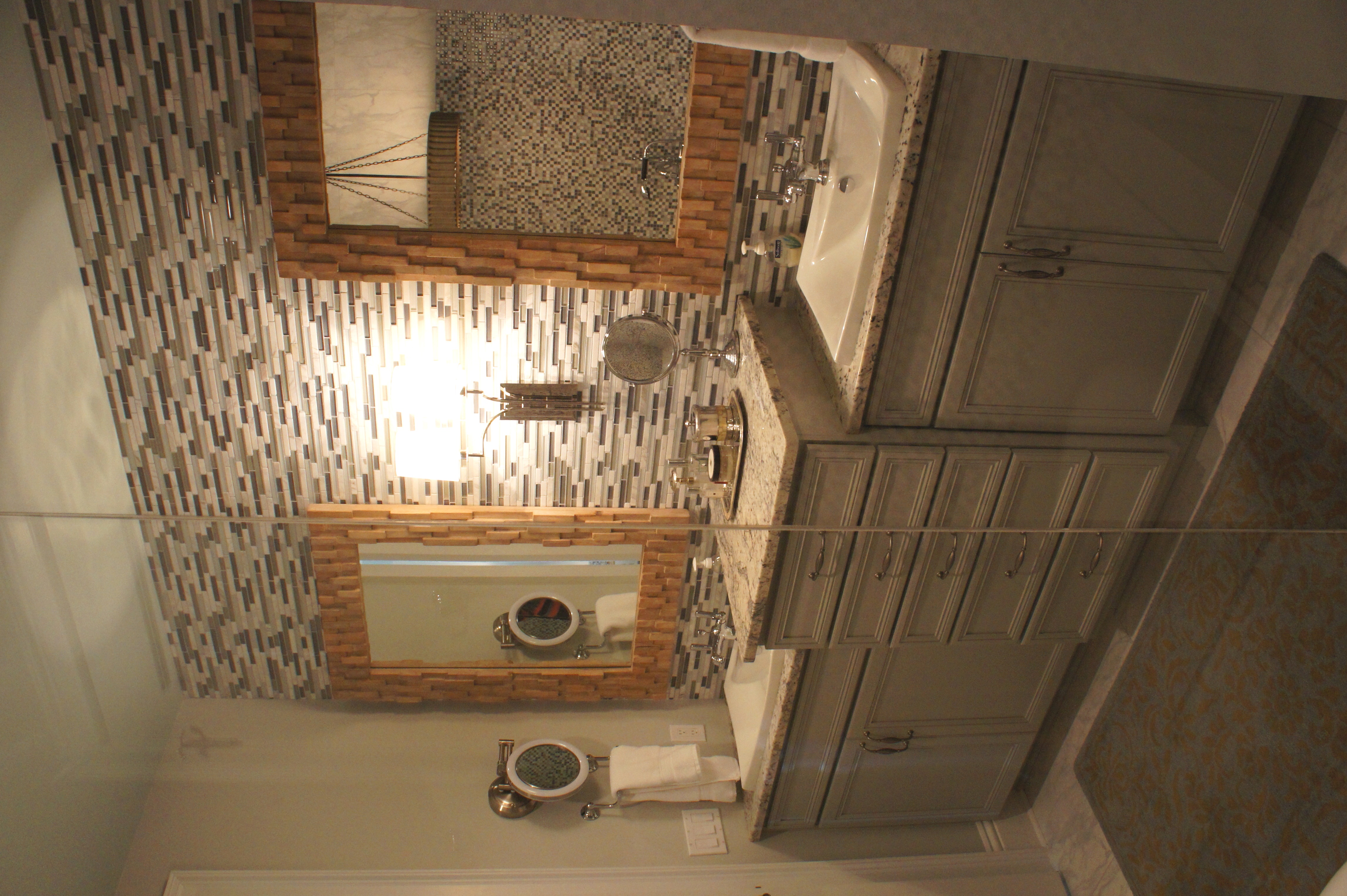
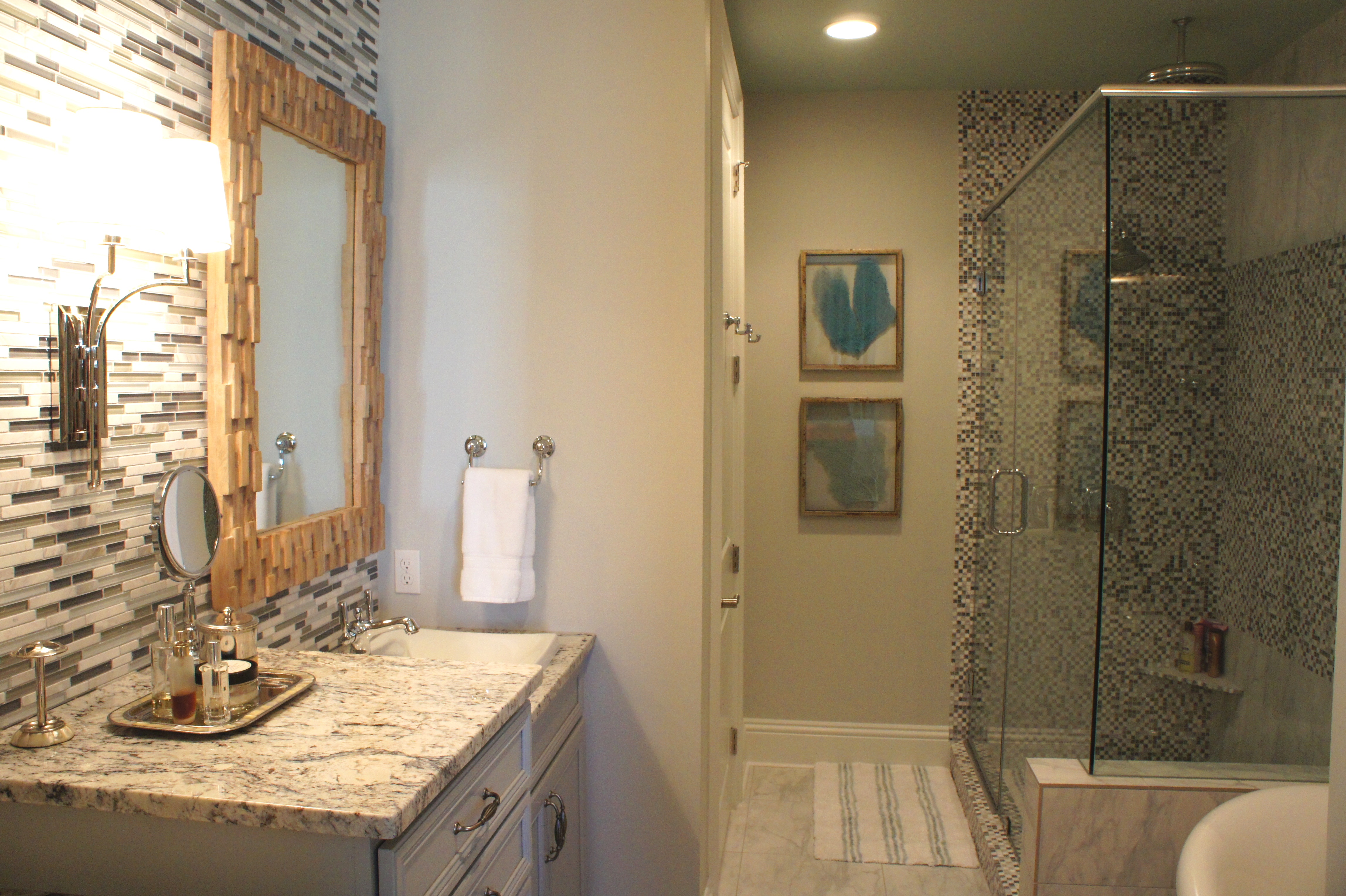
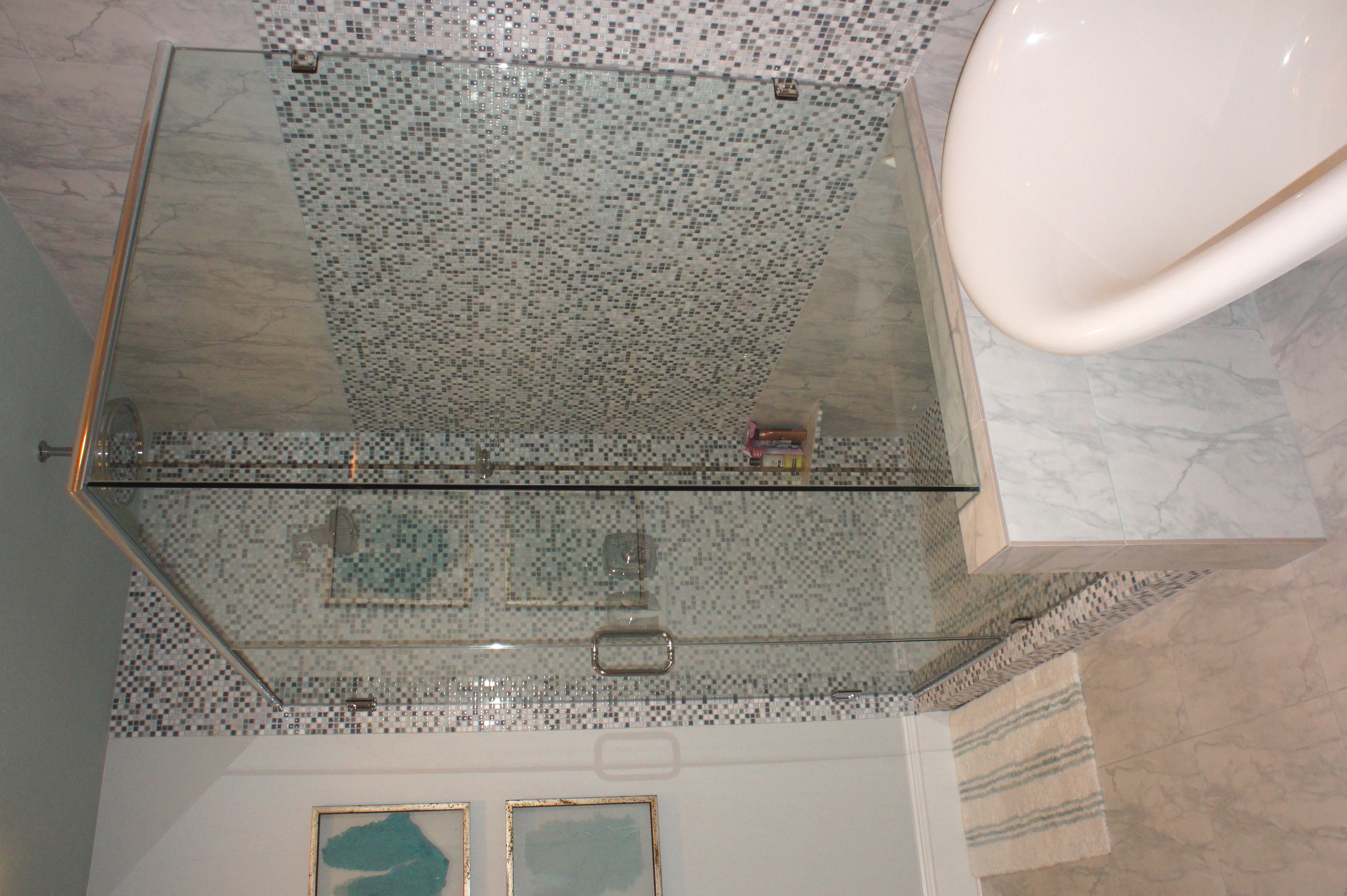
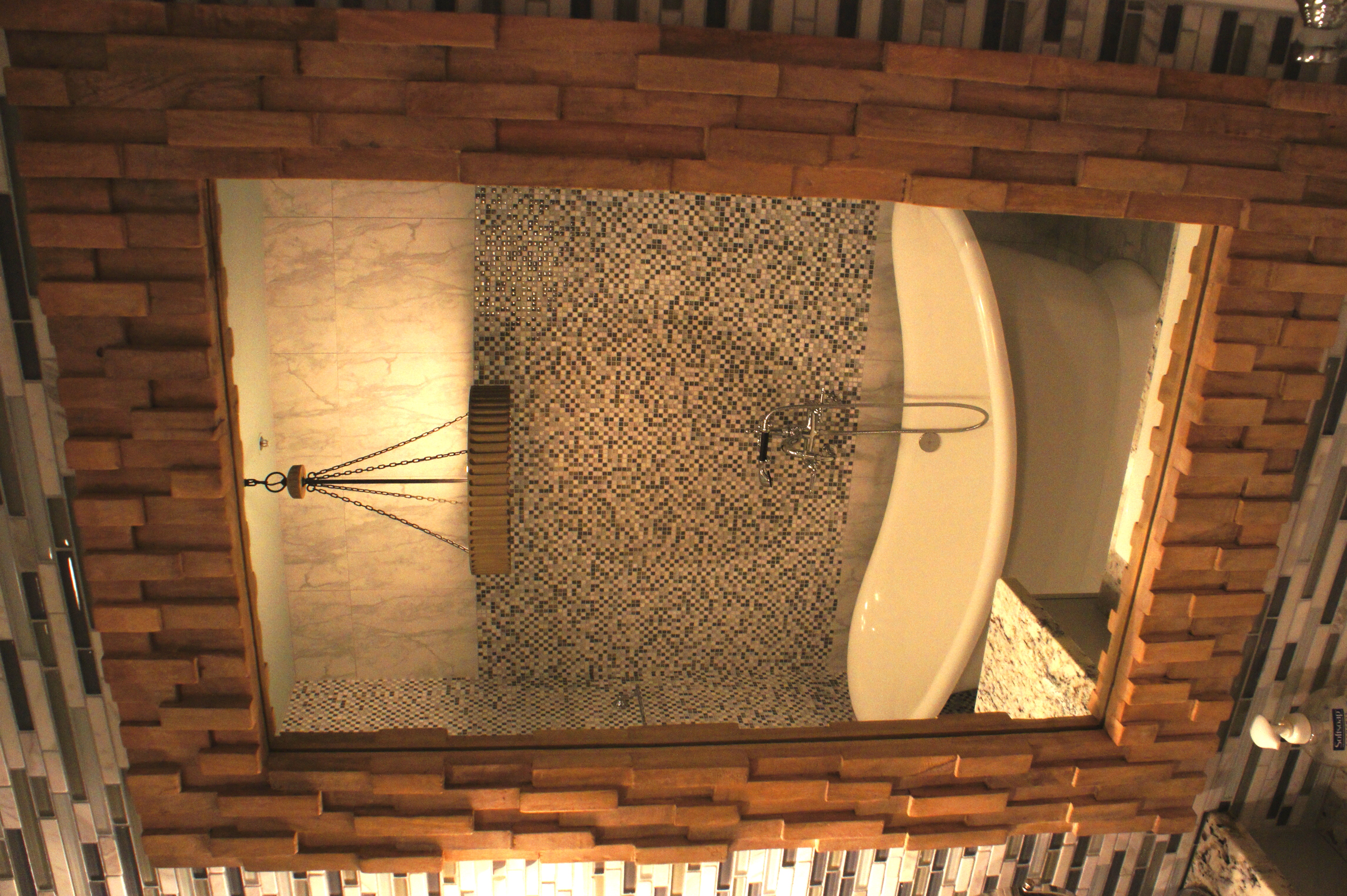
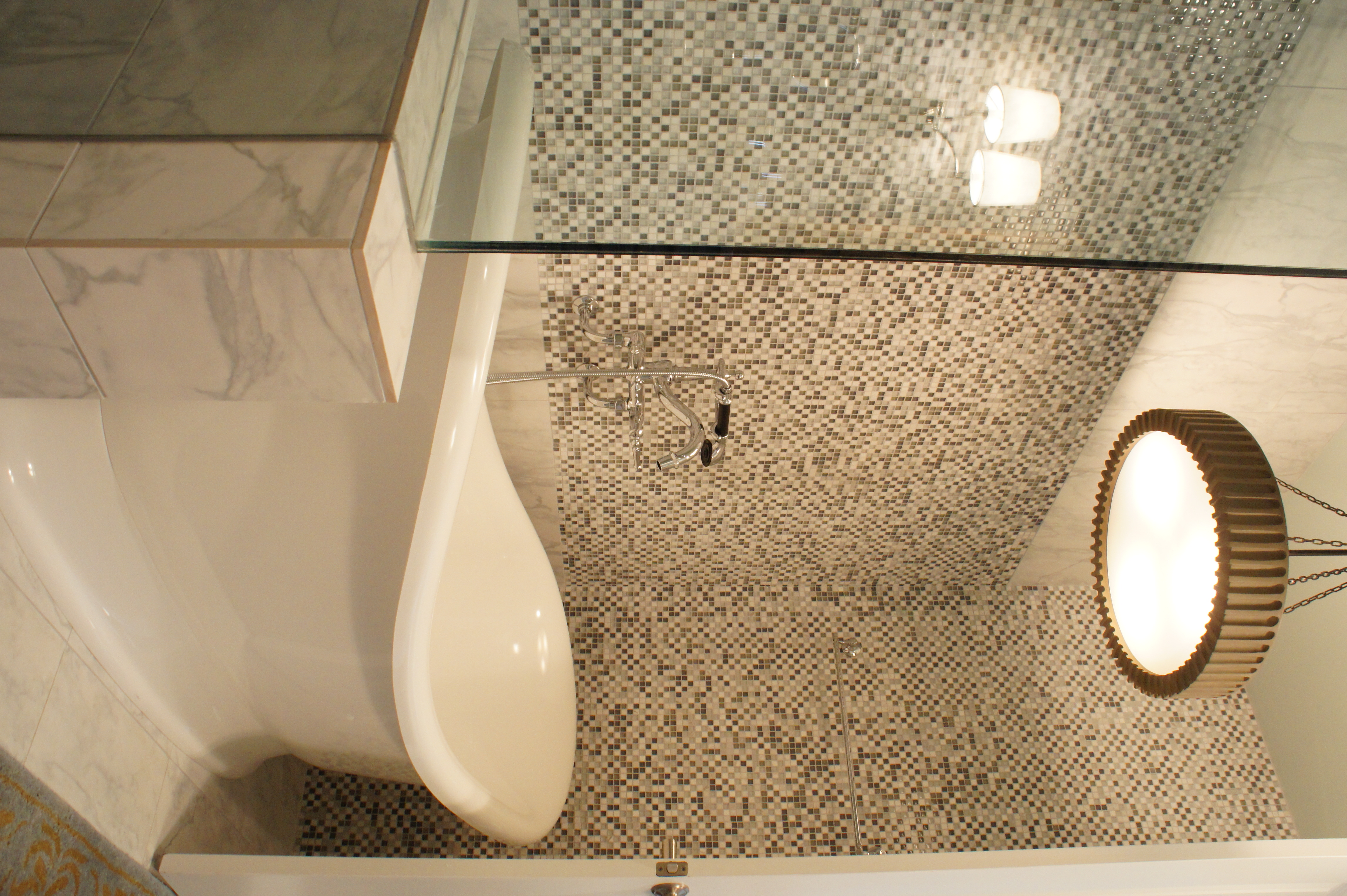
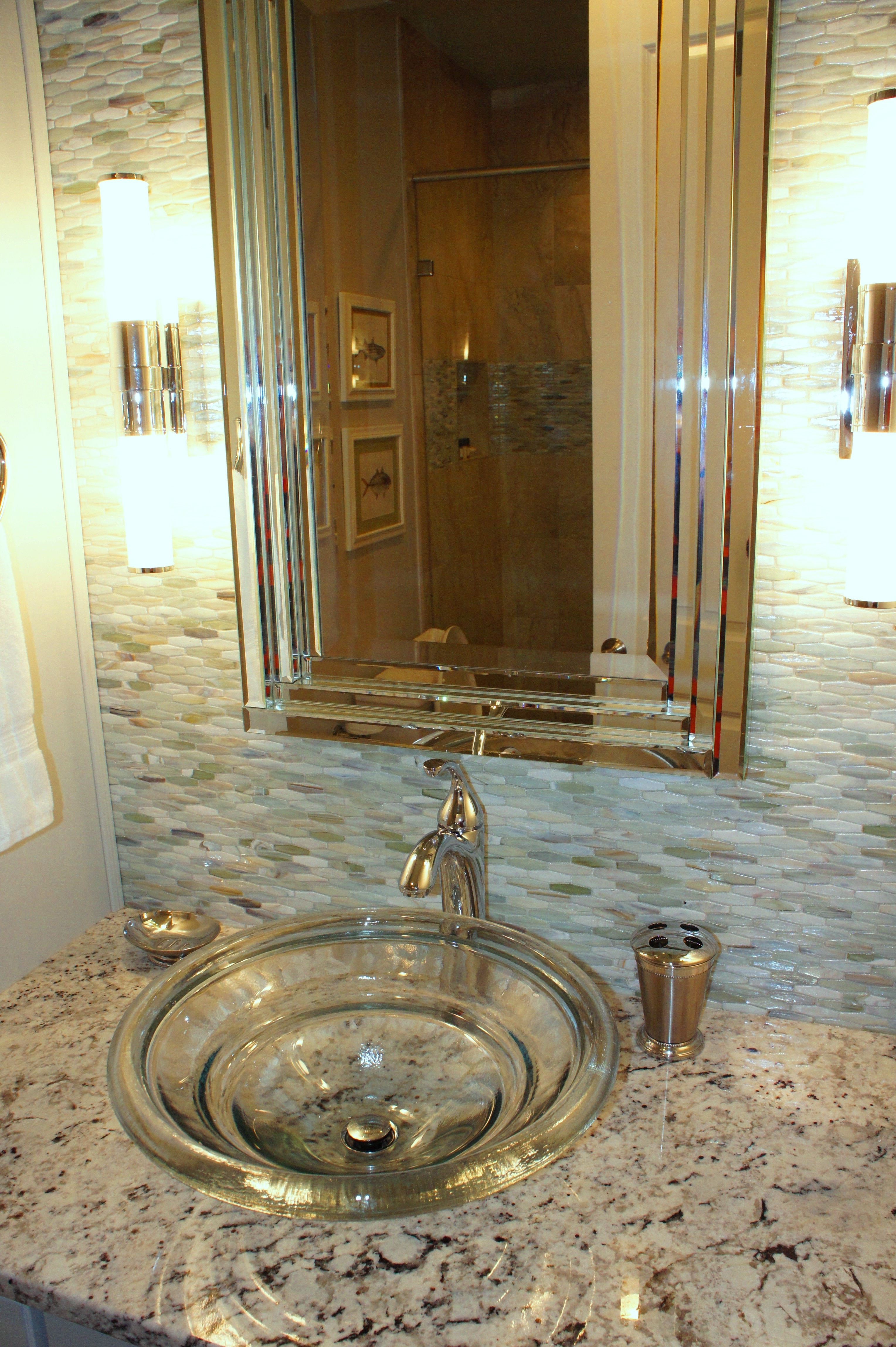
The Master Bathroom felt very small and claustrophobic. It had a small vanity, with an even smaller vanity in the far back corner, right next to the toilet. We demoed the entire bathroom and started over! We placed the toilet in the far back corner, and gave it privacy with walls and a door. This allowed us to do do a much larger double vanity towards the entrance. I chose some glass and marble tile for the backsplash, and a gray painted finish on the cabinets. The White Ice granite I used throughout the unit has such beautiful off-white, taupe and gray coloring, which goes with all the new paint colors and accents.
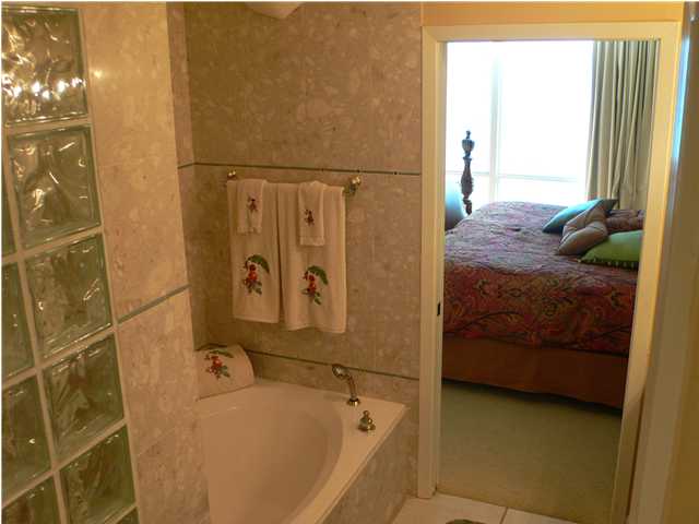
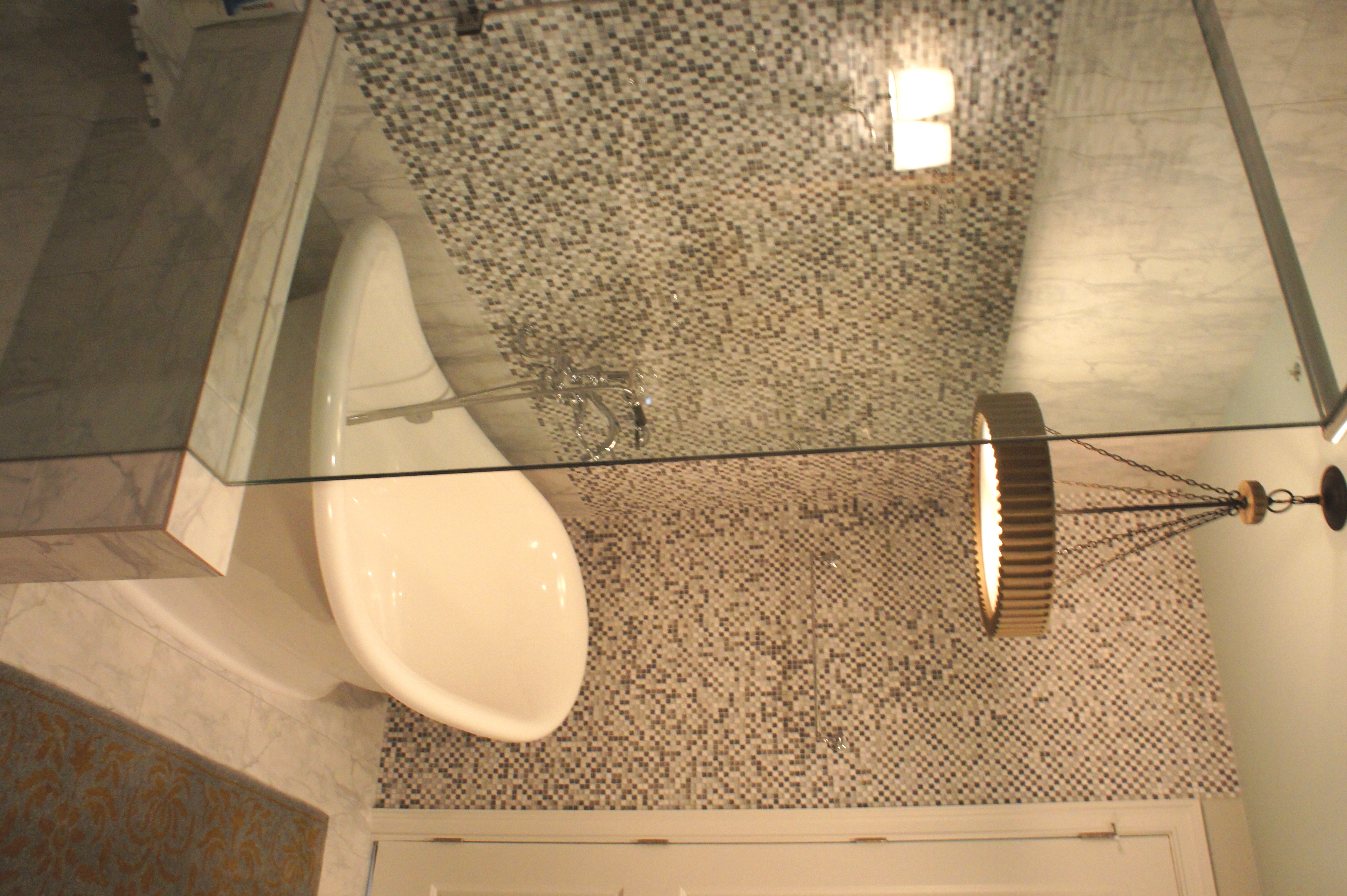
Master Bathroom Before
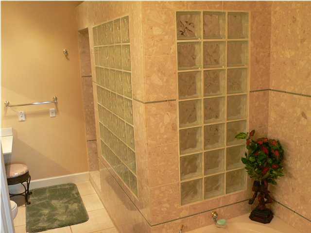
Master Shower Before
Gone is the retro glass block; in its place is clear glass shower walls and door. Instead of a blocky, built-in tub deck, we have a beautiful, shapely, open soaker tub.
Master Tub Before
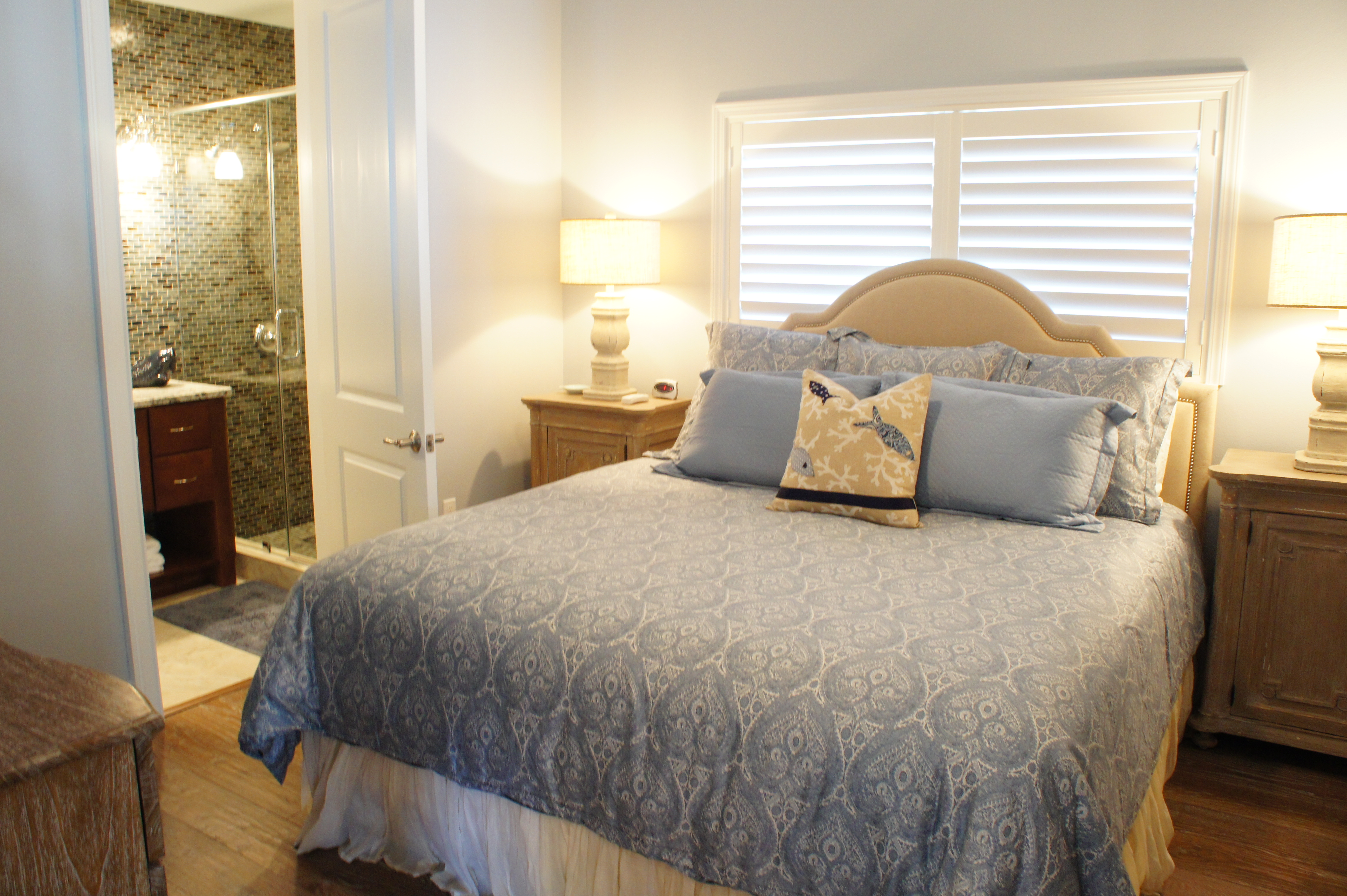
Second Master Before
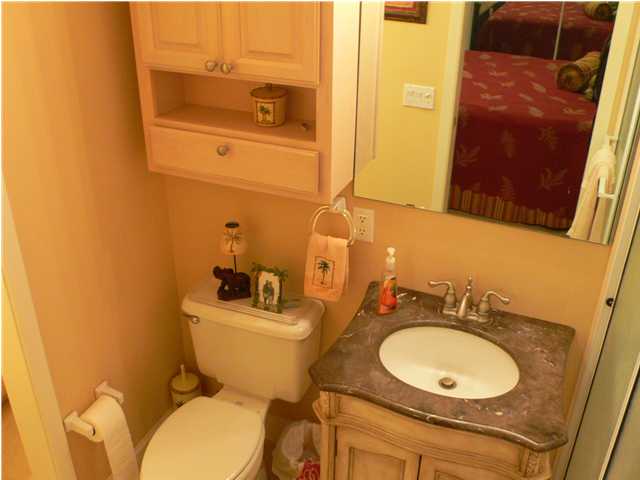
Second Master Bath Before
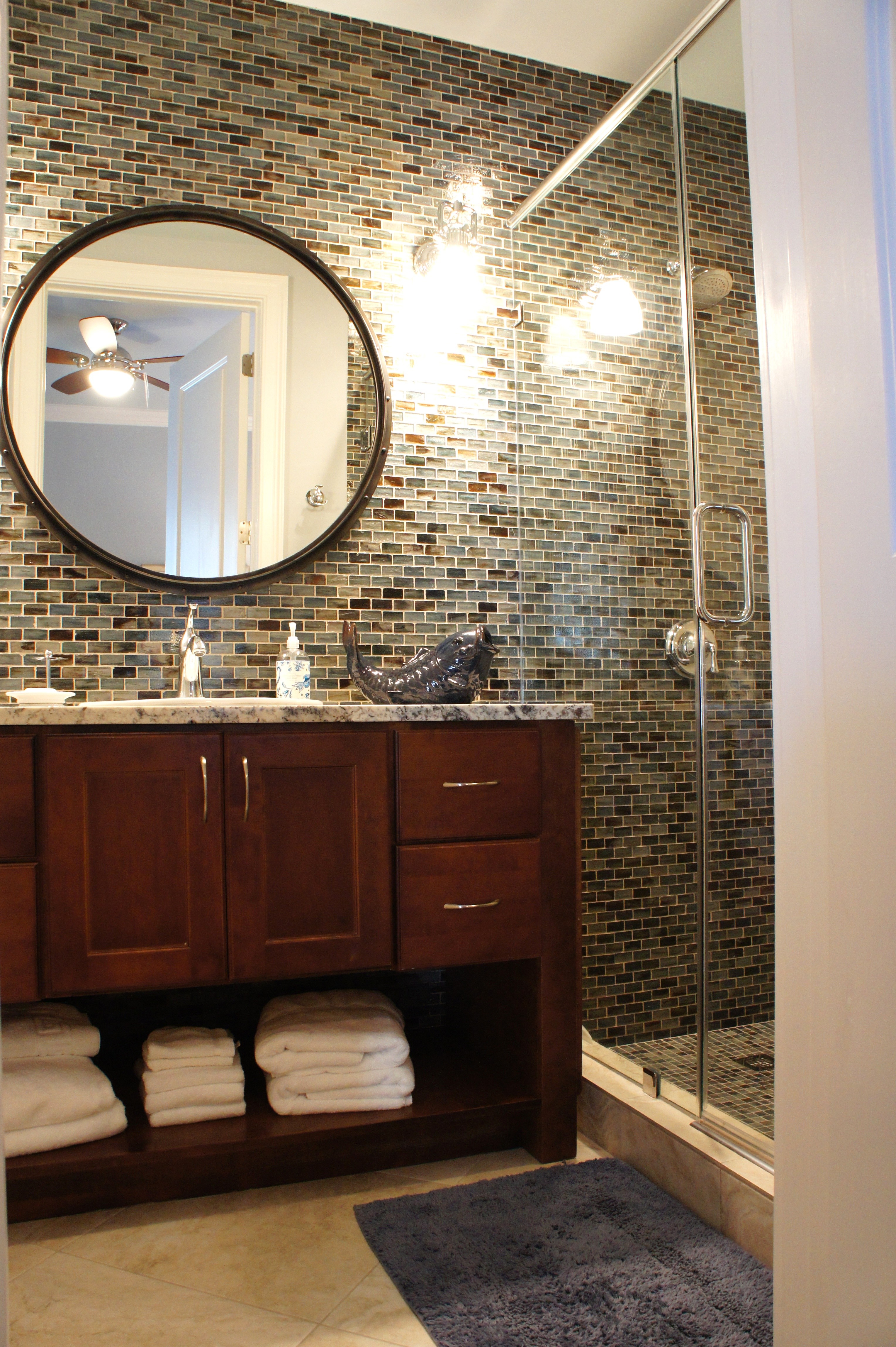
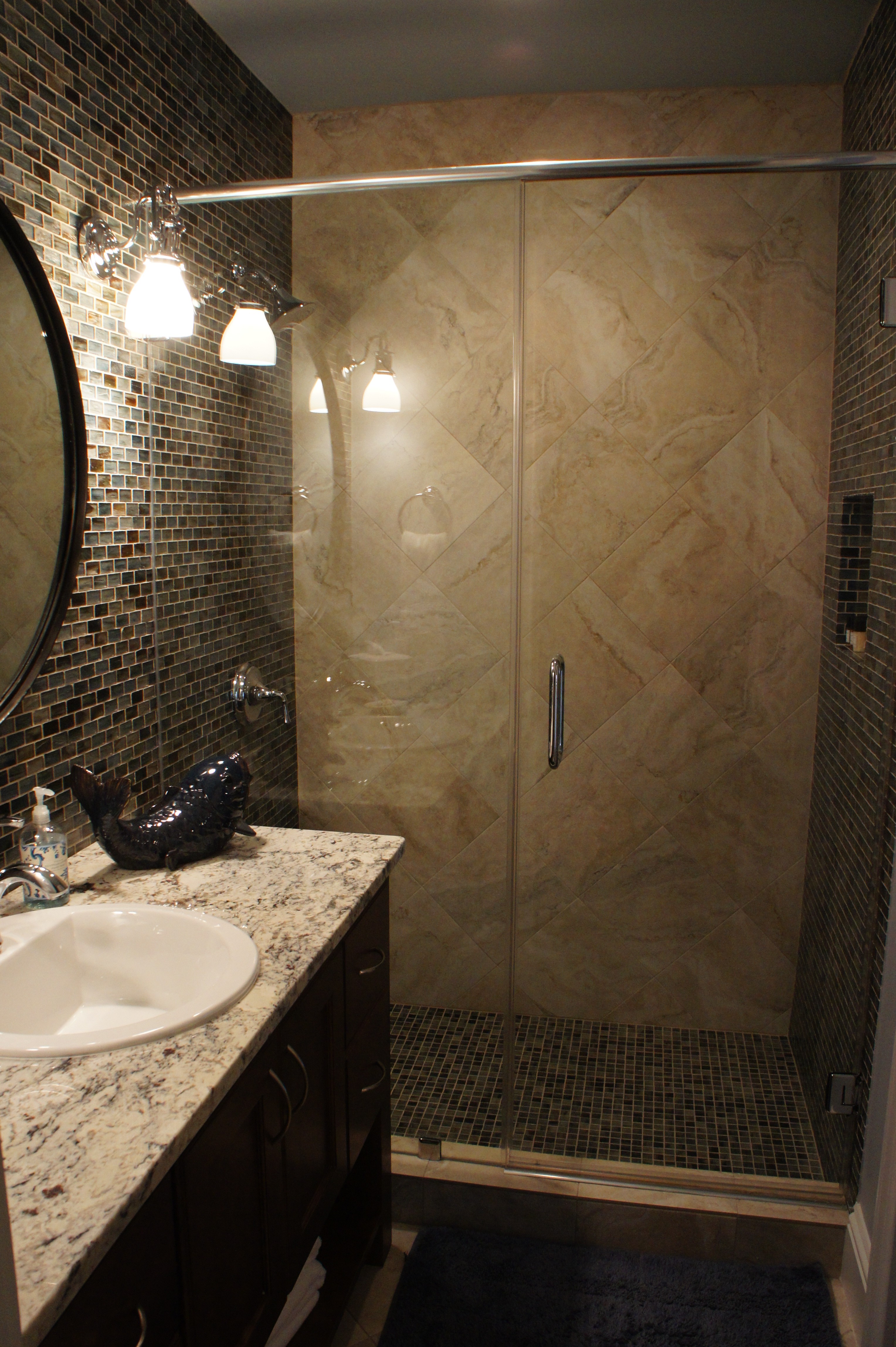
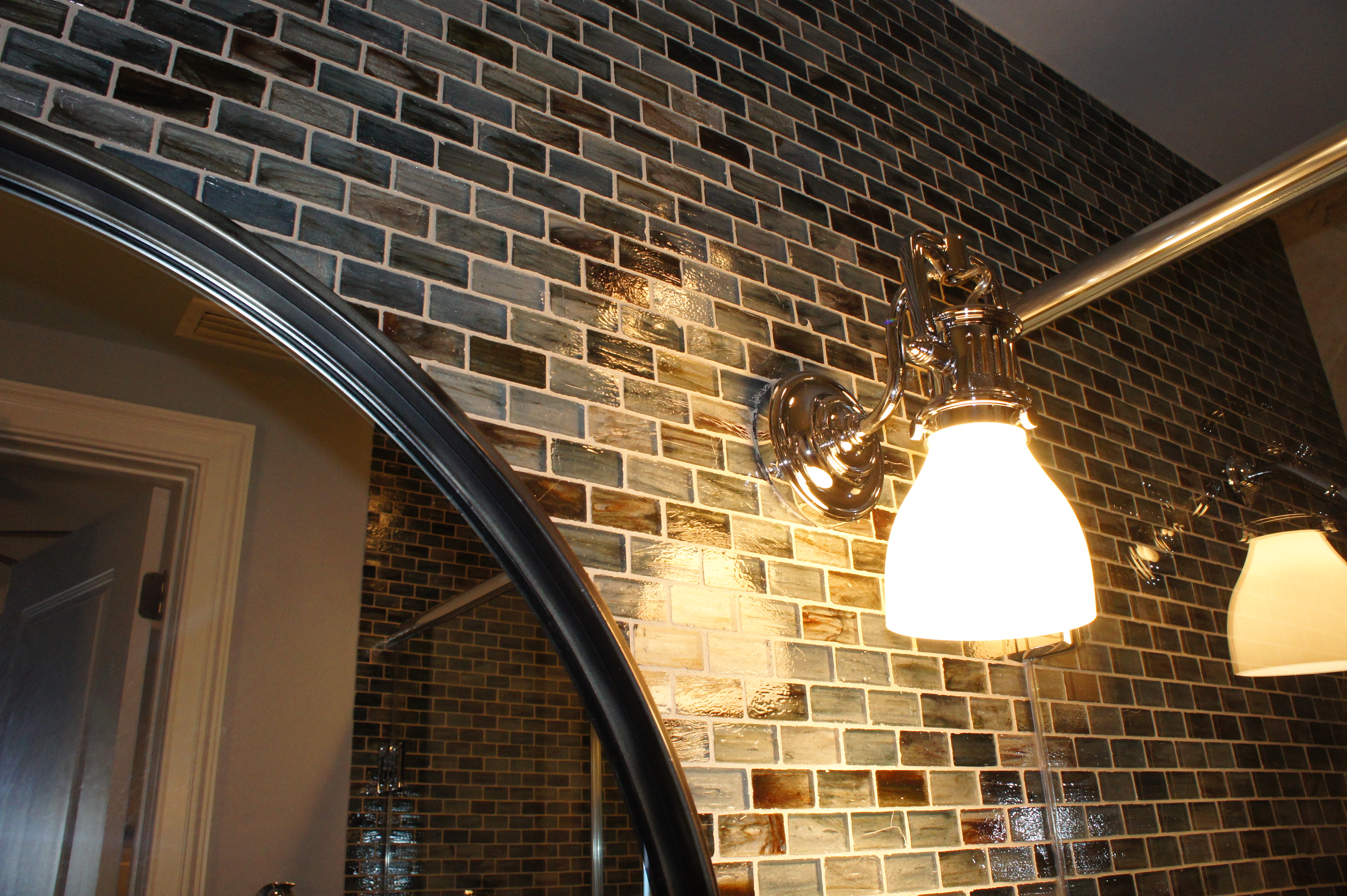
This Bathroom was very tight and closed-in. We placed the toilet to the far left and enclosed it in privacy. We built a larger vanity and enclosed the shower in glass. I chose a blue glass tile that coordinated with the adjoined room, and placed it on the entire vanity wall, on into the shower. This give the bathroom a more open and integrated feel. The rear shower wall is all a porcelain tile that matches the floor. This not only ties the floors in, but also lightens the room and helps the glass tile to stand out more.
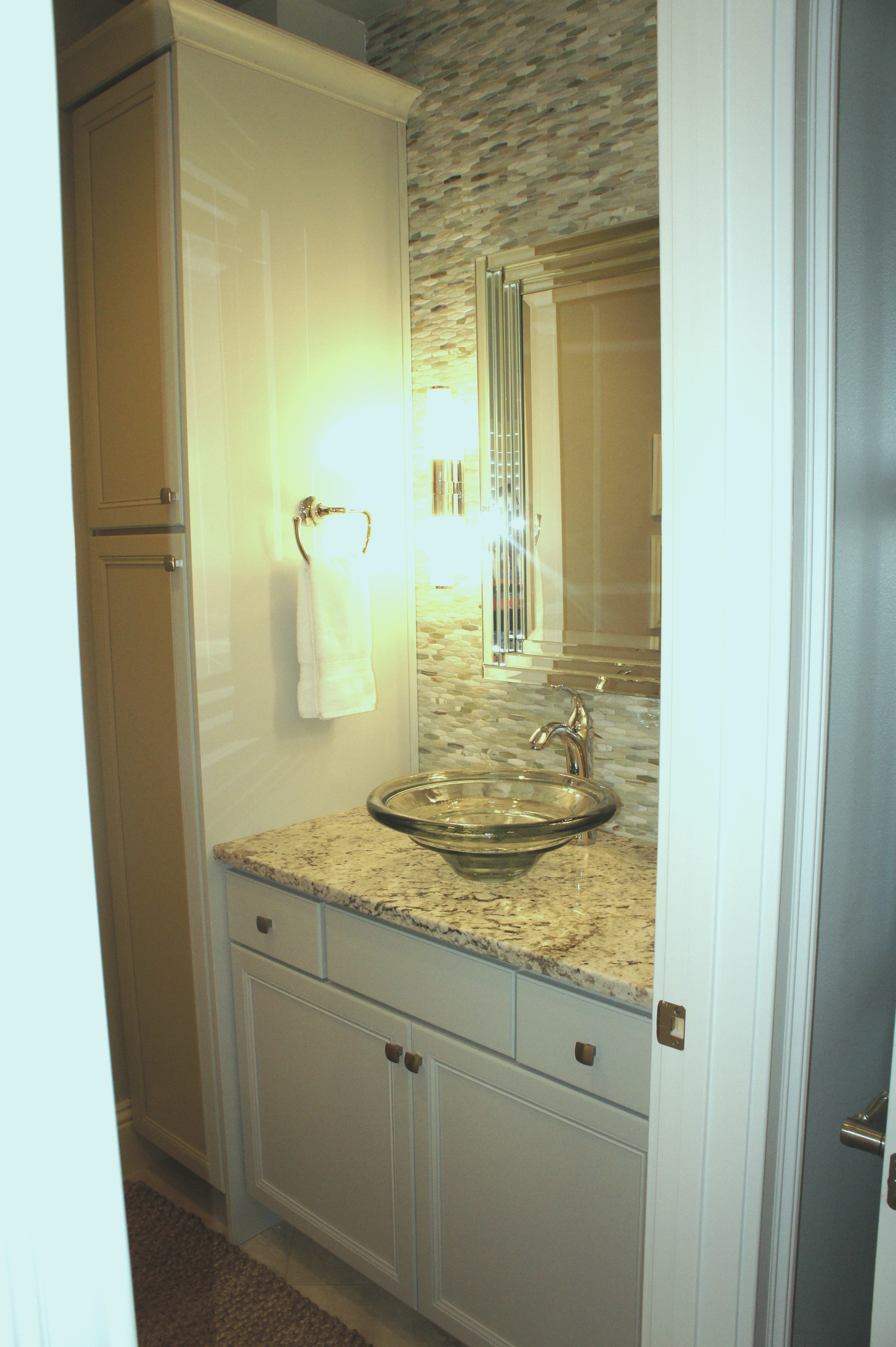
The guest bathroom was remodeled to house more linen storage, and a stand-up shower in lieu of a tub/shower combo. We also created more room by eliminating one of the entrances into the bathroom. The room was too small to have two entrances. We lightened the feel with the beautiful glass tile and painted cabinets.
Please contact me if you need design help!
cara@lovelaceinteriors.com

What a great transformation, as always! You are so creative – great job…very inspiring.
Linda
http://www.thecolorfulbee.com