“Light is the first of painters.”
~Ralph Waldo Emerson
The first step I had to take in painting these clients a new picture for this unit was obvious to me at first sight: Lighten things up! These clients wanted their beach getaway to be nothing like their permanent residence. They wanted it to be light, airy, open and spacious feeling–in essence, like the beach, of course. So, I came up with a design and a plan that would shed some light on the subject!
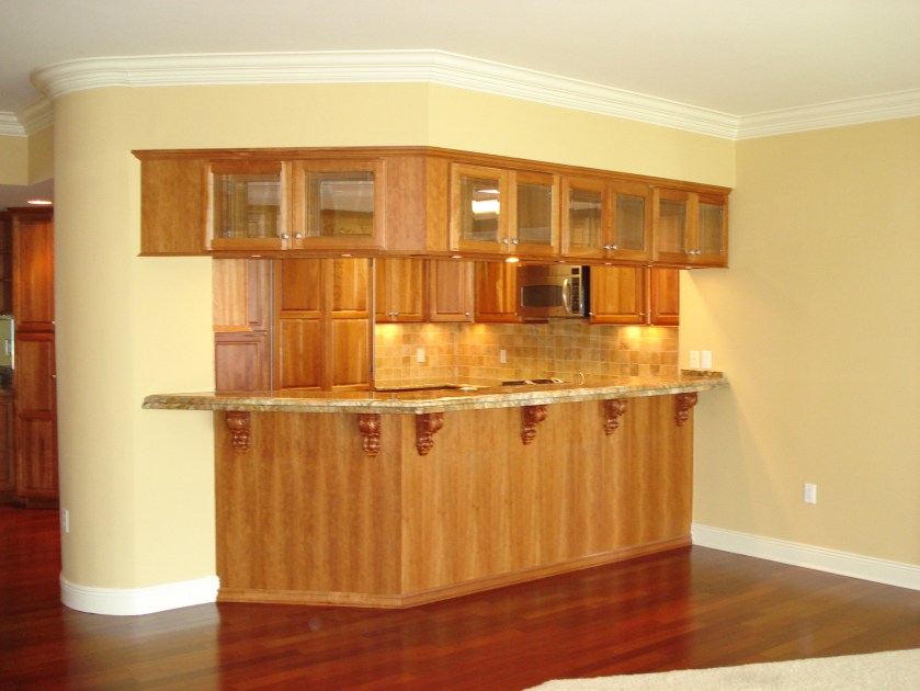
The first step I decided to take was to paint the walls, ceilings and much to the chagrin, I am sure, of the previous owners, I decided to paint over all the wood cabinets. Custom handmade medium-stained cabinetry and dark cherry floors both have their benefits, but when they are installed together, they create a dark, warm atmosphere. Besides, the fact that their finishes clashed was an assault to my design sensibilities. So, we said goodbye to the beautiful woodwork, and welcomed the much lighter overall effect of paint. After painting a base coat of off-white, we went over it with a dark brown glaze that was left in the cracks and “crannies” of the woodwork to make it appear antiqued.

BEFORE

Secondly, we had to get rid of the dated gold undertones of the walls, finishes and existing window treatments. We chose a French white for the walls that had a crisp, frothy cream undertone. We followed that with the same color linen in the window treatments of the main living areas, and accented them with a green like the water outside. By making the walls, cabinets and draperies all basically the same cream color, we reduced the contrast and made all the elements feel more integrated and open. My eyes were no longer being drawn to the large expanse of dark cabinets. Instead, my focus could rest on the view, and any colorful accents I decided to use in the design


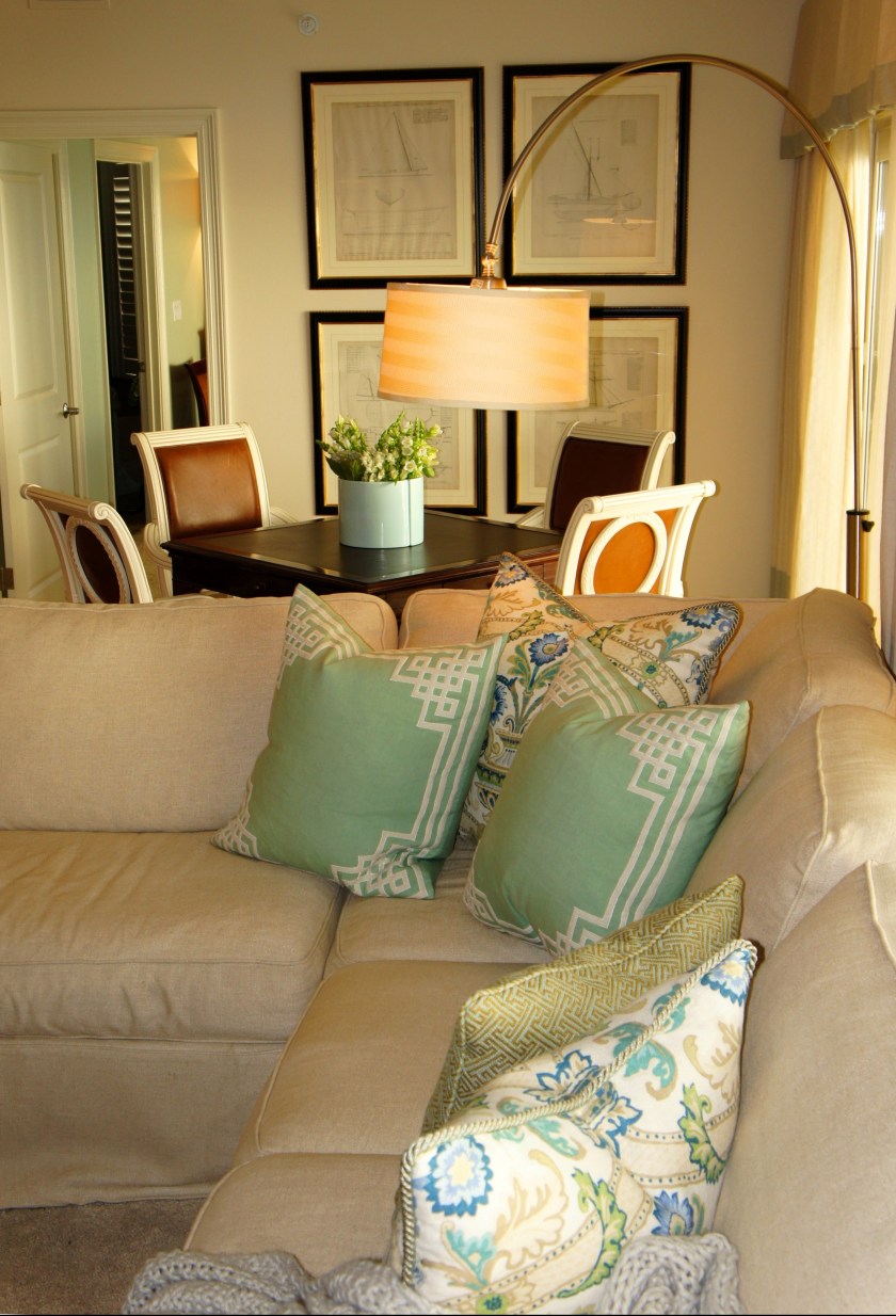
I separated this long living space into two different functioning areas. On this end of the room, I specified a game table that could be used as a breakfast table or for activities. The chairs we found in the Lovelace Interiors consignment gallery. The wood was a medium wood finish that blended into the leather color. I chose to have the wood painted and antiqued so that the warm leather would stand out more and not appear too dark or dull. The warm leather on these chairs and certain occasional items pull out the wood tone of the floors. The large prints on the wall behind the table and chairs are four antique prints of shipbuilding plans.
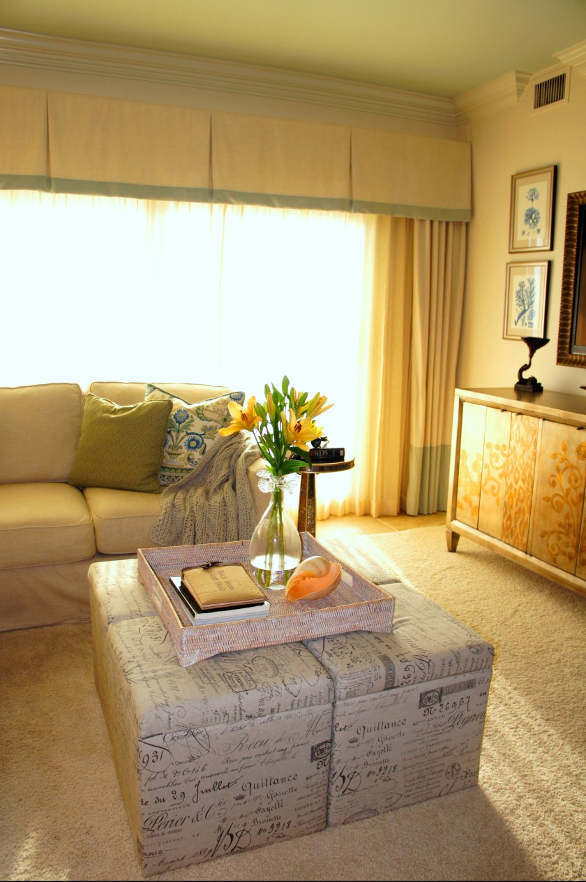
Storage cubes make great occasional tables in Living Rooms. You can stow away toys, magazines, blankets, games and anything else you don’t want cluttering up your area. You can sit on them, use them as foot stools, and when used together as a cluster, you can turn them into a cocktail table with a large tray. These script cubes are by Hooker Furniture. The other reason we wanted to use upholstered cubes rather than a large heavy cocktail table, is because this sectional has a built-in pull-out bed. Company will not need to injure themselves trying to move furniture around in order to sleep. This slipcovered sleeper sectional is by Lee Industries.
BEFORE

In the above before and after, it is apparent how much more easily the eye can move around the room after we painted the cabinets. The blue corals we displayed in the upper glass cabinets were able to shine afterwards, as well.

We decided to frame the television like a piece of art so that it would blend more easily into its environment. This crowd-pleasing trick allows most wives to be more accepting of their husband’s “bigger is better” mentality when choosing a t.v. The t.v. becomes a piece of art, in a sense, and looks less like a large electronic device on your wall.
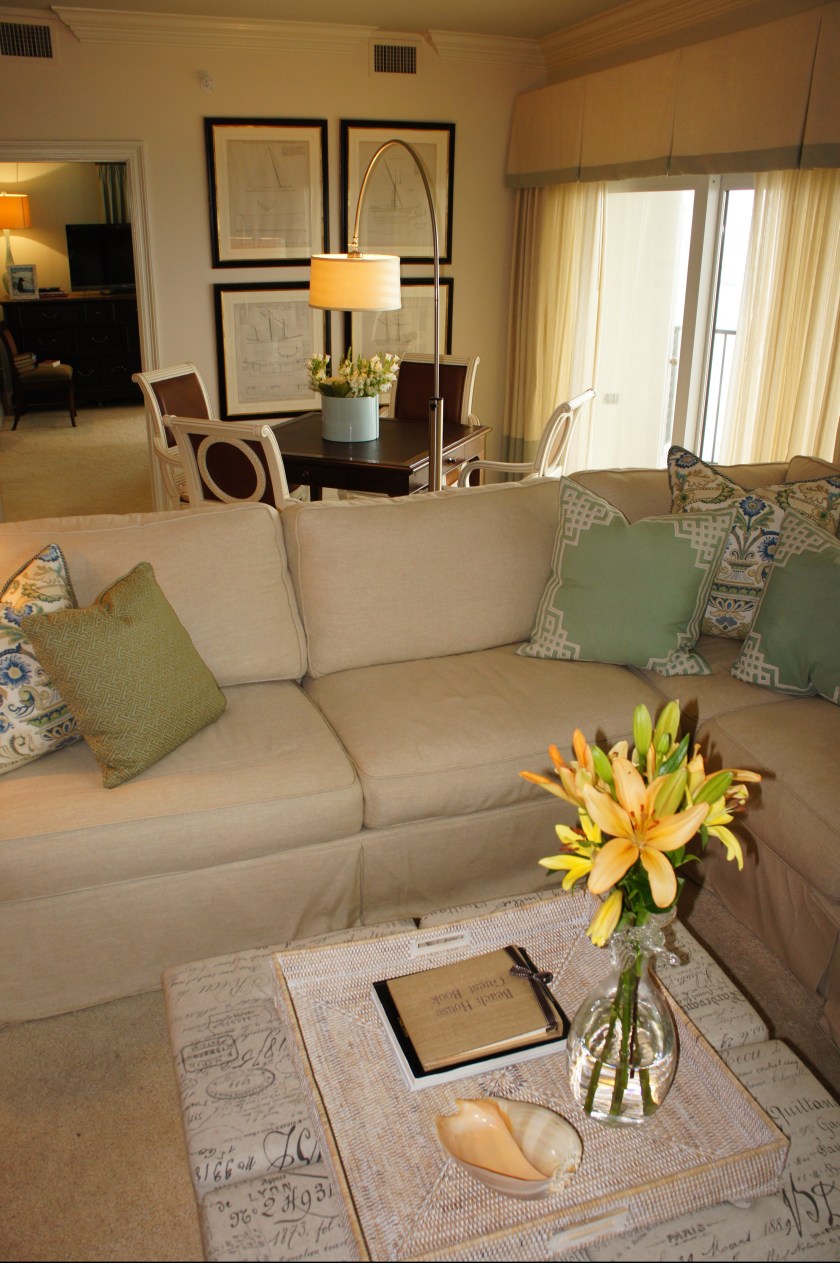
In the above two photos you will see the dual functions of the floor lamp I used. It can be swiveled to act as an overhead light for gamers, or as a reading task light for sofa loungers.


BEFORE

BEFORE

The second living area provided a nice space to lounge, socialize, read a book or sleep. I anchored the seating group with a round area rug that pulled more color in and made the space more inviting.

BEFORE

BEFORE

The Currey and Company “Seaward” wall sconces I used give the room some warm ambient lighting, but also act as sculptures, bringing some coastal whimsy to the walls.


BEFORE
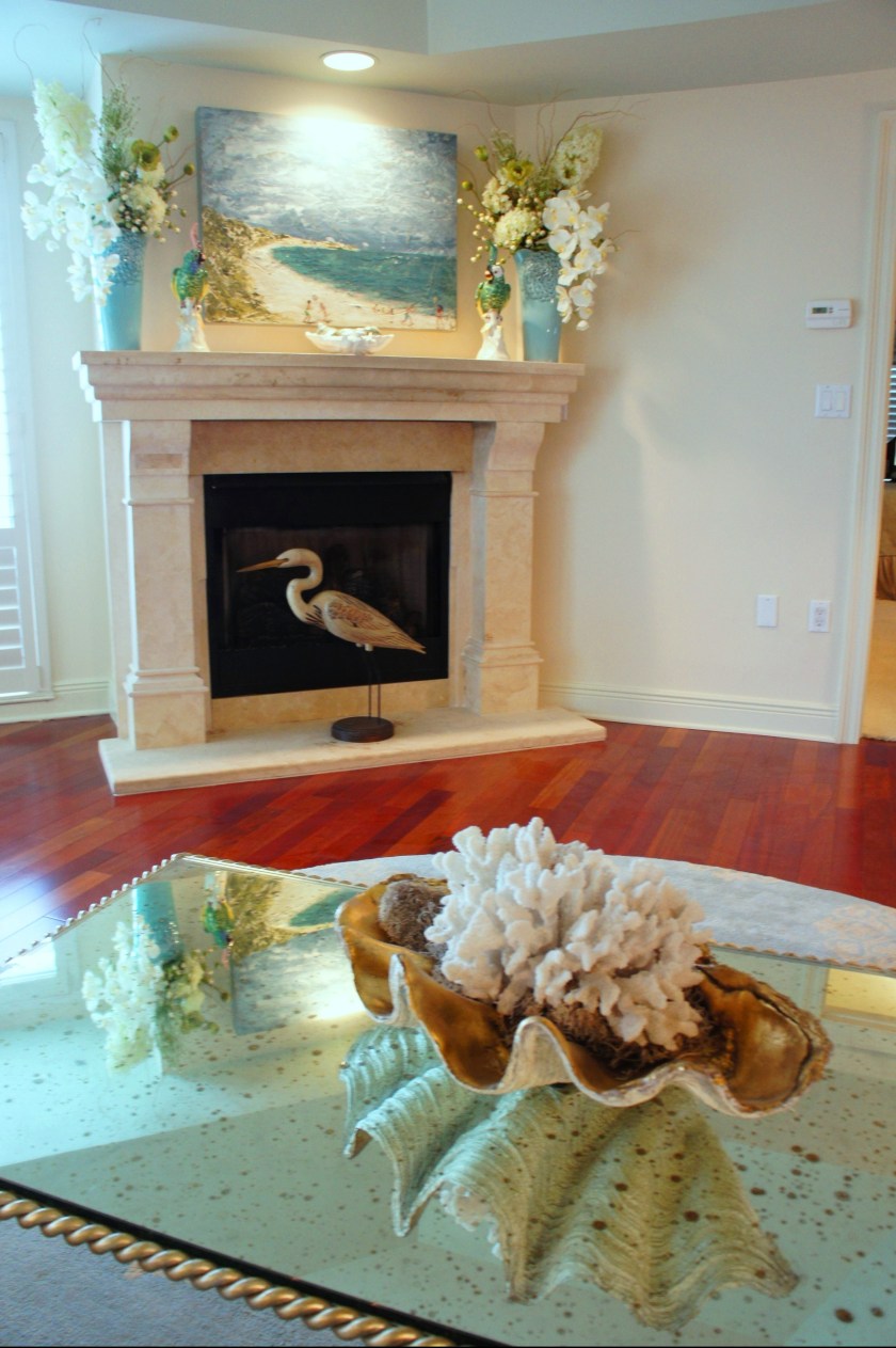
The cast stone fireplace needed little more than a great piece of art and some accessorizing. This is a commissioned piece of art by local artist Allison Wickey. The art over the sofa/chaise is also one of her pieces. I love how they pulled all of our color accents together with an impactful punch.


BEFORE

In the powder bath, I lightened the cabinets and eliminated the tired light fixture. I replaced it with a gorgeous abalone shell mirror by Currey & Company and two sconces by Corbett Lighting.

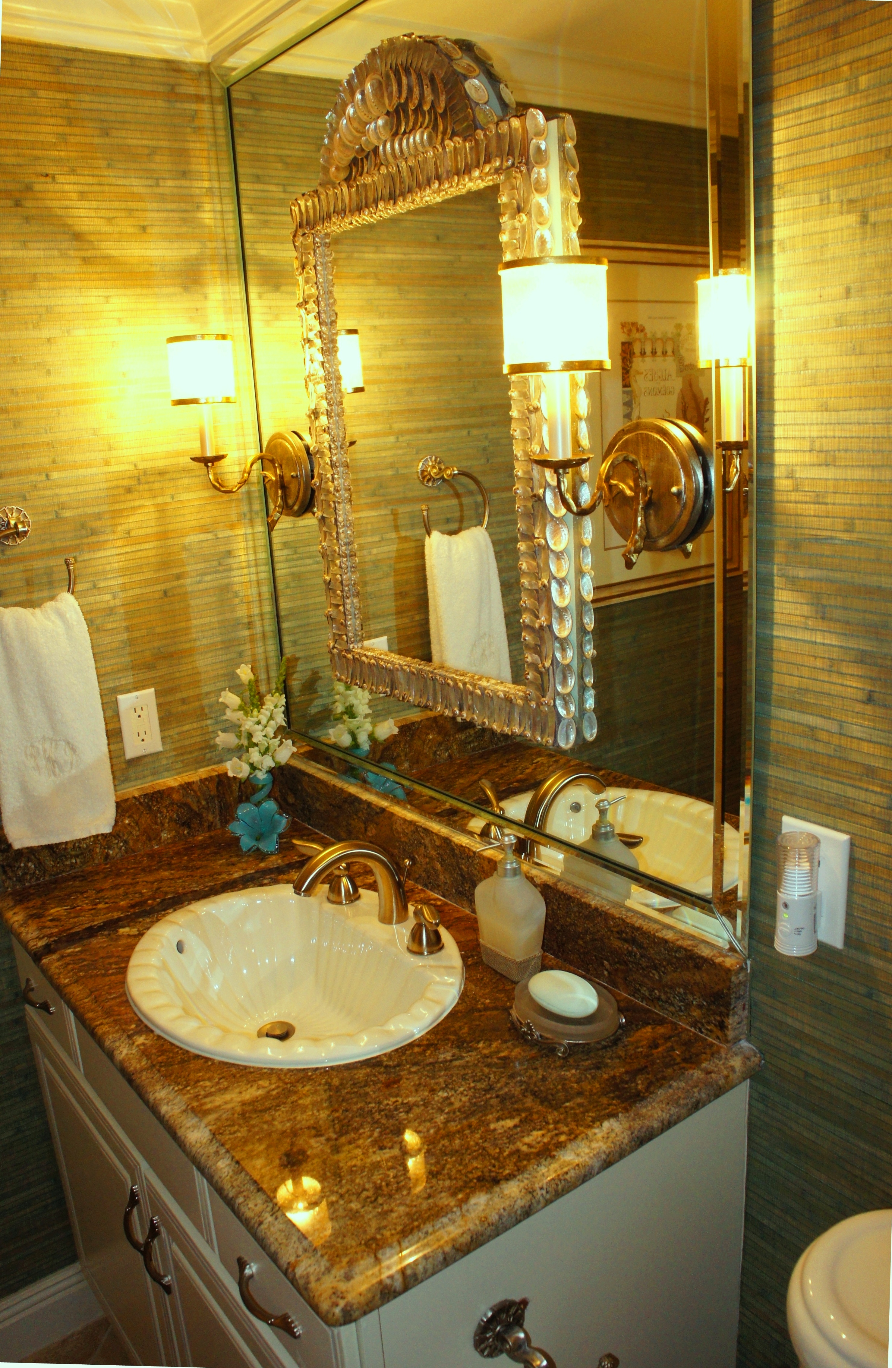
I covered the walls in a bamboo and grasscloth wallpaper for color and texture. To the right of the vanity, I hung two shell encrusted wall brackets with displayed corals. They were strategically placed to help mask the unavoidable seam in the wallcovering.


BEFORE


This is the Master Bedroom. You can see what an amazing view this unit has. I wanted to frame that view with a more uniform window treatment. Instead of doing drapes and one random roman shade, I designed a drapery system that included all three walls.

To help add light, I placed reading lights in the soffit above the bed. I also had some ambient sconces installed that can be controlled from each side of the bed. The large scale coral fabric I used is a Design Legacy fabric. It provided a wonderful array of blues and greens to build from. The chair and ottoman is another great consignment find that we recovered in the perfect stripe! It had all the right colors.

BEFORE
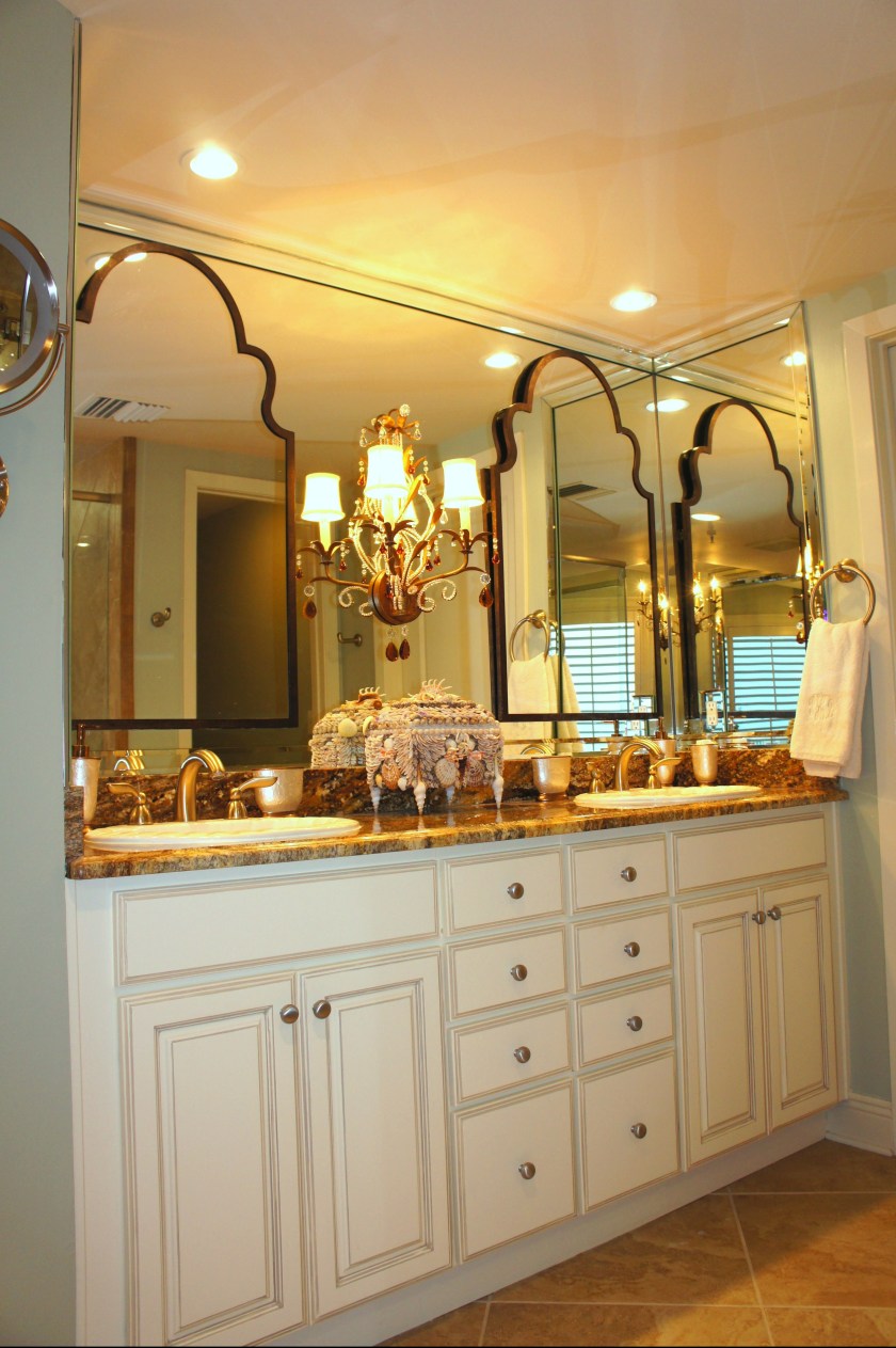
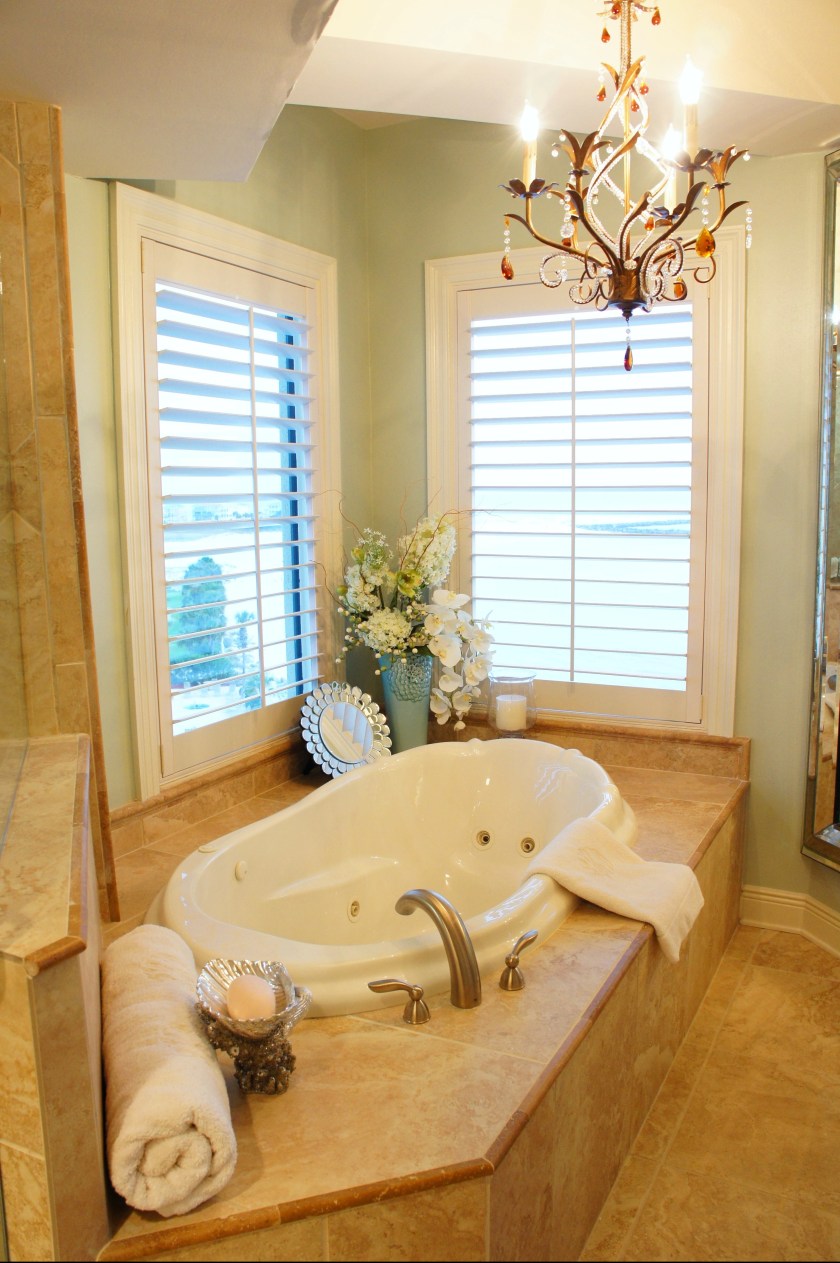
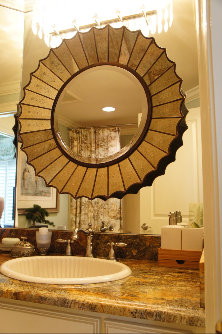
The Master Bathroom was less than impressive , with its globular lights and cabinets that blended into the granite. We painted the cabinets to lighten the room up a bit. This helped to show off the beautiful granite. I removed the globular lights, but decided to keep the wall-to-wall mirrors. I, instead, dressed the wall by placing a mirror above each sink and installing a two-light sconce in the center. The amber glass beads pulled out the colors in the granite and complemented the green color I painted the walls.


BEFORE

BEFORE

BEFORE

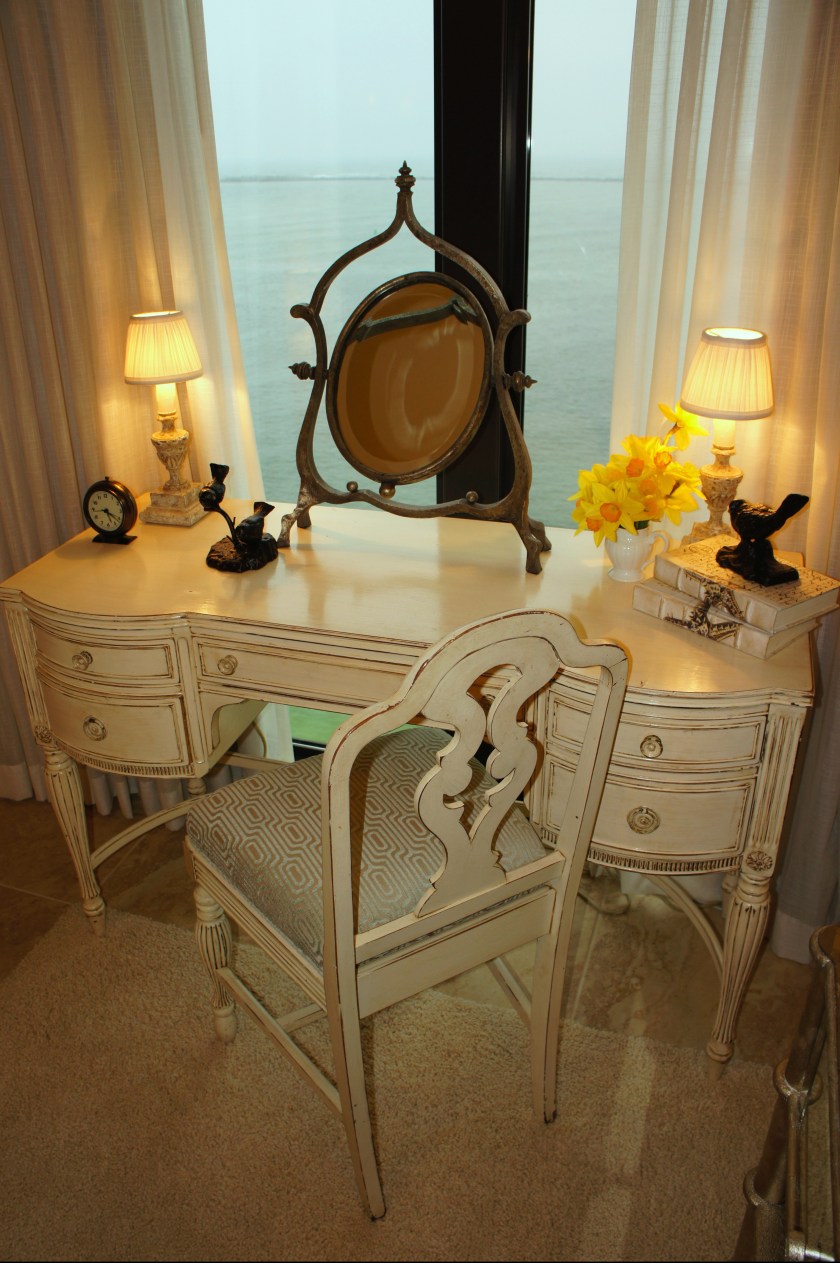
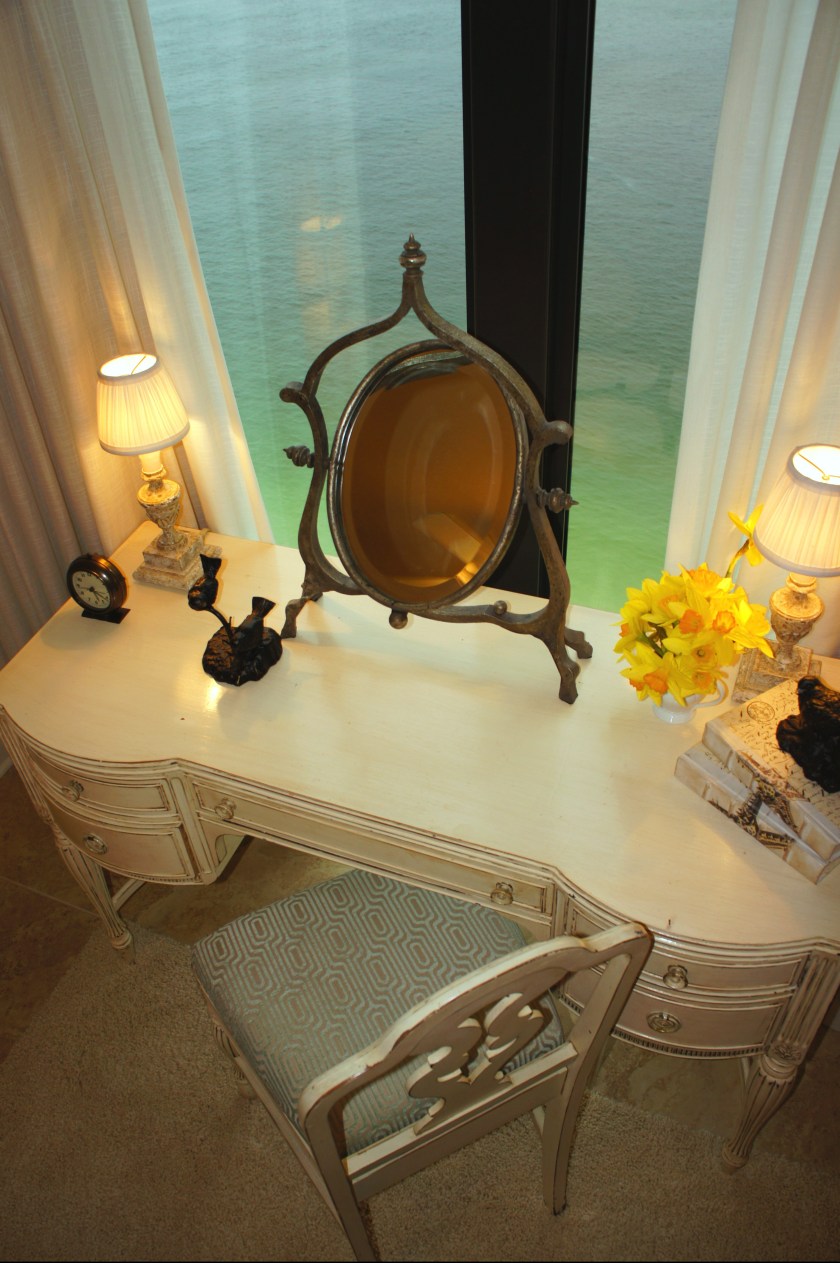
In the guest bedroom, we decided to work with the existing draperies. We opted for a dramatically tall upholstered bed and some wood bead wall sconces. The euro pillows were custom-made in a green linen that matched the walls, and french pleated mini-flanges. The long bed pillow is in a floral by Robert Allen Fabrics, and wood bead trim. The duvet is a ruched linen duvet by Pinecone Hill. Because natural lighting is the best lighting for doing makeup, we decided to place the vanity directly in front of the window. The sheers can be closed separately from the blackout lining to filter direct lighit if needed.

BEFORE

This is the second master bedroom. It has a panoramic view of the harbor. Since the shutters were a great solution for treating the windows already, all the windows needed was some “makeup,” or non-functional drapes to dress it up a bit. I used the same toile fabric that was in the bedding, and trimmed the valances in a glass bead.

BEFORE

The structural column on the far side of the room provided the perfect spot for a full-length mirror. This one is by Uttermost.

BEFORE
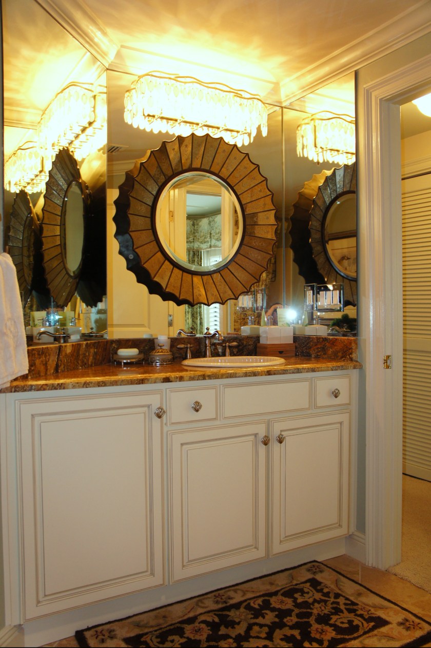
I dressed this bathroom vanity up by installing a mirror and capiz shell bath light. We painted the cabinets and replaced the brass faucet & door hardware.

Cara, Cara, Cara – what a fabulous re-design! I love every inch of it! I am going to pin some of these photos. Beautiful job! Wish you were up here in NY (would love to work with you!). I would have done the same things to the kicthen cabinetry – great call. There was way too much wood before!
Thanks for this post!
Linda
Thank you, LInda! I wish I were in New York, too! Your profile says you are in Houston–I am currently working on a project in Houston. Any advise on places, fabricators or installers we must use? It is a condo designed in the 80’s that we are remodeling & opening up to be a more spacious, modern unit. Style is contemporary/transitional. Happy Designing!
Cara
Hey Cara…I’m not in Houston. Wish I was. I’ll have to check that on my profile – ’cause I’m in NY, (Long Island actually). I can check to see if some of my blog friends have any contacts for you.
Try to get a job in the Hamptons up here – your design-style would be perfect up here!!
Linda
Cara,
The entire family loves what you did with the condo!! We never want to leave and neither do my Mom or Dad! Thanks for making it such a beautiful place for all of us to enjoy!!
Thank you! I don’t want to leave when I’m there, either! I am so glad that you and your family are enjoying it!!
Cara,
You did such a wonderful job with Pat and Cosby’s condo. I have really enjoyed seeing the before and after. The colors for each room are so soft and the furniture could not be better in each area. I love what you did with the whole place. I hope to visit in person someday. Would love to meet you. Again a fabulous job. Sandi Askins
Cara,
You achieved what we wanted, calm sea colors, to let the ocean & harbor be the focal points from every room. It is a very restful & comfortable design with our gorgeous setting. Our family is happy in this unique through the unit viewing, thanks to you! It was a pleasure working with you, too.
Pat & Cosby
Cara I love the ceramic birds you used on the mantle. Could you post the source or brand for these?