Someone wise once told me that if you are able to look at a home and automatically know who designed it, then that designer did not do his/her job, as the aesthetic should always reflect the clients’ personal style. The designer’s job is to elevate that style. If I could have a personal style in my work, however, this project would come closest to achieving it. I was thrilled to meet these Louisiana natives after being introduced to them by Susan Lovelace, the owner of Lovelace Interiors. They knew Susan through similar acquaintances, and after meeting with them, she felt that the couple and I would make a perfect fit. She was right!

Rustic jute, raffia, linen and distressed finishes; or rich wool, silk, velvet, golds and things adorned in crystals? Why pick and choose when you can have it all? This unit was designed for two people who hold the beach near and dear to their hearts, while also enjoying the finer things in life. I wanted their design to reflect both of these loves by contrasting natural, somewhat rustic coastal finishes and accents with rich, fine textures and sparkling finishes. I laughingly came up with the term “crusty-chic”, which we ended up using quite a bit through the process! A more proper description, however, would probably be “coastal-chic”.

This is the Living Room. The natural linen fabrics of the sofa and swivel chairs were made more sophisticated by the clean lines, bench seat cushion and waterfall skirts. The large jute area rug was topped with a hand-woven wool and silk area rug that pulled in some color. This is a great way to anchor a large space and achieve richness without breaking the bank. After all, layering is not just for fashion!

The main focal piece in this room is a large heart pine sideboard and hutch that the clients brought from home. This is an antique that once resided in someone’s kitchen. We loved the idea of making this into a t.v. piece, because it brought so much warmth and weight to the room, and helped anchor and define the space. We removed the shelves & mounted the t.v. Then, I had some custom doors made to match the piece, and upholstered them in a matching woven linen. This hides their components and makes it more functional. I love it when a client brings their own things like this to the table, because it helps to make a design unique, while also bringing an automatic sense of familiarity and “home” to their new place.


Before

One thing I had working for me from the start is the incredible view!

Confronting a large, open and empty space can seem daunting at first, but I see it only as a room full of possibilities. One way to define specific areas in a large open space is to use one piece of furniture in each area that is weighty, contrasting, and acts as an “anchor”. In this case, the living room is anchored by the entertainment unit, and the Dining Room by the black and gold Drexel Heritage china/curio cabinet. Rugs and light fixtures are also easy ways to define a space.

Opposite the entertainment unit is this wall, which is adorned with some commissioned original art by local artist Allison Wickey, and sconces by Fine Art Lamps. The French settee is finished in antique white, and upholstered in raffia, with a linen tufted seat cushion. To add color, I had these two custom kidney pillows made and trimmed it with moon shell fringe from Kravet’s Barbara Barry collection. The green velvet bolster was actually made for one of the bedrooms, but worked out perfectly here instead!

This view of the Living Room gives you a glimpse of the guest bedroom, and shows the repetition of color used throughout.


This unit provides a glorious view of the sunset in the evenings. In the foreground above, you will see the reclaimed wood sofa table we used, topped with the oval art glass from Fusion Art Glass. In this sculpture are 3-dimensional impressions of fish, finished in golds that sparkle when the light shines on it.


This Luna Bella standing chandeler was a must-have! Putting it in the room was like adding the most fabulous piece of jewelry to an outfit that everyone talks about and loves. The success of this piece is in the dramatic contrast between the vintage-looking metal and wire, and the sparkling crystals, pearls and gold accents. When the light shines just right, it casts rainbows on nearby surfaces!

Here you can see how closing the sheers in the evenings helps to filter the sun, and casts a warm golden glow on the entire room.

Kitchen Before

Here is the kitchen, the heart of any home! Before, the cabinets were a generic wood finish, the backsplash was a ho-hum matte tile, and the countertops were nice, but typical granite. I started the transformation by, of course, painting the entire unit-walls, ceilings and all. I also had the cabinets painted the same color as the walls, but in a semi-gloss finish. This helped the cabinets blend into the background and let the other accents do the “talking”. Making the loudest noise (be still, my beating heart) is this rippled glass counter top on the island! This particular detail ended up being the keystone piece to complete the whole design. Once everything was in, it became apparent that the island, being the center of the design, was not living up to its potential with the existing granite. I sent my clients in search of an exotic labradorite granite that pulled in aqua accents and reflective pieces of exotic gemstone (see examples below)


They came back with the glass idea, instead, which I immediately said “YES!” to. It is rich, colorful, and reminiscent of the ocean. Just Perfect!

On the outlying counters, we used a less conspicuous, but equally cool solid surface material that contained pieces of shell, beach glass, and tiny reflective mirror pieces. Finally, the backsplash needed some sparkle, which was achieved with this horizontal staggered glass tile.

Here you can see how the glass island added a beautiful punch of color that picked up on the water outside. I replaced their pendant lights with these mercury glass pendants from Arteriors that look like they are dripping from the ceiling. The counter stools are by Lee Industries, and are covered in ice blue leather.

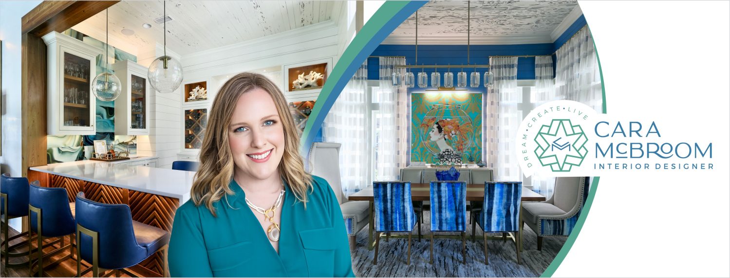
Here is the Dining Room. Helping to define this area are the Crystorama drum chandelier with amber crystal teardrops, and the hand-woven wool rug that pulls all the colors together. The French cane side chairs with linen slipcovered seats are by Aidan Gray. The host and hostess chairs are by Henredon, and are covered in rich green velvet, with linen contrast welt and band at the bottom.


The dining table is an old, inexpensive table I found at an antique store and had faux finished by local artist, Polly Yokum, to match the dining side chairs. I loved this table because of the undulating curves of the top, and because of the details on the pedestal bases. I knew this would clean up beautifully—the lines of it were wonderful!

The Currey & Company dining sideboard is heavily adorned in shells and coral, and topped with white marble. Above it is the matching wood and shell trumeau mirror. These two pieces were the epitome of “crusty-chic” with its distressed finishes and bleached shells, arranged into a classic and timeless form. I accessorized with this fabulous lamp with draped glass by Global Views. Opposite is a mermaid sculpture with shell and iridescent glass accents.


Before


In the above two photos, you can see how beautiful natural light during the day is transformed into a sparkling ambience in the evening. This is why lighting is important, and can be an art form in itself.

The Master Bedroom shows off an upholstered king bed by Oly, antique mirrored nightstands by Currey & Company, and some fabulous bedside pendants. This is a wonderful alternative to lamps because they look more custom, and also free up space on your nightstands.

The art over the bed is antique prints of shells framed in handmade frames, which bring touch of contrast to the room. The bedding is all custom-made, sewn in hues of green, greige, and soft gold. A wide-stripe Peacock Alley blanket is topped with a green silk coverlet, and then topped again with a linen duvet. Again with the layering—the more the merrier when dressing your bed! It gives it a rich, plush and inviting appearance. The lambskin throw adds a final touch of luxurious texture.

Master Bathroom Before


Here is the Master Bathroom. As you can see, I am a huge fan of “mirrors on mirrors”. In another example of layering, we dressed this bathroom up by adding one unique and beautiful LaBarge mirror over the vanity, mounted in front of the existing wall-to-wall mirrors. It is flanked by two Arteriors buffet lamps.

Over the tub is this large Design Legacy coral tapestry. The Drexel Heritage bed step works well in helping the client climb in and out of the tub.

The Guest Bedroom is slightly more feminine, with its crystal lamps, curvilinear bed and antique fauteuils.

Antique Florida maps sandwiched and floating in glass add color to the other side of the room.

Antique Fauteuils Before

I love using writing desks as nightstands. This one is by Drexel Heritage, and is finished in the perfect green and cream paint colors. Flanking the bed are framed seahorse prints by Vintage Print Gallery. The fauteuils in this room are ones my clients brought from home. I gave them relevance and style by recovering them in this fabulous green Romo linen and geometric velvet print by Kravet.

The queen leather bed by Schnadig provided a warm richness needed to contrast all the light fabrics and finishes. The other bedside table is a gold and marble table by Cyan Designs.

All I need is a mug of hot tea and a good book, and I could crawl into this bed and never get out!

Hmmm…I wonder where we got our color inspiration?


The Guest Bathroom was dressed up with another LaBarge “mirror on mirror” (my handyman loves me!) This particular mirror was VERY heavy and the process was laborious, but the result was worth it. This is why I employ people who believe that if there is a will, there is a way. I am very strong-willed! The wallpaper is a pale green with shiny gold print. It is colorful enough to give richness to the bathroom, but faded enough to not be too busy.

I designed this shower curtain to be simple, so as not to take away from the wallcovering. The applied coral band picks up on the gold hues of the wallpaper, and adds just the right coastal touch.

The third and final bedroom was made into a bunk room. The client wanted this room to be fun, but also sophisticated. The whale triptych, coral pillows and custom boxed pillows add a whimsical touch. The tailored linen capsets, oyster shell sconces, painted venetian chest and capiz shell mirror provide the balance of sophistication.


Let us not forget the Powder Bath! Before, this room sported a pedestal sink and generic light fixture. I replaced those with this contemporary wood lavatory by Kohler that provided some storage, a white faux horn mirror by Jamie Young, and capiz shell light fixture by Corbett Lighting. The green and champagne paisley wallcovering picks up on all the colorful accents in the main living area.

Follow me out onto the balcony!

Warm teak club chairs and chaise lounge by Brown Jordan provide a relaxing place to sit and enjoy the sun. Color was added with Sunbrella pillows and these beautiful garden stools. The side table above, by the chaise lounge, is actually made of ceramic, but designed to look like driftwood! Garden Stools and side table are by Emissary.


Emerald Coast photographer, Mark T. Worden, is photographing the unit for an upcoming issue of Condo Owner’s Magazine! Pictures are to come—Of course, I try my best, but his pictures promise to be much better than mine!!


Thank you for visiting my blog! Call or email me if you need any design help:
Cara L. McBroom
850-837-5563 ph

Cara,
I am giving you a Grammy on your photos, you caputured our approval on all levels. Your work and photos show your eye for all things we love.
LOVE IT ALL!!!! I’m especially in love with the pendants in the master bedroom and using a writing desk as a nightstand. A genuis two for one. You’re so very talented.
Good job Cara! Great photos and great blog!
This is a great site, might you be interested in doing a discussion regarding
just how you designed it? If you are e-mail me! Thanks, I’ve recently been seeking for information regarding it subject for some time and yours is the better I’ve found updated.
Thanks for a marvelous submitting! I really enjoyed reading it, you
may be a very good writer.I could always bookmark your internet site and may
even keep returning later on. I want to encourage one to continue your great writing, have a nice holiday weekend!