This is a unit I had a blast helping design in Atlanta’s Viewpoint Towers in Mid-Town. I loved the raw concrete on the ceilings and columns, and the unobstructed view of the city that the unit had to offer. We originally discussed painting the ceilings a dramatic color in the bedrooms, and I am glad we did not! I needed to see them in person only once to realize they were an asset, and not to be covered.
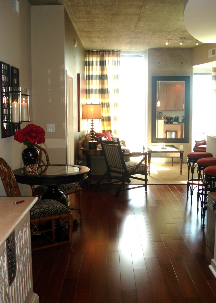
This is a view of the Living Room from the Entry, except for the fact that my camera did not capture the city view. The warm wooden floors provide the perfect balance to the cool concrete ceilings and columns. We added more character to the visual palette be using a mixture of wood finishes and painted black finishes on our furniture and accessories. The cocktail table and the bistro table are both black with antique mirror inserts. The wall sconces over the bistro table and chairs help to define the area, and also provide the opportunity for a romantic candlelit dinner! The overall color scheme was a neutral black, gold and beige, with dramatic but sparing use of red in the accessories and smaller pieces of furniture.
We dressed the windows in the Living Room simply, but dramatically. The simplicity of the floor-to-ceiling, pinch-pleated, 2-times fullness drapes allowed us to address the issue of filtering the afternoon light, without doing anything fussy. The 2-times fullness allowed us to stack the drapes back to a minimal dimension, for optimal view when opened. Had we used solid fabric, I feel that the drapes would have been too simple. This is why I chose the dramatic wide-stripe Romo fabric, with its colors that tied the room together so beautifully. The fact that the fabric was extra wide (118″) permitted us to railroad the fabric so that we would have seamless drapes, with horizontal stripes. The panels were sewed so that when they are closed, the stripes matched and were level, even with the drop in ceiling height. I believe that the horizontal stripes in the room broke up the length and verticality of the space.
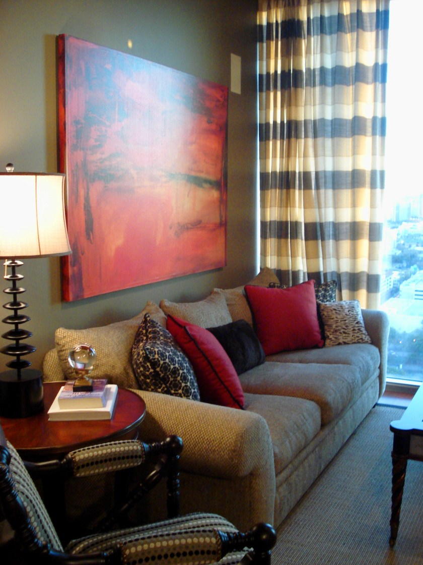
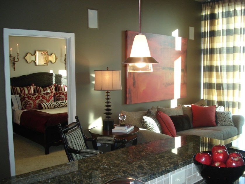
The sofa was the client’s sofa. She loved the comfort and the cats loved to crawl under it and hide! For this reason, we chose to keep it and jazz it up with some new pillows. Two of the pillows are out of a modern, geometric leopard print from Robert Allen. The two red pillows are actually tone-on-tone fretwork from Schumacher. Both the leopard pillows and the fretwork pillows are corded with leather braided cords, for a contrasting texture. The center pillow is made from faux fur. The painting was my client’s painting, and was the inspiration for our color scheme. I felt that the lamp was perfect, for the graduating discs mimicked the stripes in the drapes.
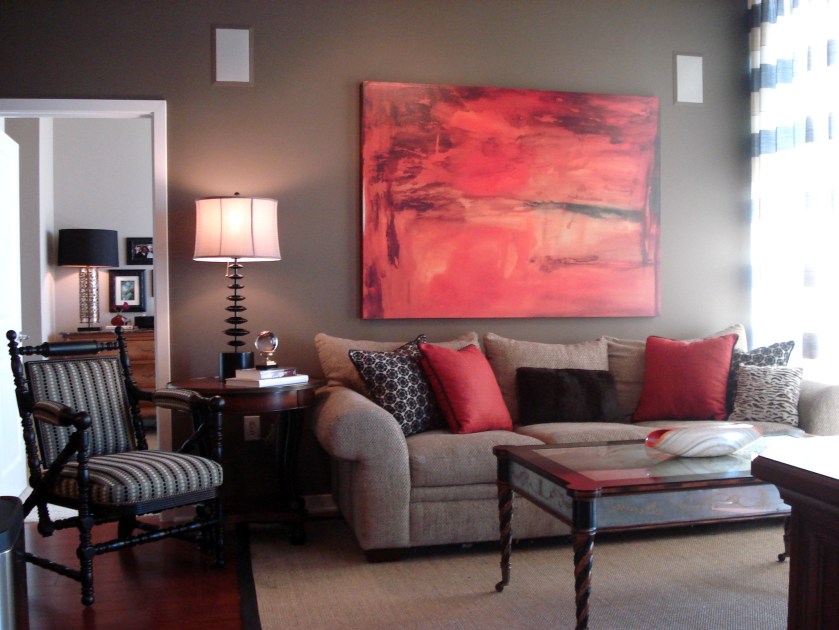
The black accent chair in the picture above is from Bernhardt’s Martha Stewart collection. I covered the seats in a modern polka-dot Robert Allen fabric. I love using crystal balls on nighstands and end tables, because they are a beautiful, harmonic shape, and also because they provide a reflective touch of glitz. The Lillian August cocktail table from Drexel Heritage had antique mirror inset into the top and sides, with painted details on the glass and legs. I chose to use a seagrass rug with black binding from Natural Elements, because this is a great way for a cat owner to avoid upholstery damage by cats wanting to sharpen their claws. Instead, they will want to claw the rug, which is virtually indestructible, and far less-expensive than upholstery, if ruined. This particular blend of seagrass had gray accents that tied in the color of the sofa and wall color.
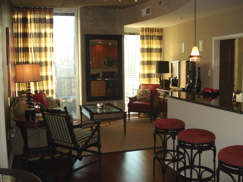
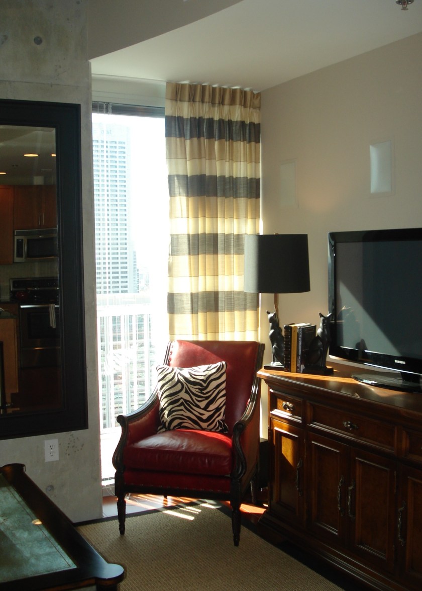
This view of the Living Room shows the great city view, and the beautiful red leather chair I found. Having one dramatic accent chair like this, placed opposite a heavier sofa and chair, helps to balance the visual weight of the room. The fact that it is in the corner with a floor lamp makes it a great place to read a book, and the zebra pillow provides the perfect amount of pattern and texture to make it a focal point in the room. The television console from Stanley Furniture was the perfect size to house all my client’s audio/visual components, and helped to break up the black.
In the above photograph, I am trying to show how the colors in the Living Room transitions into the Master. You will see that I used the red as a common grounds for both rooms, but added rich plum and eggplant to the Master for an extra feminine touch.
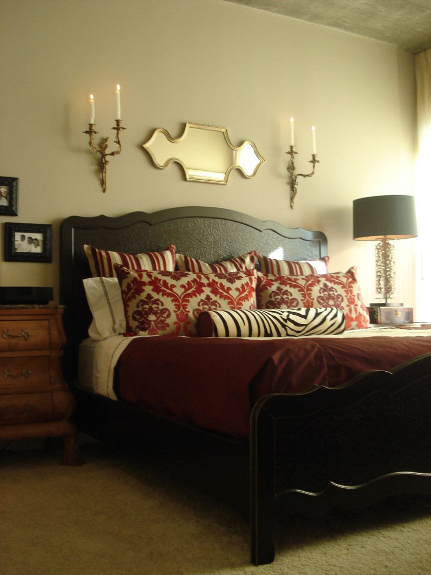
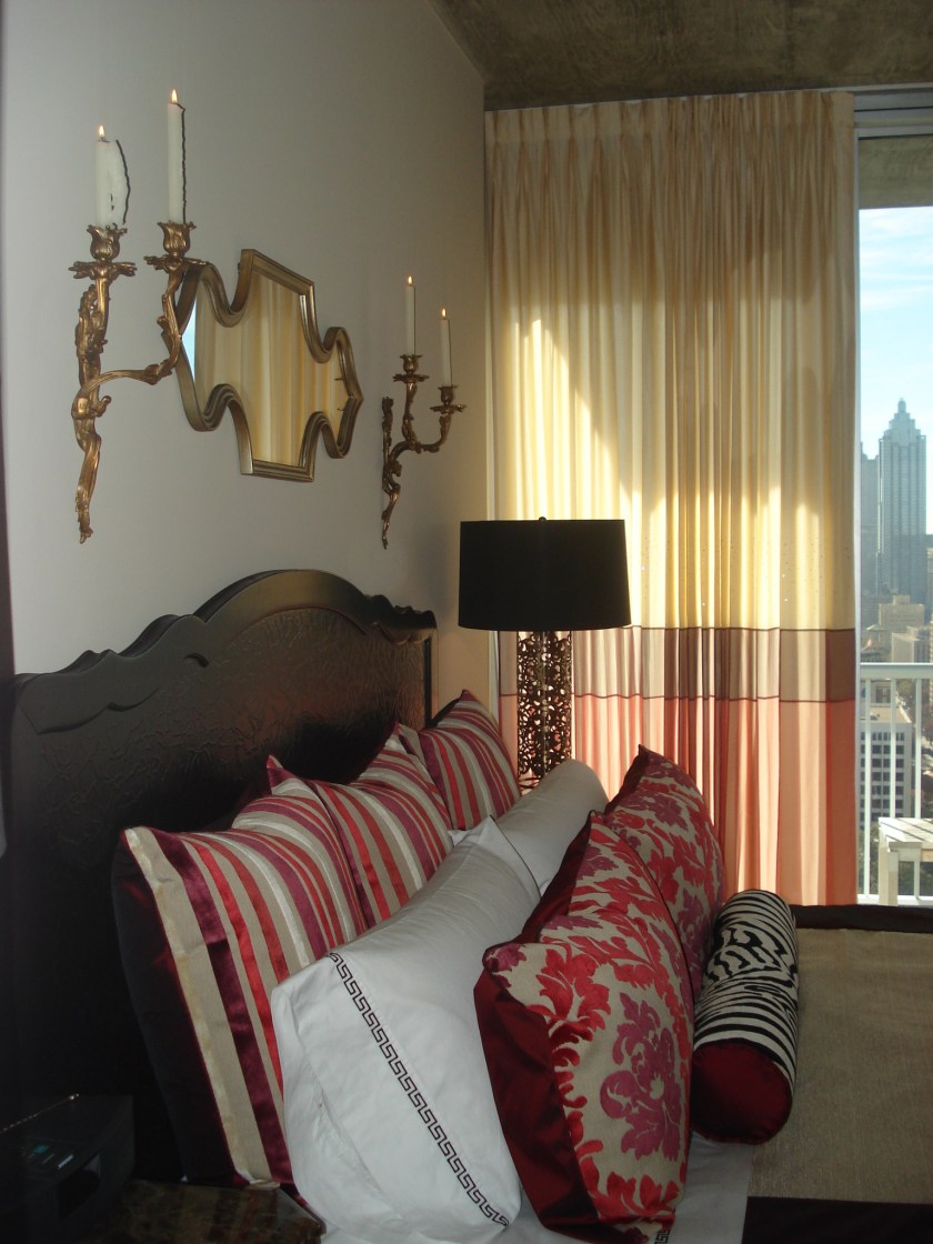
The linens on the bed are a rich, luxurious mixture of chenille, velvet, silk and natural linen. I believe that layering textures on your bed adds to the richness tenfold. The classic Legacy Bedding sheets have a black greek key border, which I love.
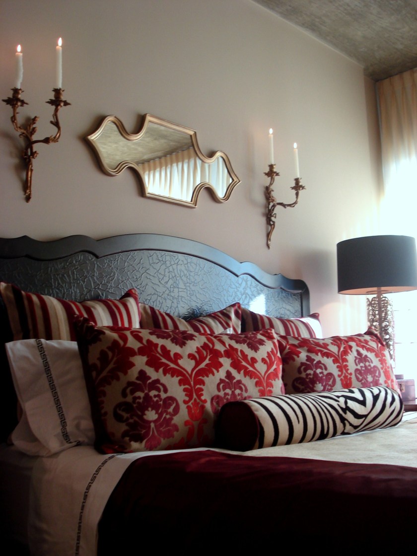
The bed is by Woodbridge, and has a crackled texture to the headboard and footboard. I loved the Moroccan shape to the Cyan mirror above the bed, which matched the finish of the flanking taper sconces from Global Views perfectly. The above picture shows a glimpse of how beautifully the rough concrete ceiling contrasts with the fine fabrics and finishes of the rest of the room.
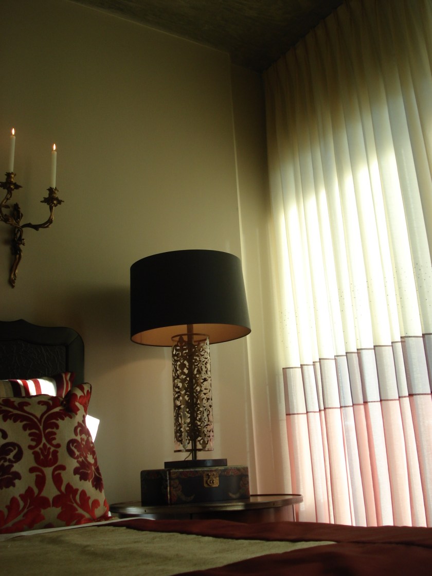
This gold filigree lamp from Arteriors had a gorgeous gold lining inside the lamp shade.
In the corner of the room, I used this armless Bernhardt chair with a neutral fretwork fabric that went well with the greek-key hurricanes next to it on the dresser. The wide bands of plum and eggplant on the drapes allow the cream color of the chair to stand out nicely. The black painted serpentine-front dresser with wood top is from Interlude. This tied together the black bed with the wood bedside chest. The shapely serpentine front of the dresser mimicked the shape of the headboard and footboard.
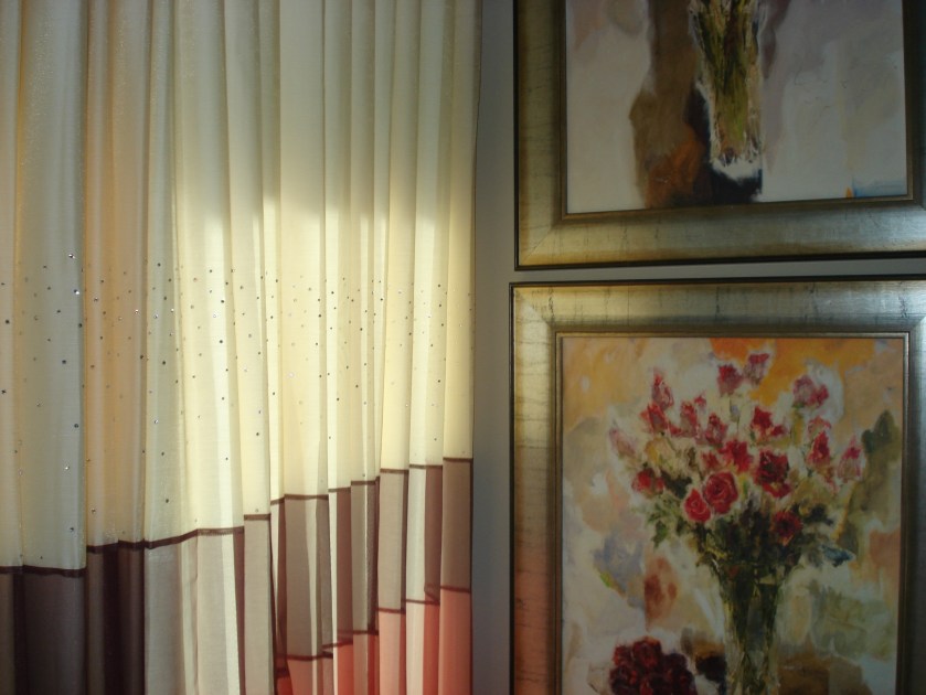
The lined sheers of this bedroom are adorned with Swarovski crystals, which sparkle at night and provide an extra touch of glamour and femininity. The oil paintings tie all the colors in the room together beautifully.
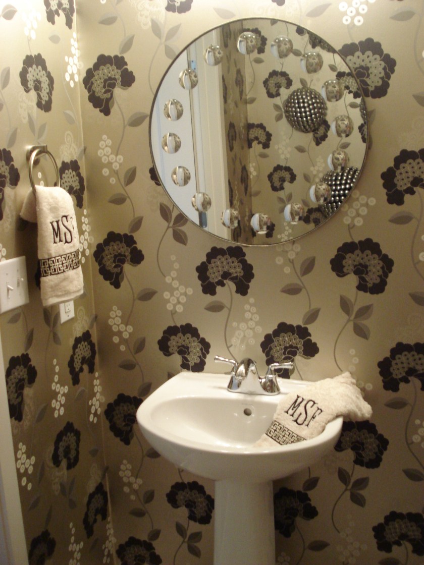
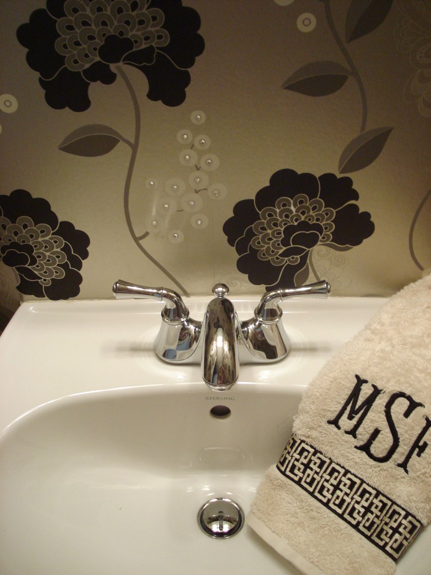
The Powder Bathroom in this unit was the perfect area to be dramatic with our wall application. I chose this glitzy champagne, black and cream Romo wallcovering for its drama and flirtiness. The silver wall sculptures by Arteriors were the perfect way to add art, without taking away from the pattern in the wallpaper. The circles in the sculptures work with the round “pods” in the wallpaper pattern.
I wanted to push the drama of this room that extra mile by gluing Swarovski flat-back crystals to the center of every-other floral “pod” grouping. This took a while, but was worth the result!
I made her hand towels by purchasing some nice, but affordable solid towels that matched the cream in the wallpaper. Then, I ordered the fabulous black and champagne fretwork decorative tape from Robert Allen and had it sewed as the border. Lastly, I had my client’s initials monogrammed above the decorative trim. This was a great way to have custom towels that matched the room perfectly.
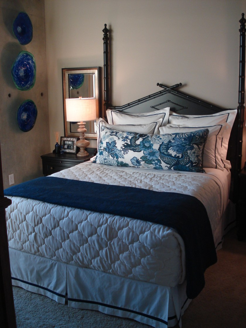
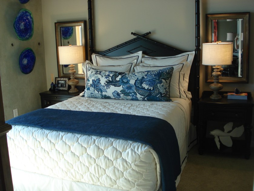
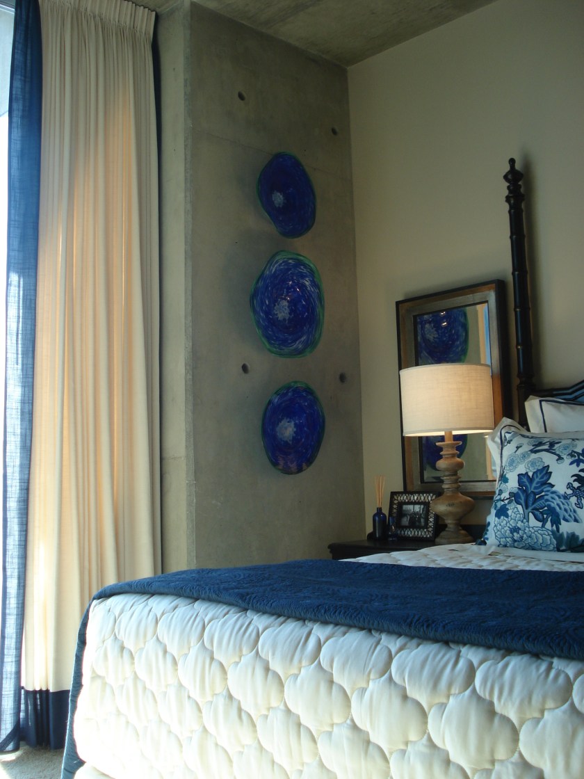
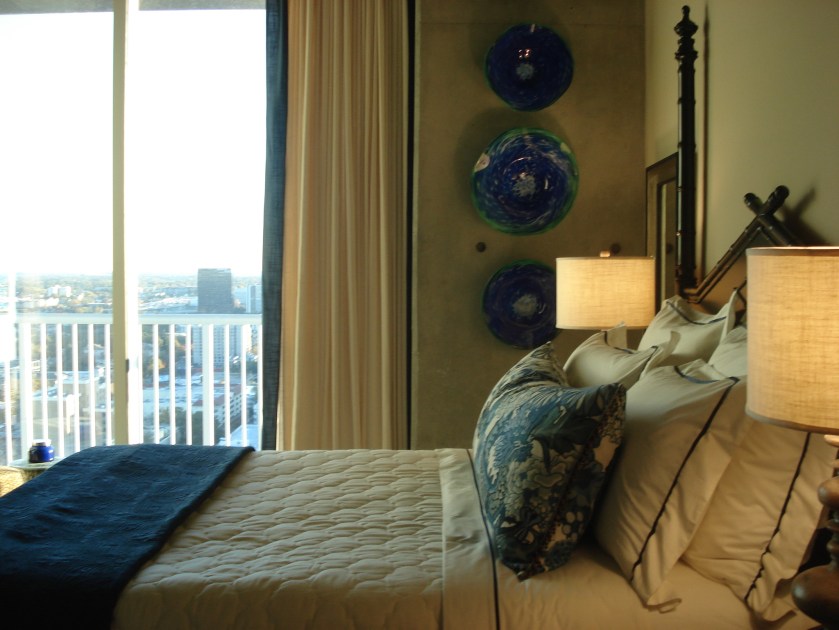
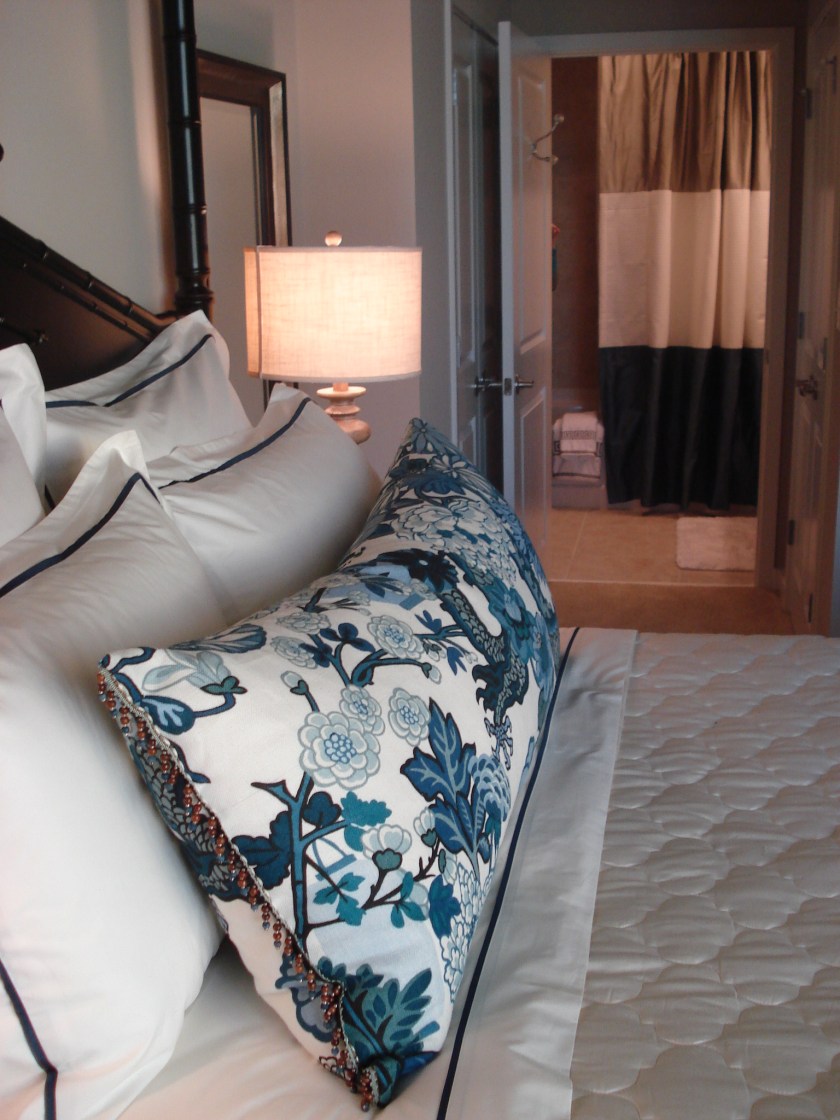
This is a view of the secondary bedroom in this unit. The color scheme was derrived from my client’s existing television armoire, which was a natural wood tone, with navy accents. I first found this amazing dragon print from Schumacher. I knew I wanted this fabric to be the focal point of the room. I did this by allowing the large pattern to show fully on one large body pillow, and giving it a solid cream and white canvas, or backdrop, with the Legacy sheeting and Homestyle Bedding Coverlet. The dark blue coverlet helped to dress the bed up and add an extra textured layer. The body pillow is trimmed on the ends with a hanging blue and brown beaded fringe. Because the Drexel Heritage headboard had such an interesting shape, I did not want to detract from it by adding any art over the bed. Instead, I added depth to the room with matching mirrors over each nightstand. These mirrors reflect the lamp light at night for added lumination. I had an artist custom-make the art glass sculptures hanging from the concrete column. I love the juxtaposition of the smooth, reflective glass on the rough concrete, and the bright burst of color against the mottled gray. I cleaned up the corners of the bed dressings by envelope-wrapping the top coverlet. Not only does this look clean and allow us to see the blue silk-trimmed bedskirt, but it also provides a tight “snug-as-a-bug” feeling when crawling in for the night.
The rustic wood lamps mirror the rusticity of the concrete, and are also similar to the color of the armoire. I loved adding this white beta fish sculpture on the dark shelf of the nightstand.
I chose a solid cream linen for the drapes, and banded it in blue for a slight pop of color.
In this picture, you can see the trim I used for the ends of the long body pillow. Also visible, is the custom shower curtain, sewn with large blocks of blue, cream and silver. The towels have embroidered sliver greek key borders.
This was me trying to look composed as best I could, after a long and gruelling day of installation. Due to much pre-planning, we were able to complete installation of this unit in two full days, altogether. One full day on the first trip was spent placing the large pieces of furniture and art, and making a list of required art, accessories and accent pieces for the next trip. One full day on the second trip to Atlanta allowed me to finish the design, down to the last book, towel, ironed sheet and glued crystal. I thoroughly enjoyed working with this particular client on this out-of-town job, and not only was the client thrilled at the end of each working day to come home to a completely new space, but her cats were the first to try the new luxuries out:
Boots said, “I approve!”
If you would like any help designing your home, please contact me:
and visit the rest of my blog:






Hi Cara
I had not visited your website for a while, but needed a dose of beauty today and knew I could find it here. I was not disappointed when I was greeted by this amazing Midtown condo! Once again, your attention to detail makes all the difference, and your designs are so well thought out. Thanks for posting your photos and the interesting narrative. Keep it coming!—Martha
Thank-you so much! I am currently working on a place with lots of cobalt blues and whites…natural & earthy but with a vintage Art Deco influence. I can’t wait to finish and take pictures, as it may be some of my best work yet! I am so glad you have been following my work. I’ll try to keep the posts coming!
~Cara
i like the picture that show beautiful red leather chair,very unique for me.do you decorates yr houses by yourself?very creatively u know,if u live near at my place,i will paid u for redesign my room.hehehe.