80’s Houston High-Rise Before and After | Design by Cara McBroom
This high-rise condo in Houston, Texas was stuck in the 80’s, with its plethora of hallways, closed-off spaces, laminate cabinets and colored toilets. My clients know good bones when they see them, however! We enjoyed working together on their Panama City Beach remodel so much, that they called on me to help them visualize the potential in this gem! We knew we wanted a transitional look that would marry their traditional accent pieces with their contemporary affinity. We began by reworking the footprint of the condo, and doing everything we could to maximize the openness and function of every space. Then we focused on lighting, making sure we had ample recessed l.e.d. lights, mixed with accent lighting and correct electrical outlet placements. Next, I started drawing/designing all the bathrooms!
The next step was for me to fly over to Houston, 7+ months pregnant, during a classic Houston heat wave (one day my client’s car said it was 109 degrees, and my feet were ginormous!!! I waddled everywhere). But, in three days, we were able to choose every tile, cabinet, cabinet hardware, flooring, light fixture and plumbing fixture! Having the bathrooms already planned and drawn-out made the selection process much more organized and streamlined (and helped us avoid any pretty, sparkly tangents, or “squirrels”, as we laughingly called them. What’s a “squirrel”? Watch the movie UP.)! Anyhow, without further ado, here is the awesome transformation:
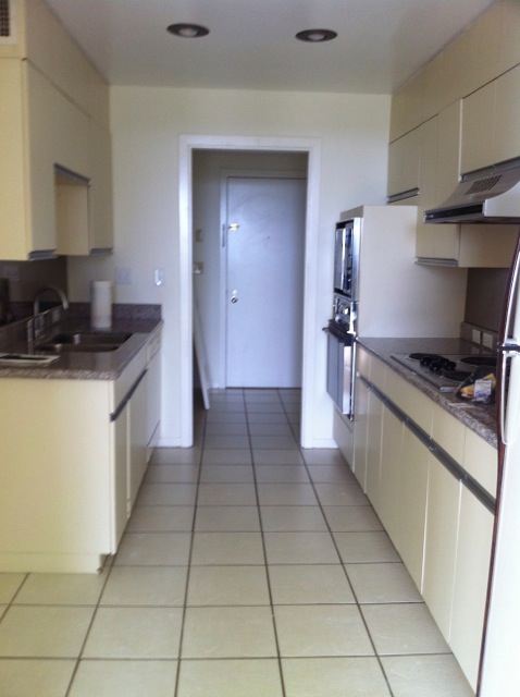
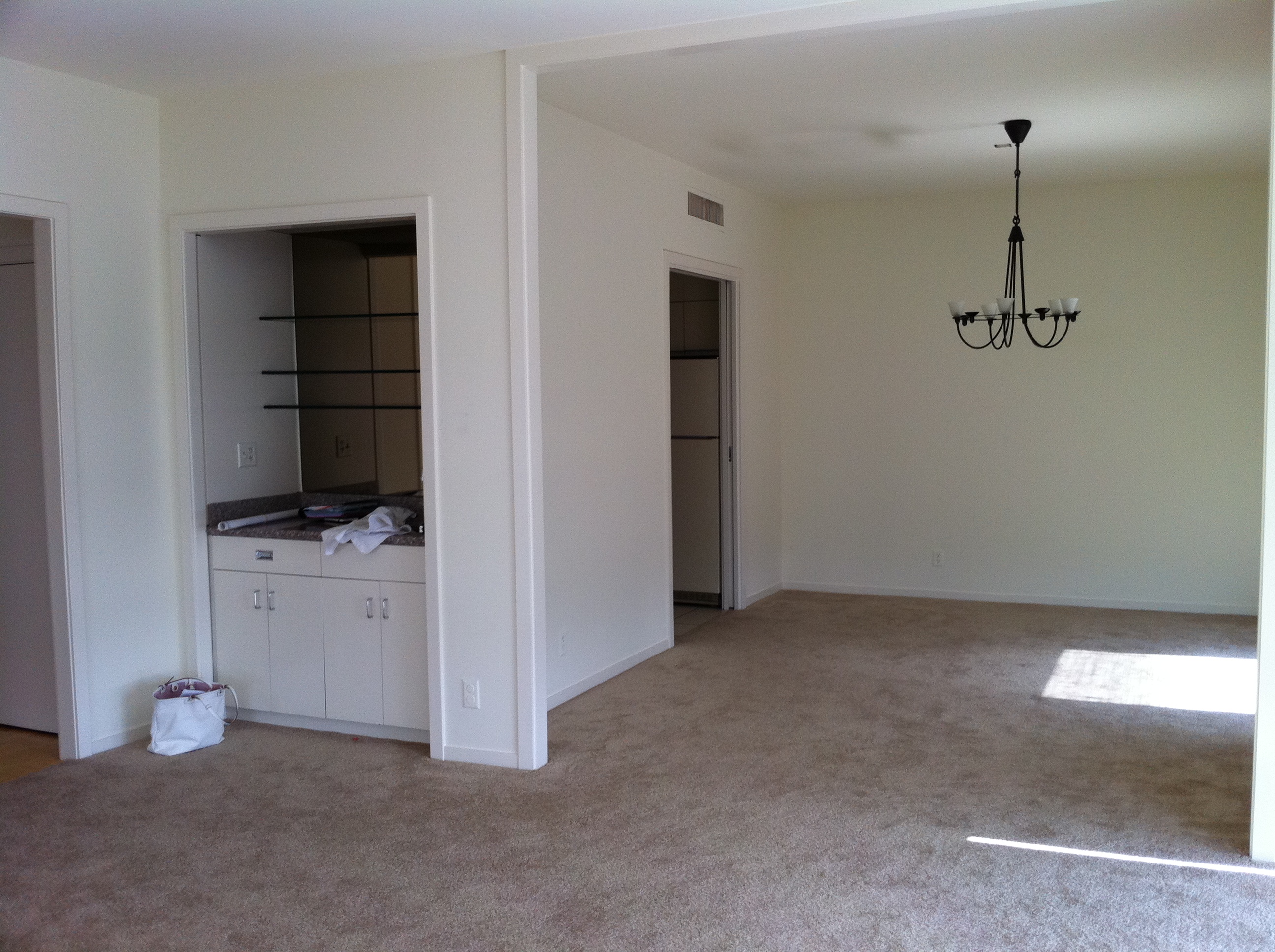
Kitchen Before
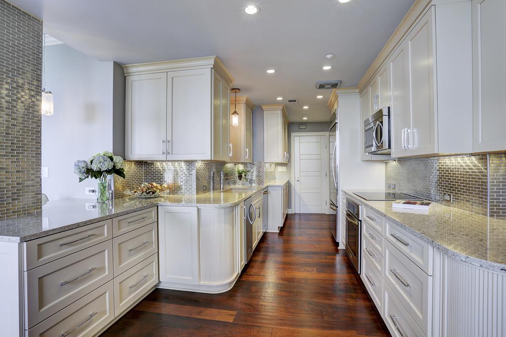
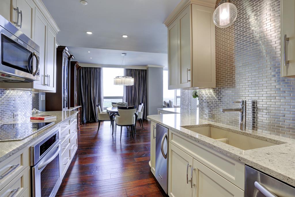
Ta-da!
The first thing we decided to do is open up the doorway leading to the rear entrance. This allowed us to extend the kitchen some, and brighten things up a bit. We also opened the walls that separated the kitchen from the living and dining areas. We replaced the living room wall/wet bar with an open counter-height bar, and accent lighting. I chose almost-white cabinets for a bright contrast against the cherry wood floors. The shining star, in my opinion, is the stainless steel backsplash tile! This took a little convincing, but was well worth it! It reflects light, adds texture, and creates the illusion of depth, much like a mirror would. We wrapped the structural column on the bar with stainless steel so that the column looks integrated and weightless.
Kitchen before (opposite view)
Kitchen After (opposite view)
View into dining/kitchen Before:
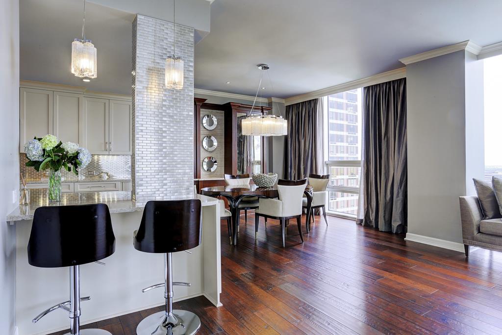
After
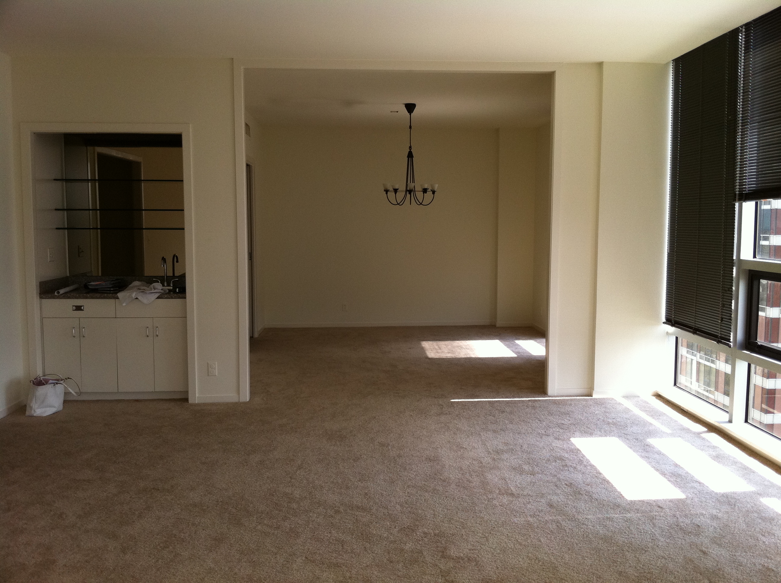
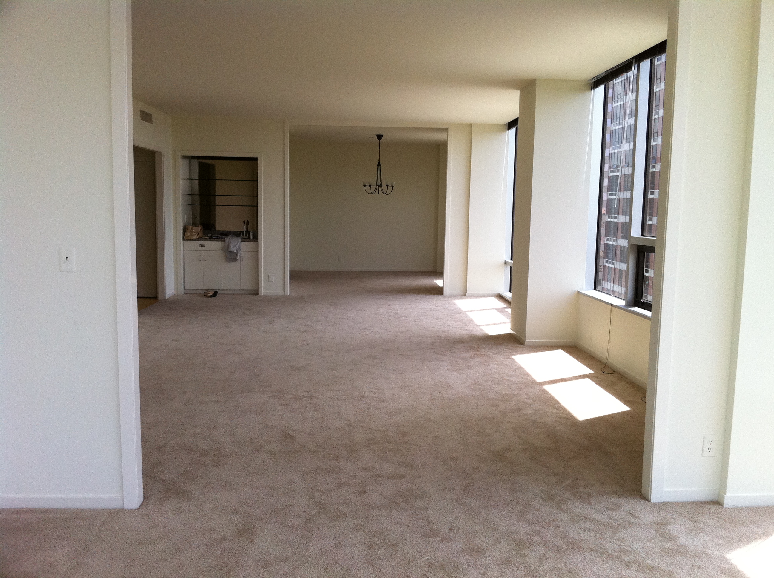
Dining Room Before:
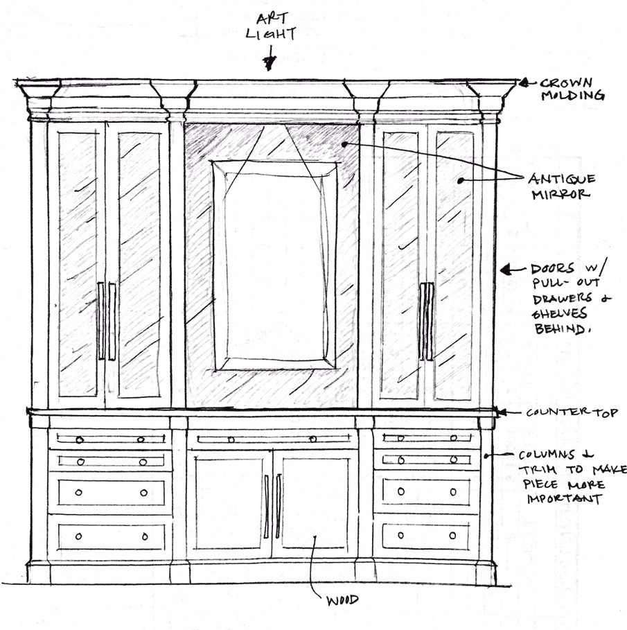
Here is my concept sketch for the new custom dining casepiece, which will dress up the Dining Room!
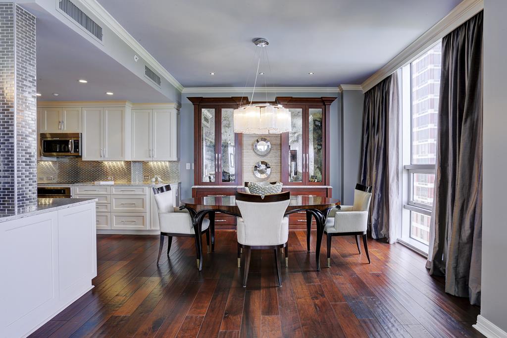
Dining Room After:
In the dining room, my clients needed a little bit more storage, so I designed this narrow buffet/hutch built-in, with beautifully stained wood, sparkling hardware, antique morrored doors, and grasscloth textured accent in the middle. I wanted this piece to look like a transitional piece of furniture (not like an extension of the kitchen). This helps to define the space and keep things from being too matchy. Pewter and blue silk drapes add some warmth, softness and drama!
Living/Dining Before:
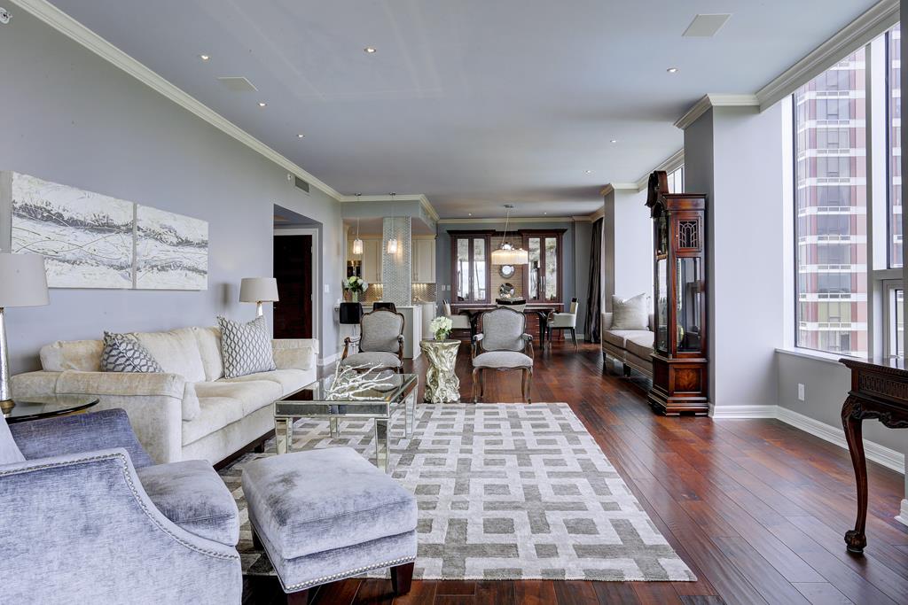
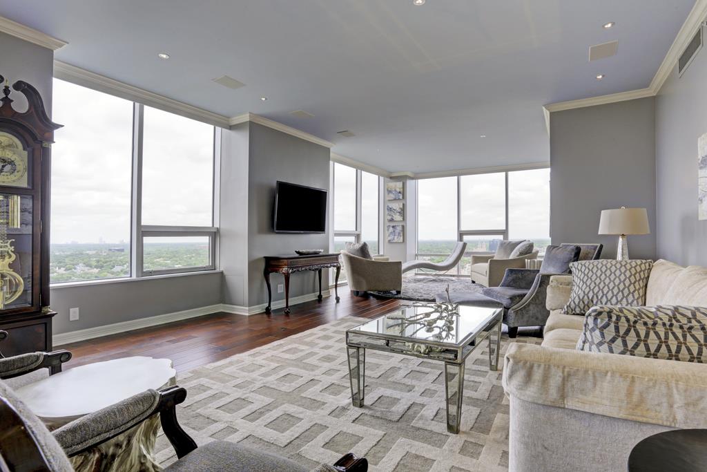
Living/Dining After:
Here you can see what a dramatic difference wood floors can make, as well as a bit of color on the ceiling! In this case, I chose a gray paint for the walls, and a slightly bluish gray for the ceiling. The color scheme is a mixture of rich cream, gray, and powder blue. Above the sofa is a commissioned piece of art painted by the Emerald Coast’s Allison Wickey. You can see how I mixed her traditional fauteuil chairs with some more modern upholstery, and recovered the chairs in a clean, masculine gray, with blue fabric in the outbacks.
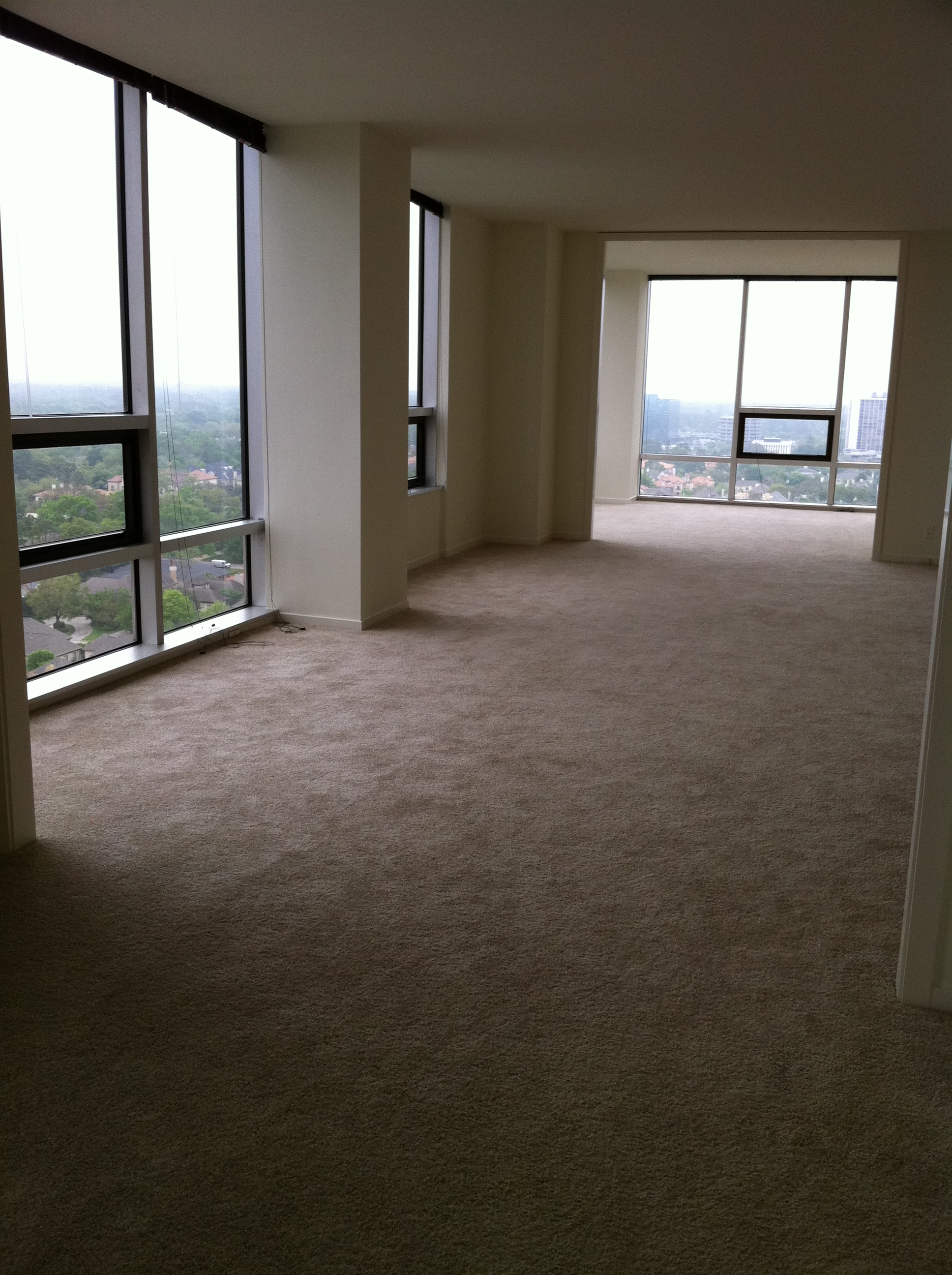
Living Room Before:
Living Room After:
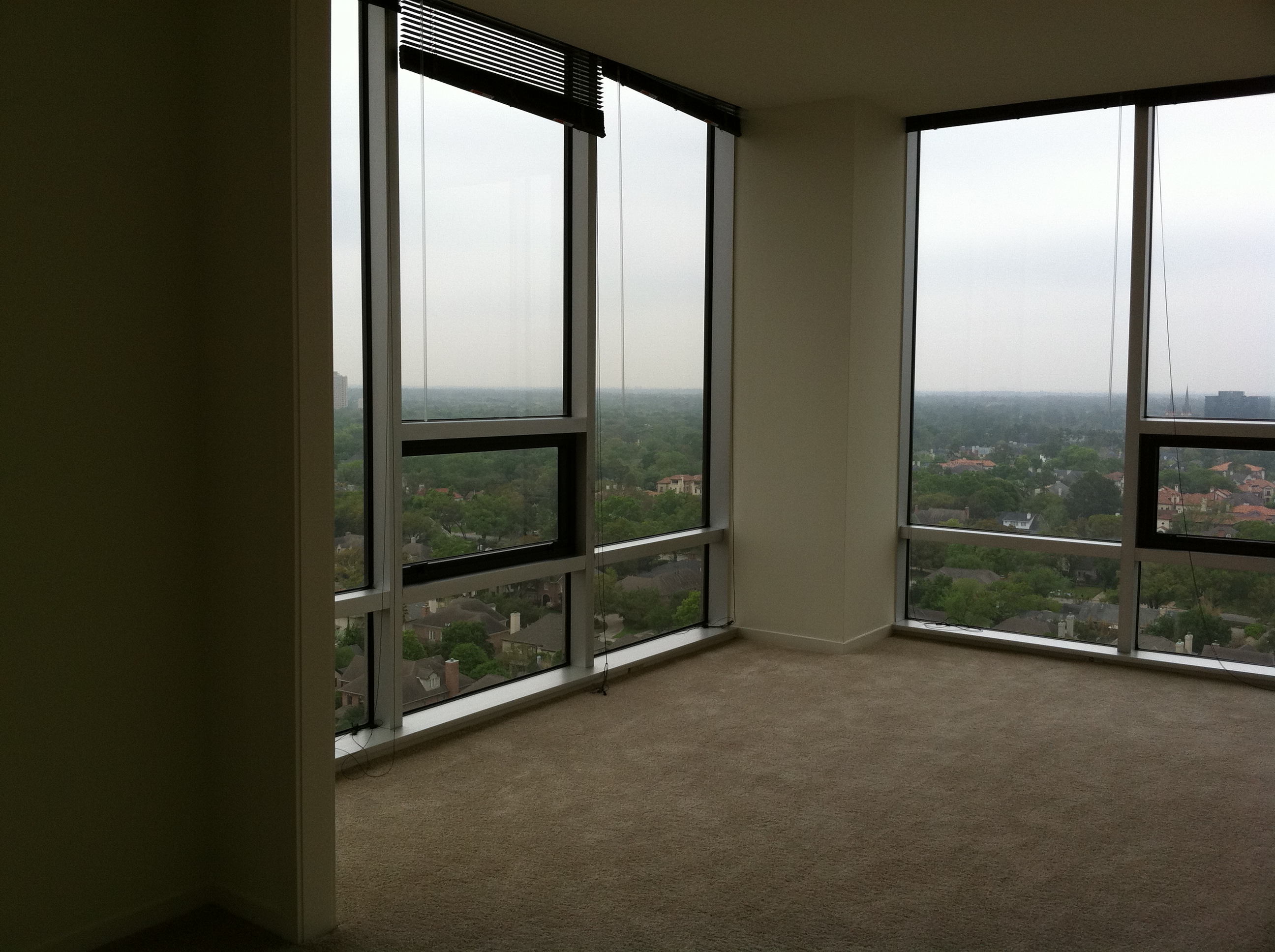
Sun Room Before:
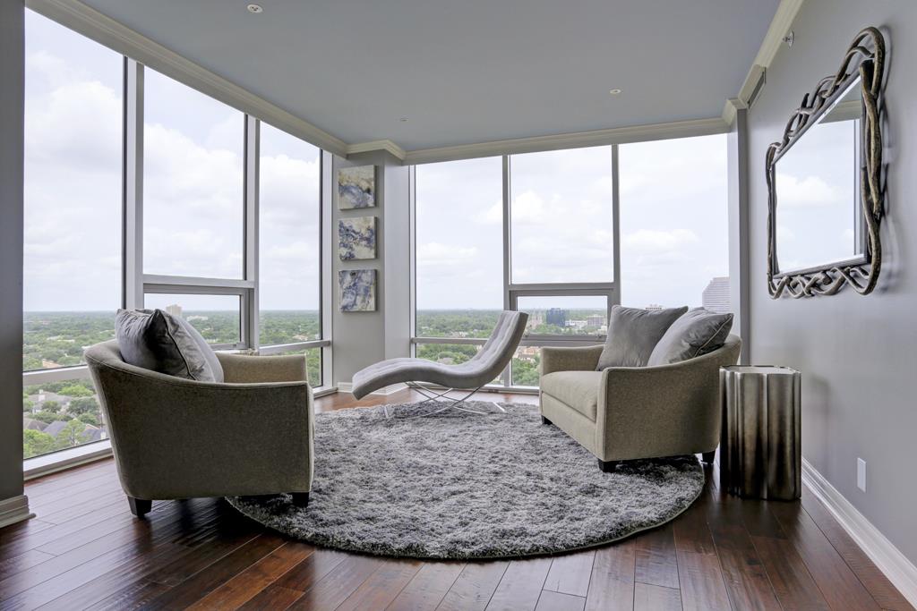
Sun Room After:
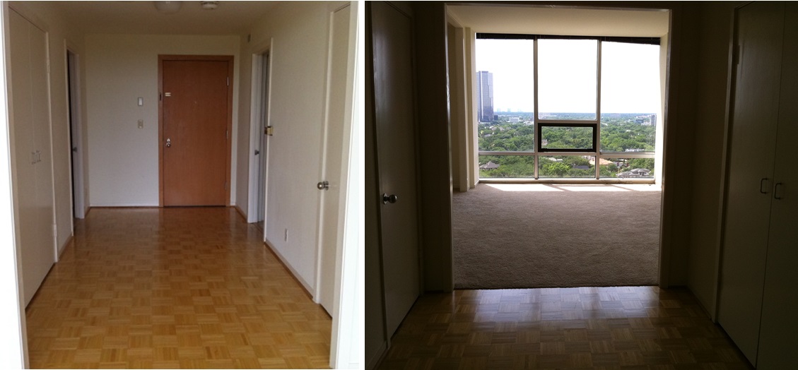
Entry Before:
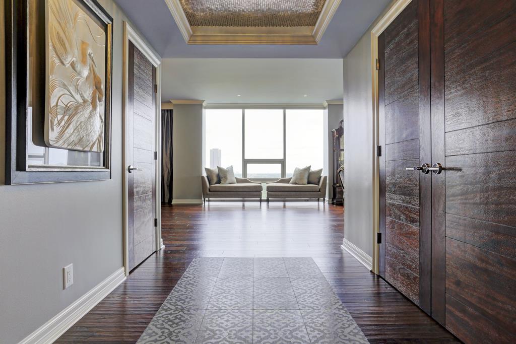
Entry After:
Bye, bye, generic doors and sad floors! Hello, beautiful wood panel doors and custom tile “carpet” design. I created the most durable, inviting entry rug “look” out of this beautiful gray damask inset tile. It mirrored the new custom recessed tray with cove lighting that I designed to give the entry some “wow” factor. Not seen in the photos is a drop-dead gorgeous rectangular crystal chandelier—decadent, yet still modern. The stainless penny rounds I installed in the recessed tray reflect the crystal lighting and twinkle, like stars!
I CAN’T WAIT TO SHOW YOU ALL THE BATHROOM BEFORE-AND-AFTERS!:
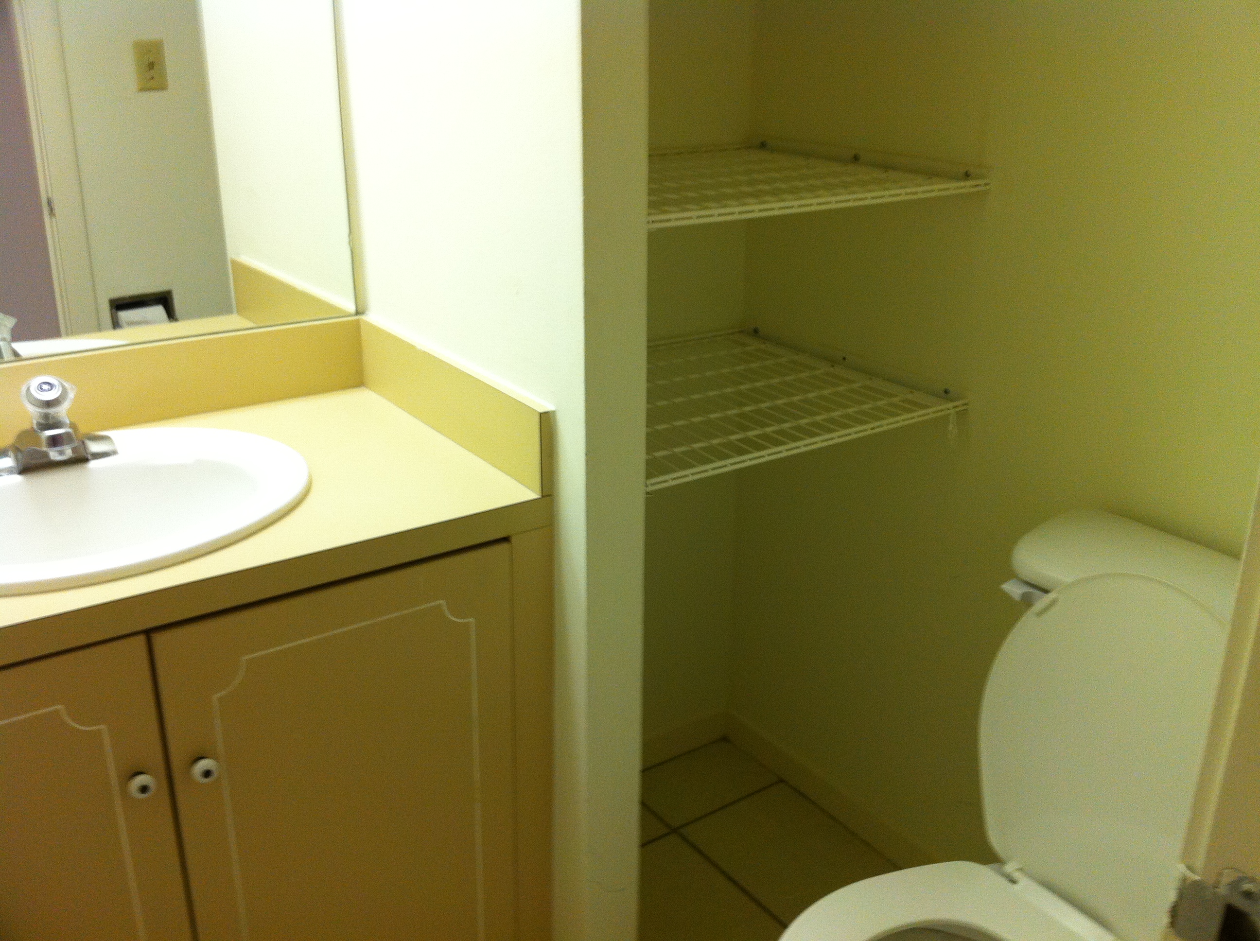
Powder Bath Before: Cramped, dark and klaustrophobic
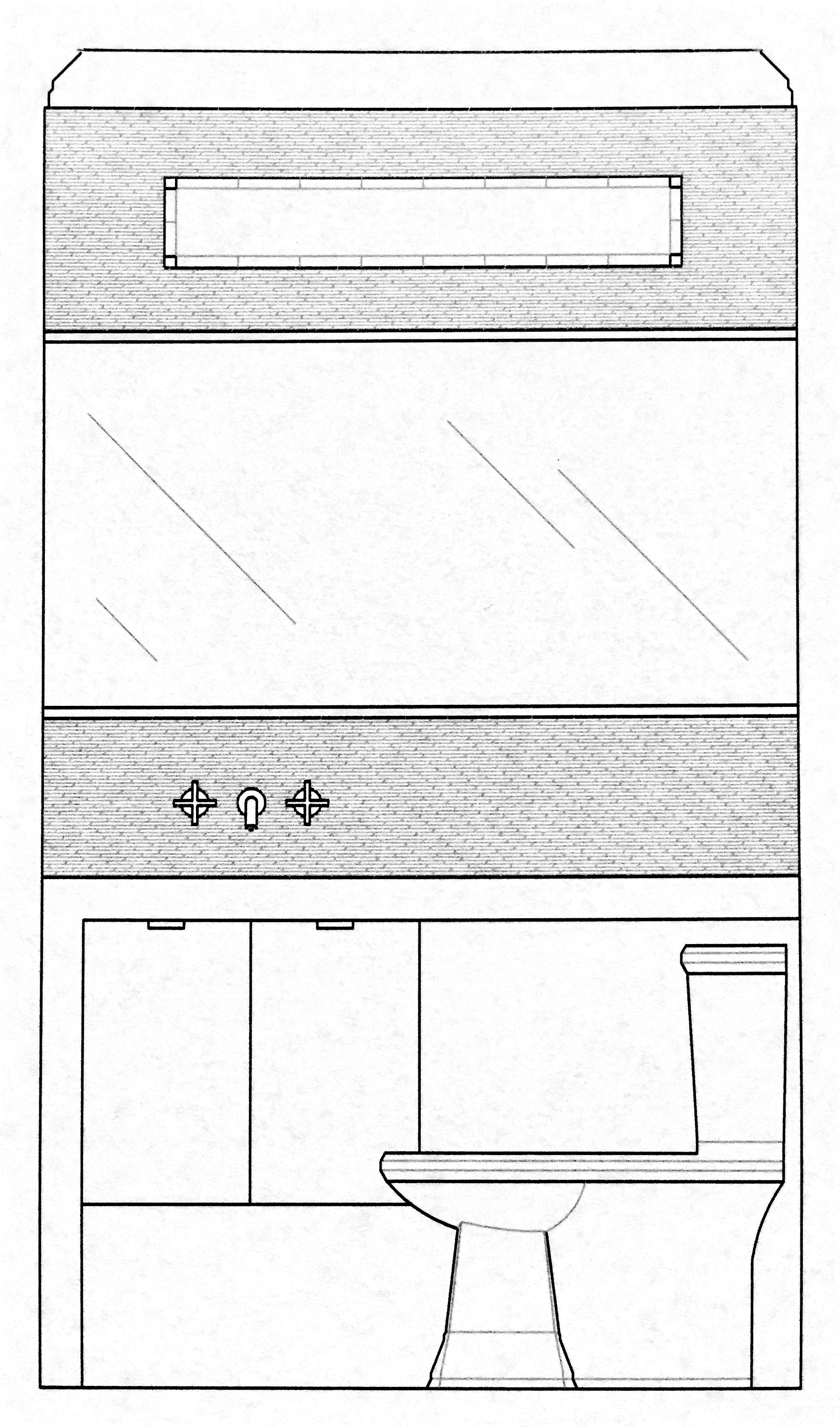
My concept drawing:
Powder Bath AFTER:
We removed the wall, which was creating a small linen closet, and expanded the bath vanity. I aimed for all white in here, to maximize the brightness. The asymmetry of the cabinet works well, with the waterfalling counter top and opening adjacent to the toilet, to prevent any cramped feelings. Some unique tile application, a horizon band mirror, and some effective lighting give this bathroom the right finishing touches.
Master Bath Vantiy Before
Master Bath shower/closet before:
Master Bathroom concept drawing: (we created a new closet elsewhere in the condo, and created a makeup vanity, with open shower design instead.
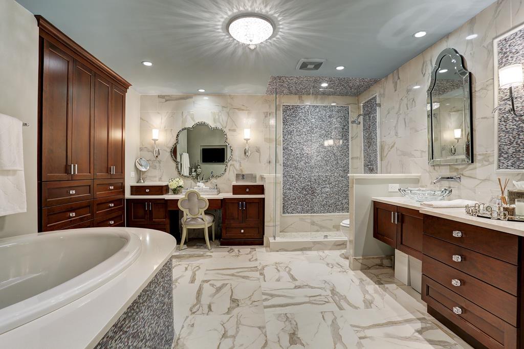
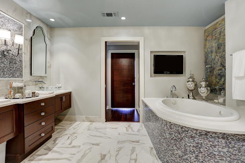
Master Bath After:
The Master Bathroom nearly tripled its size!! Not just in square footage, but also visual lightness! I chose a porcelain Carrera marble (beautiful and white, but without the porous stainability and upkeep of real marble) for the main floor and wall tile. I accented with a blue art glass mini-mosaic tile, and added transitional rectangular panels in the shower area.
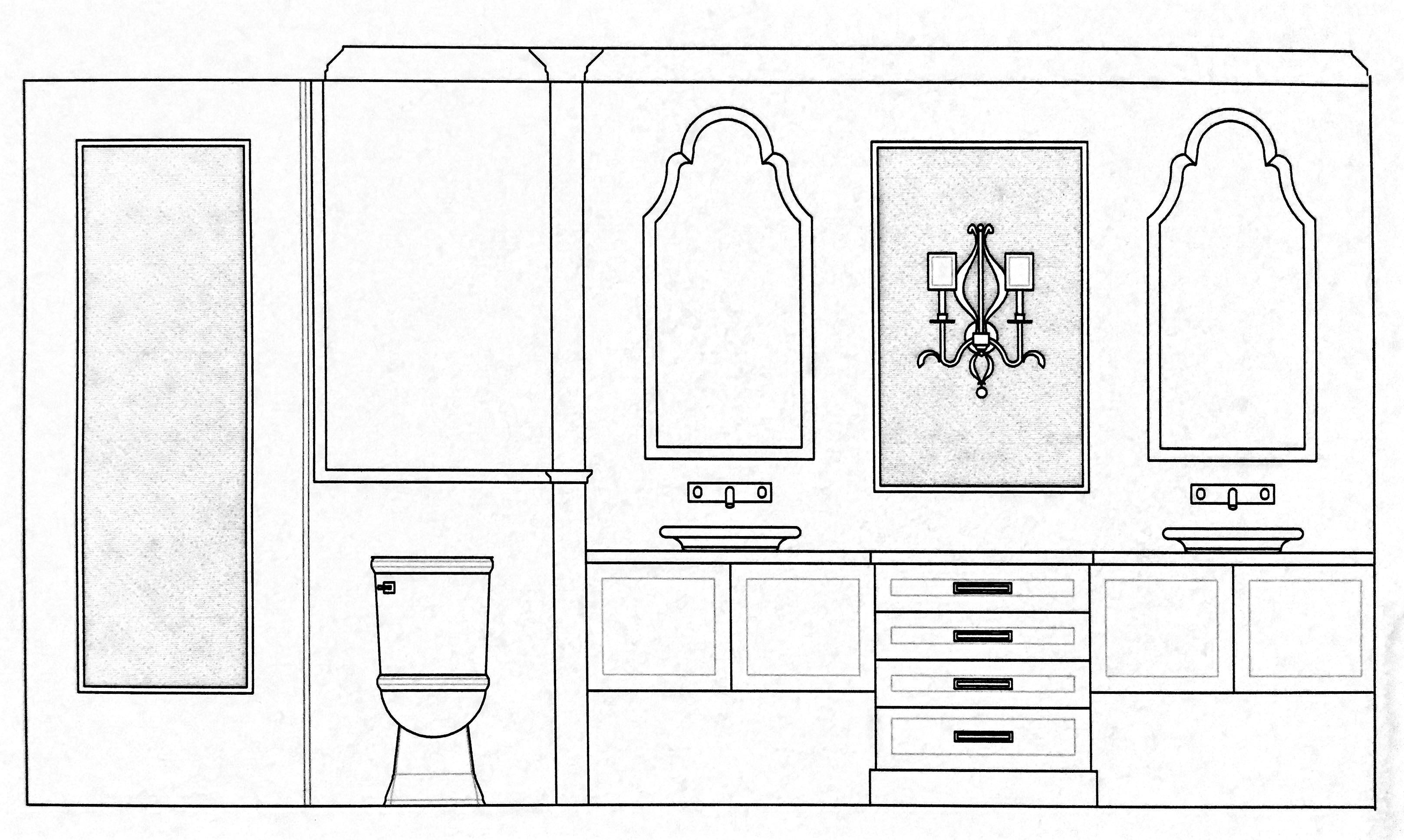
Master Vanity Concept Drawing:
Master Bath After: We created a beautiful, open and functional double vanity, with ample lighting. We also added a brand new oval tub, with curved tub deck.
Office Bath Before:
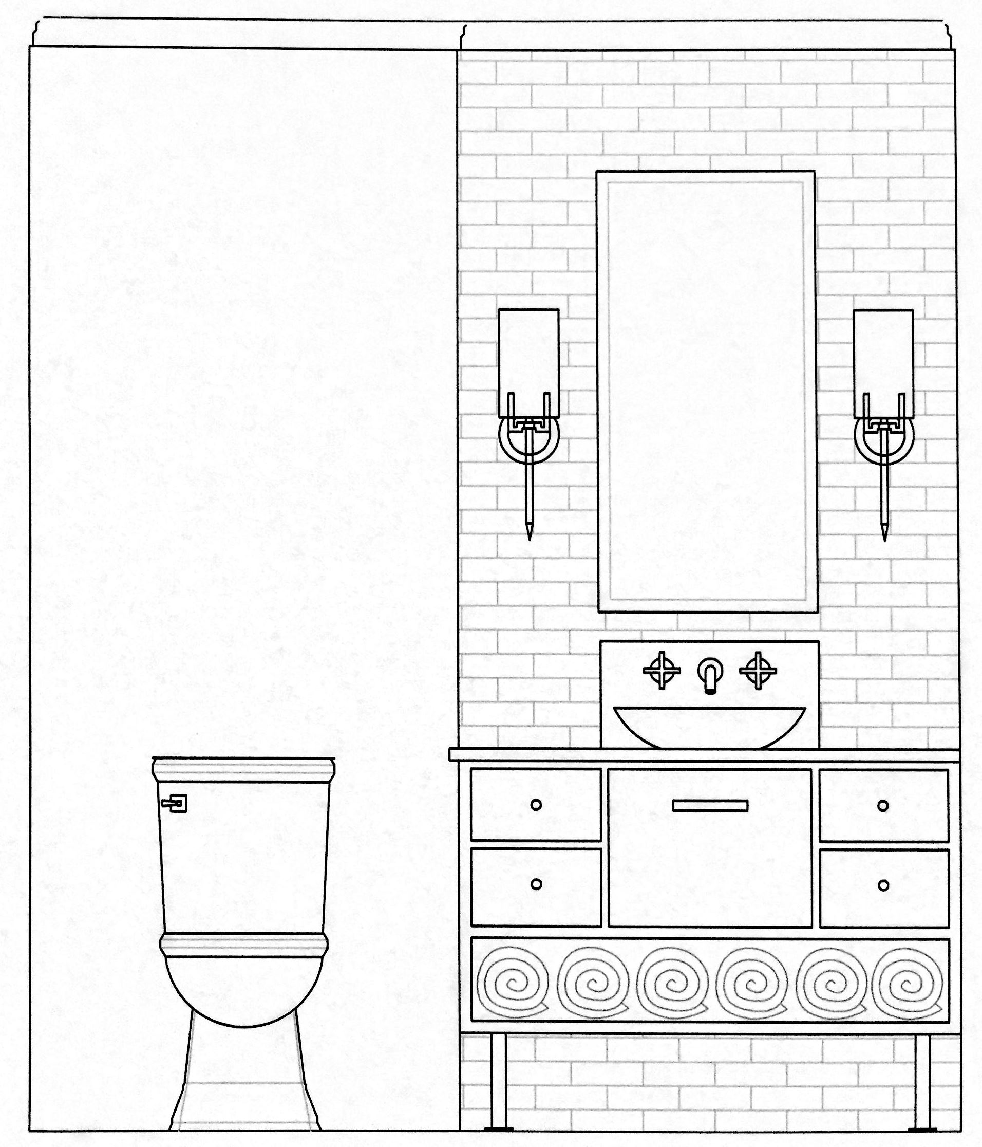
Office Bath Concept Drawing:
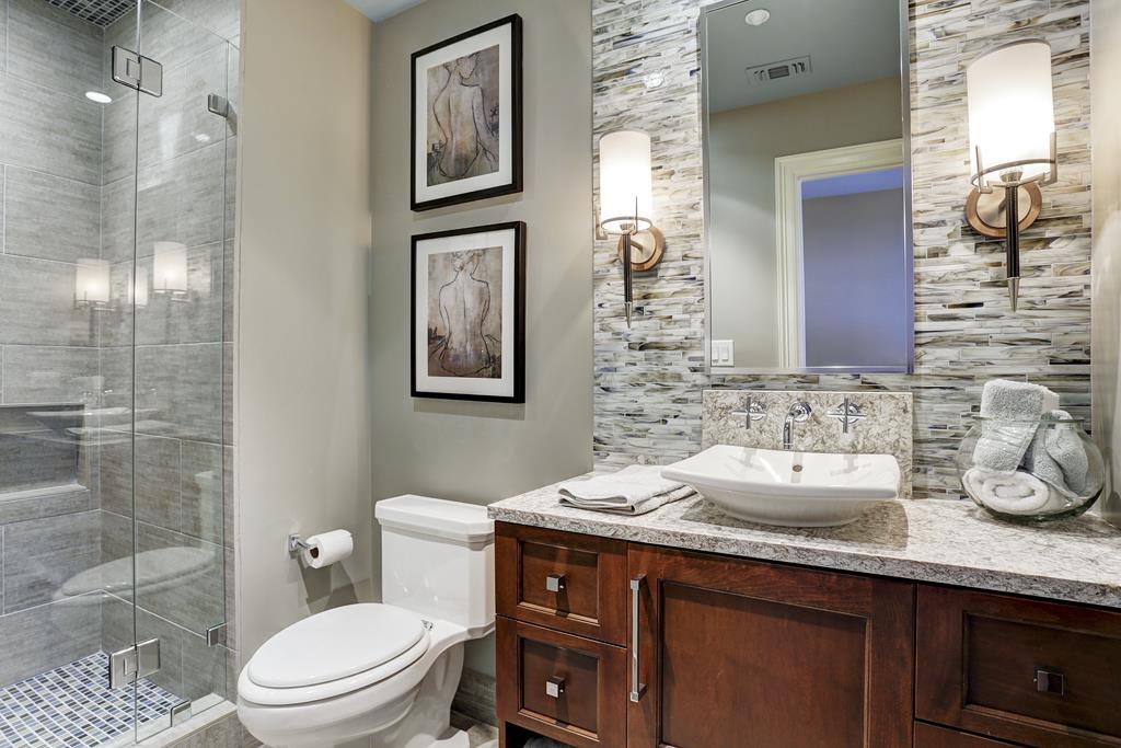
Office Bath AFTER:
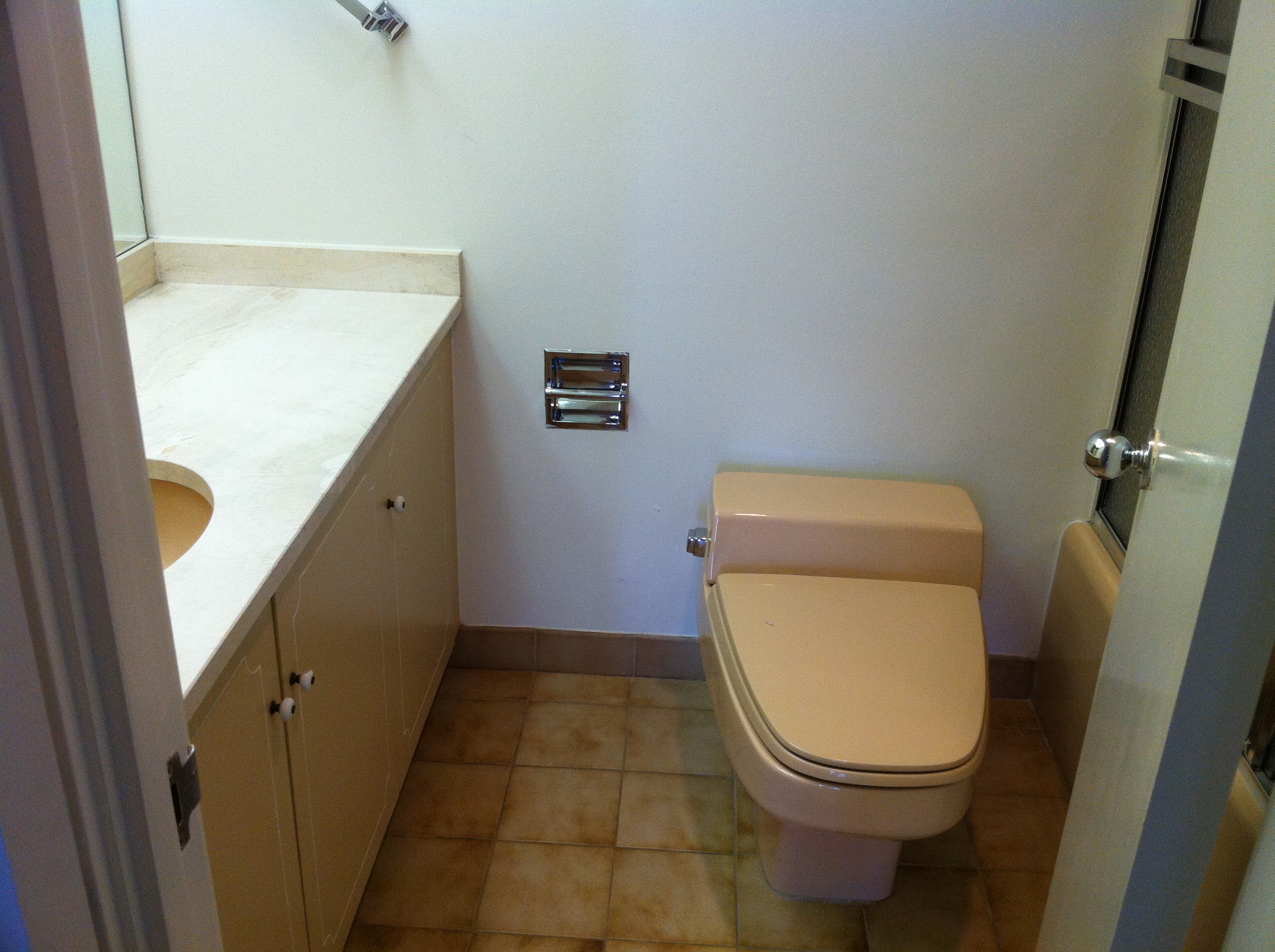
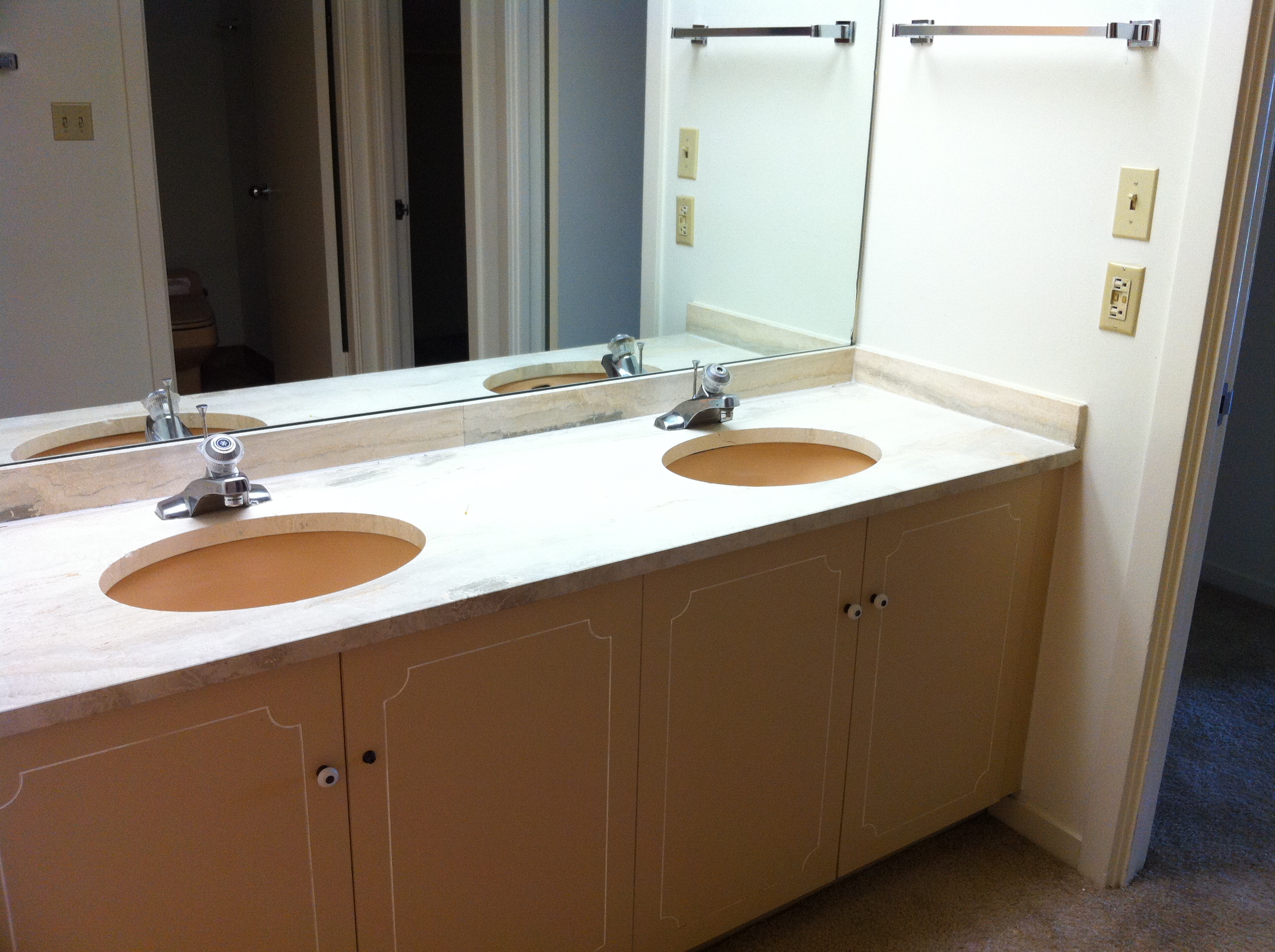
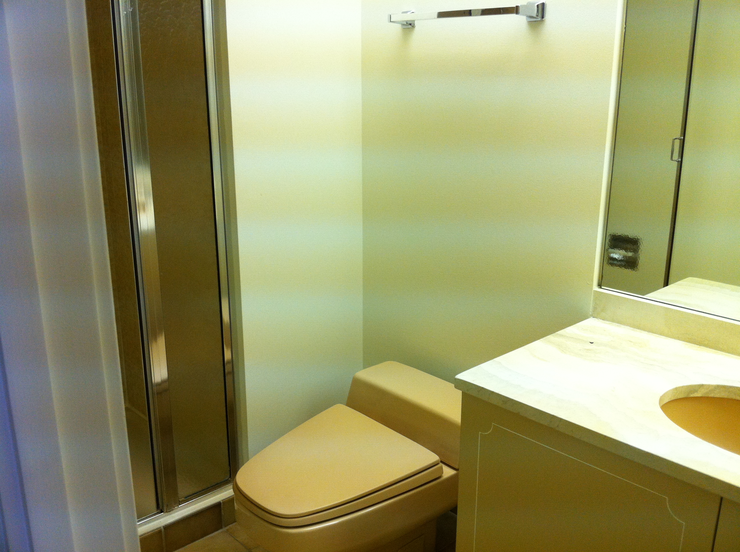
HIS Bath Before:
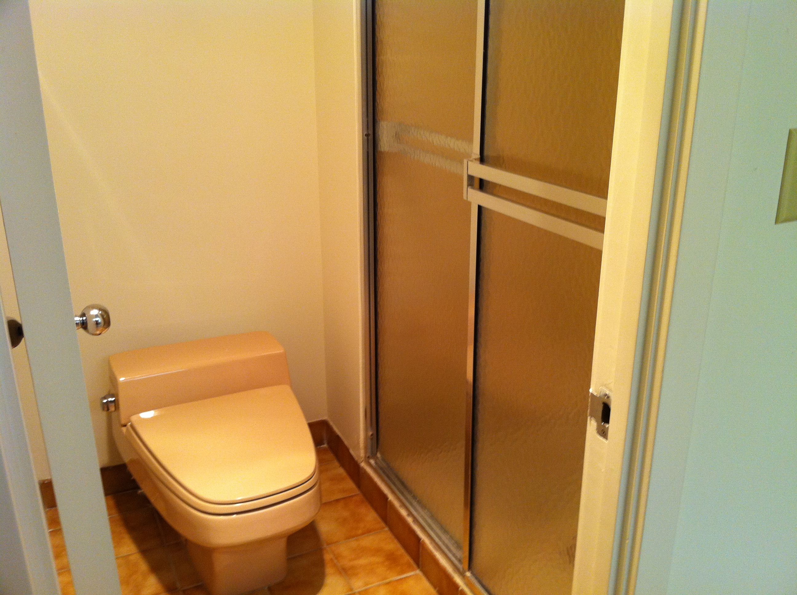
HIS shower Before:
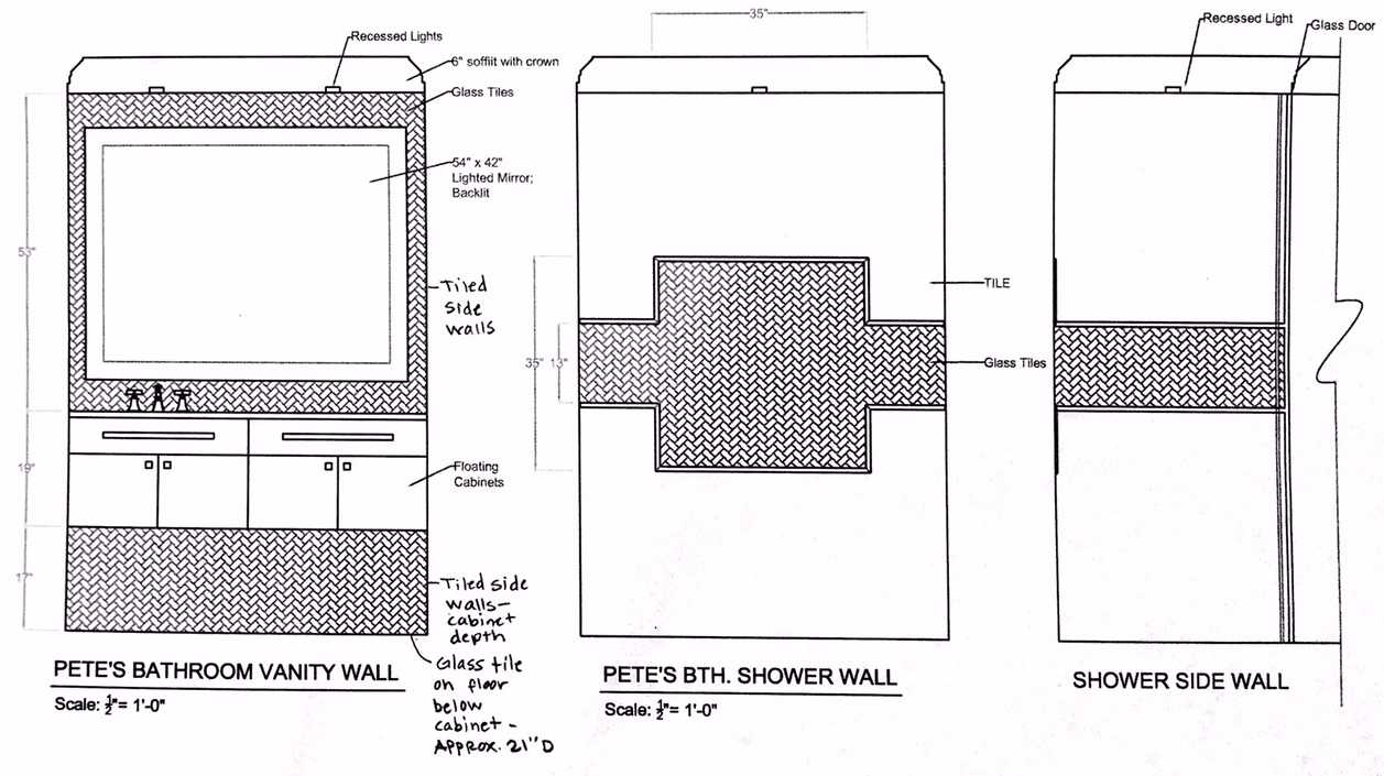
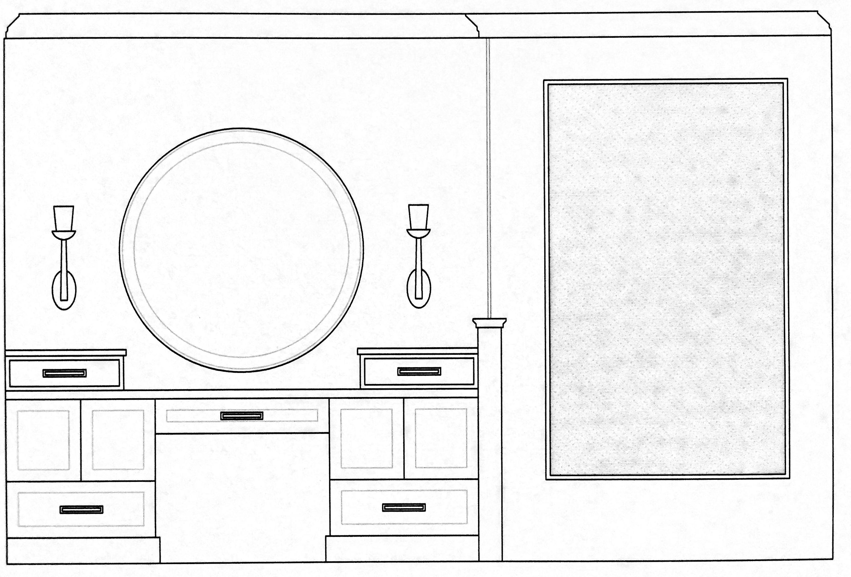
Concept Drawing:
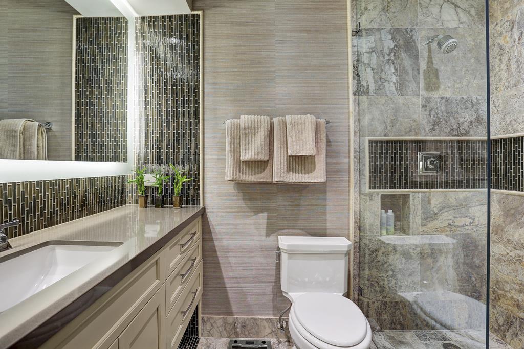
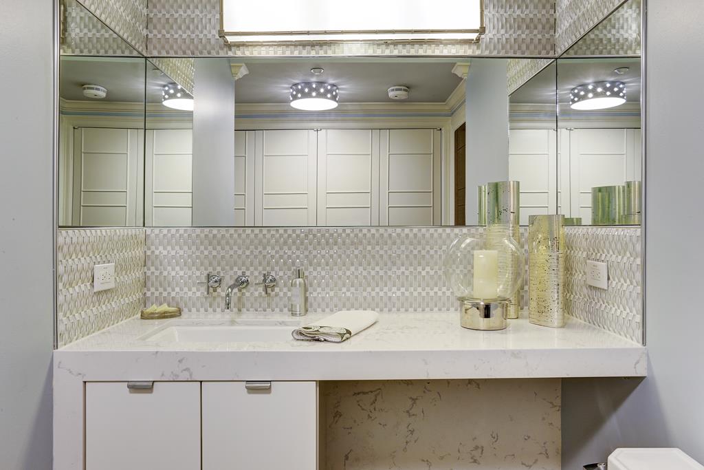
HIS Bathroom AFTER: Whoa, what a difference, right?? Clean lines, masculine, bright, functional. The electric mirror provided beautiful bright light, which reflected off of the glass tiles on the backsplash. textured grasscloth stand up to the warm colors and finishes in this bath.
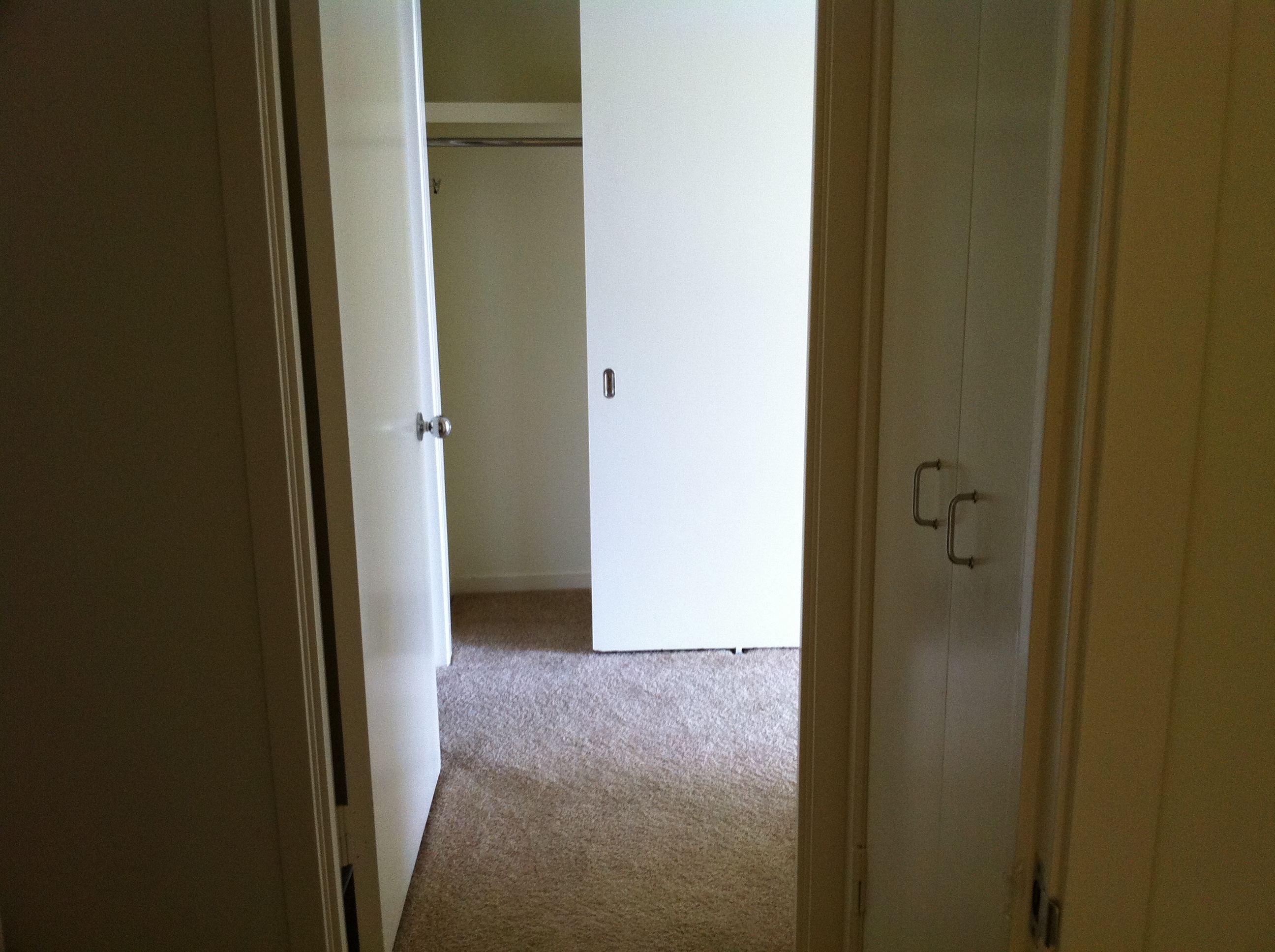
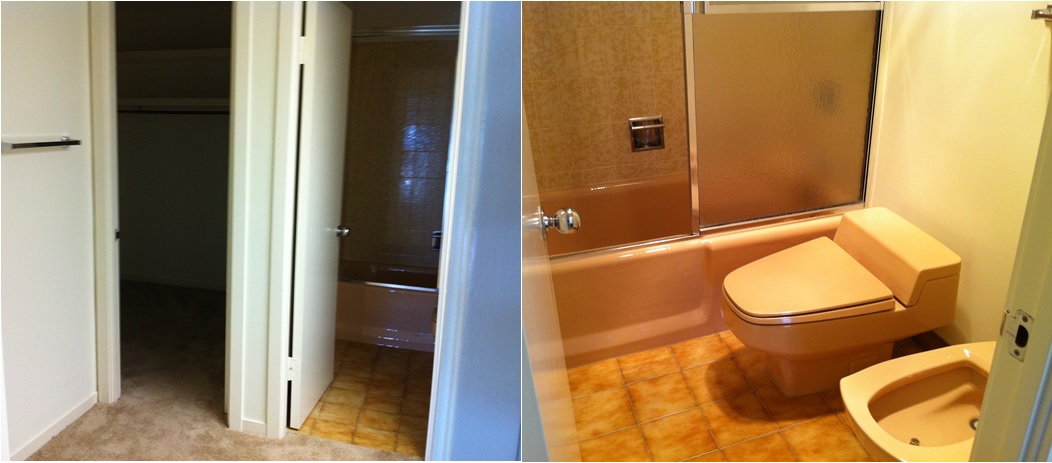
HIS closet BEFORE:
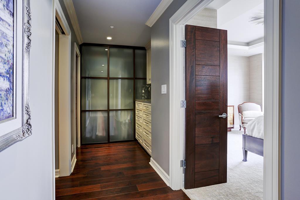
HIS closet AFTER: Look at these gorgeous frosted glass sliding doors! They dress the closet up, keep the room feeling open, and look totally handsome and rich!
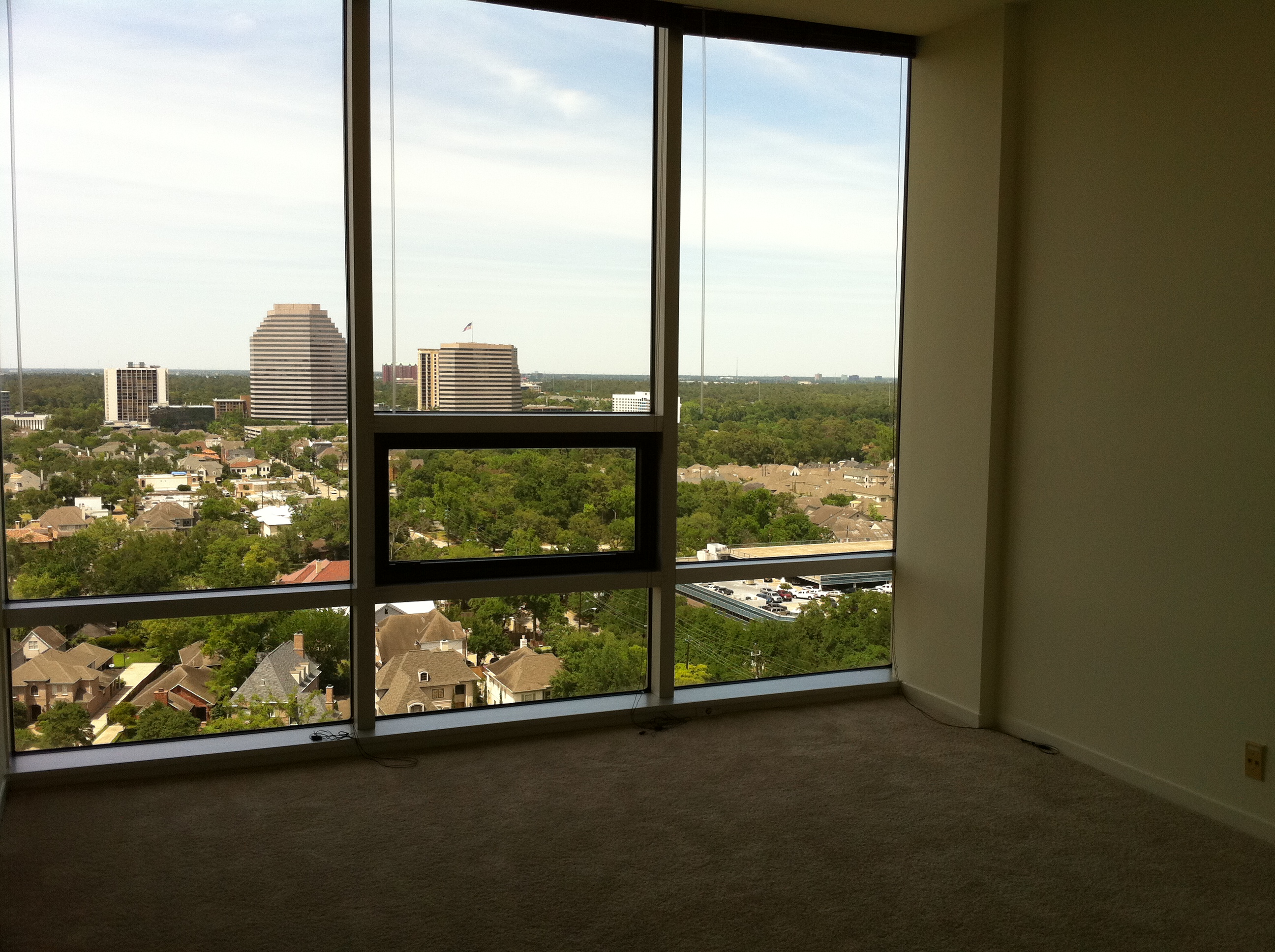
Master Bedroom Before:

Master Bedroom AFTER:
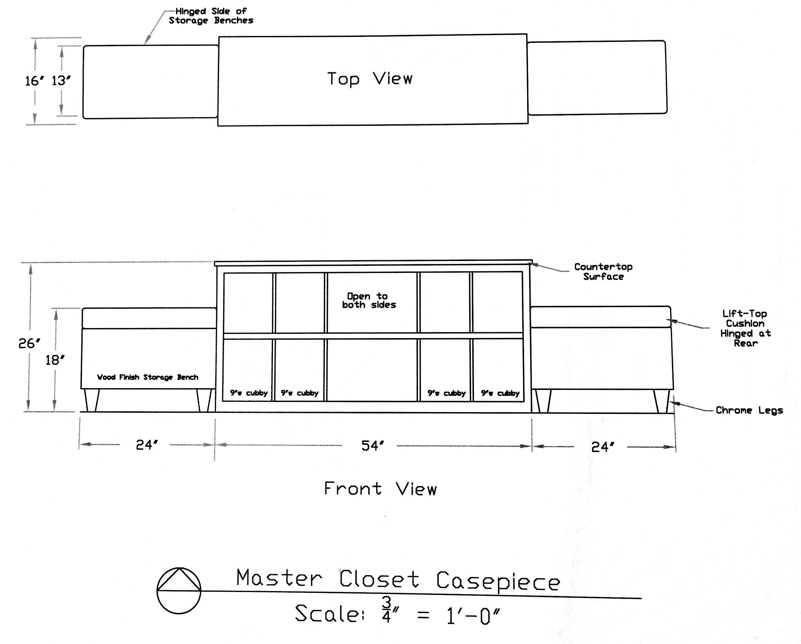
Master Closet center storage concept drawing:
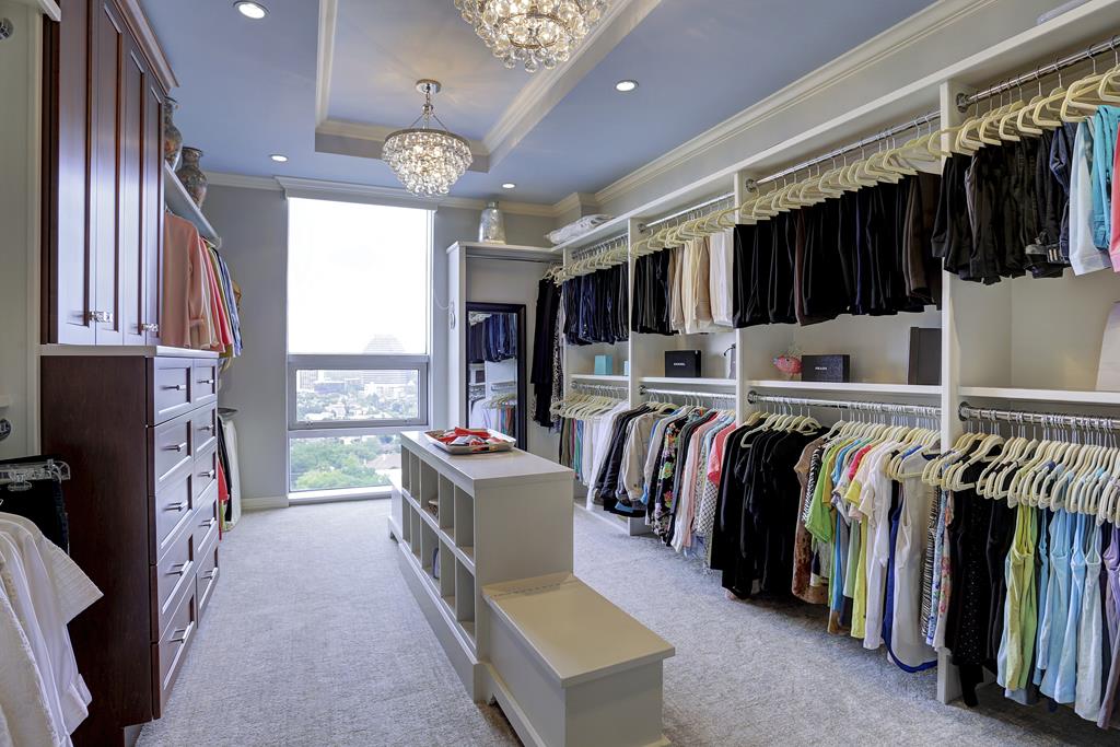
Master Closet AFTER:
I hope you enjoyed your walk through this Houston remodel, as much as I enjoyed designing it!

Just magnificent! You have quite a talent!