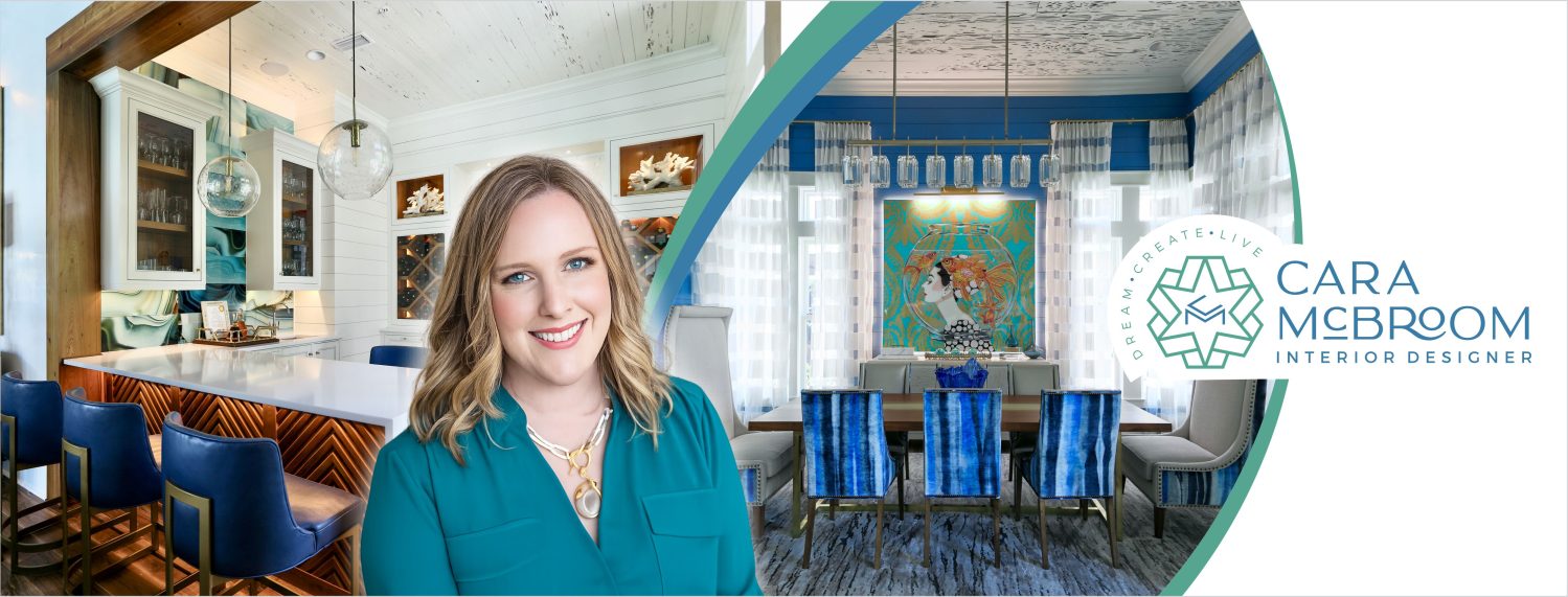

A Princess Pad | Interior Design by Cara McBroom
Come and see this fun room I had the opportunity to design for a client’s teenage girl, in their vacation condo! When this client told me their little girl loves pink, I got so excited, because I NEVER get to use pink!! Everything is always blue, blue blue, green, blue, and other variations of this. What did I come up with? An explosion of magenta, coral, and purple, contrasted with pale ice blue!
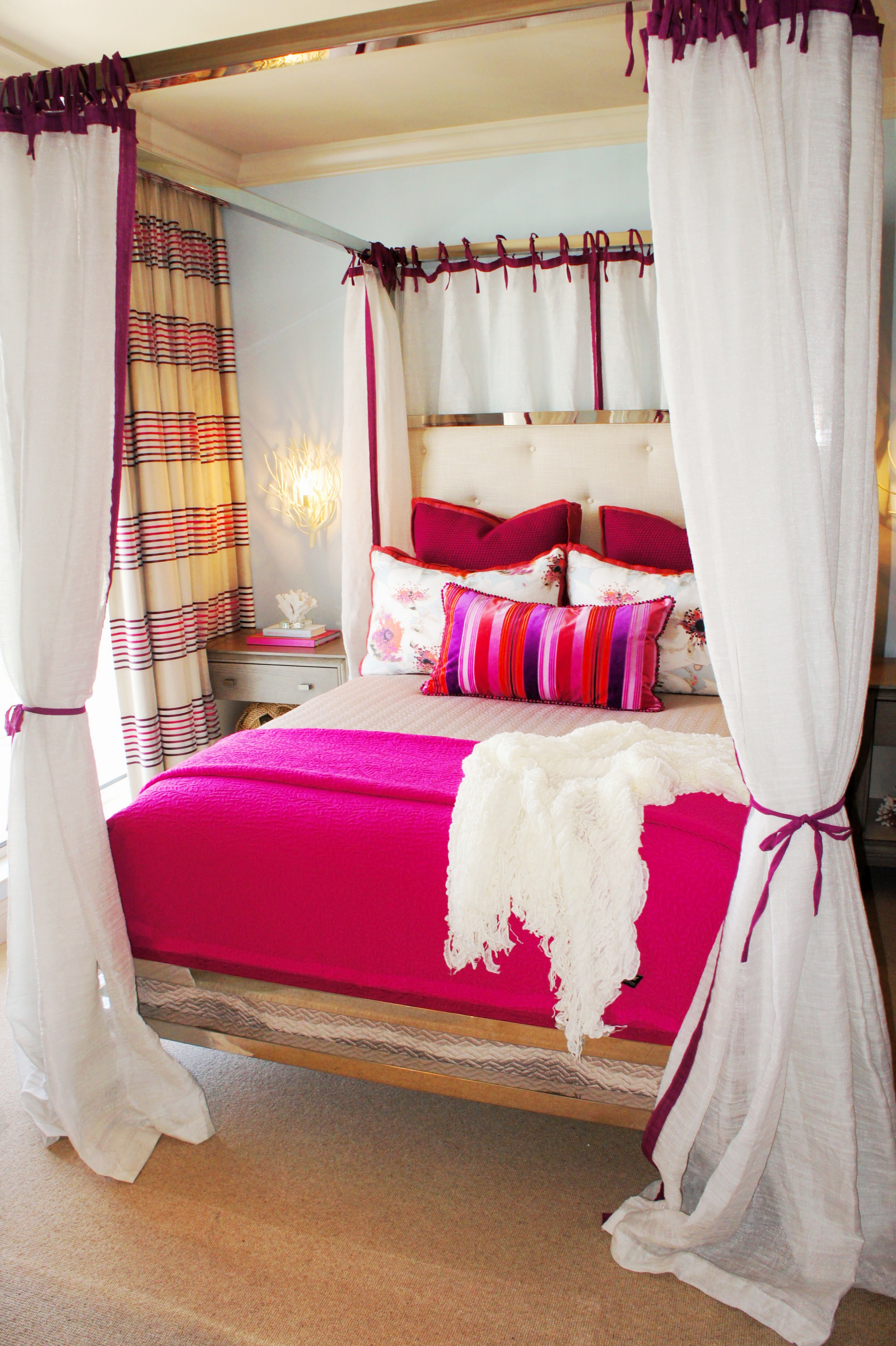
The chrome canopy bed is by Bernhardt Furniture. I designed off-white canopy sheers, with magenta trim and ties, for a romantic feel!
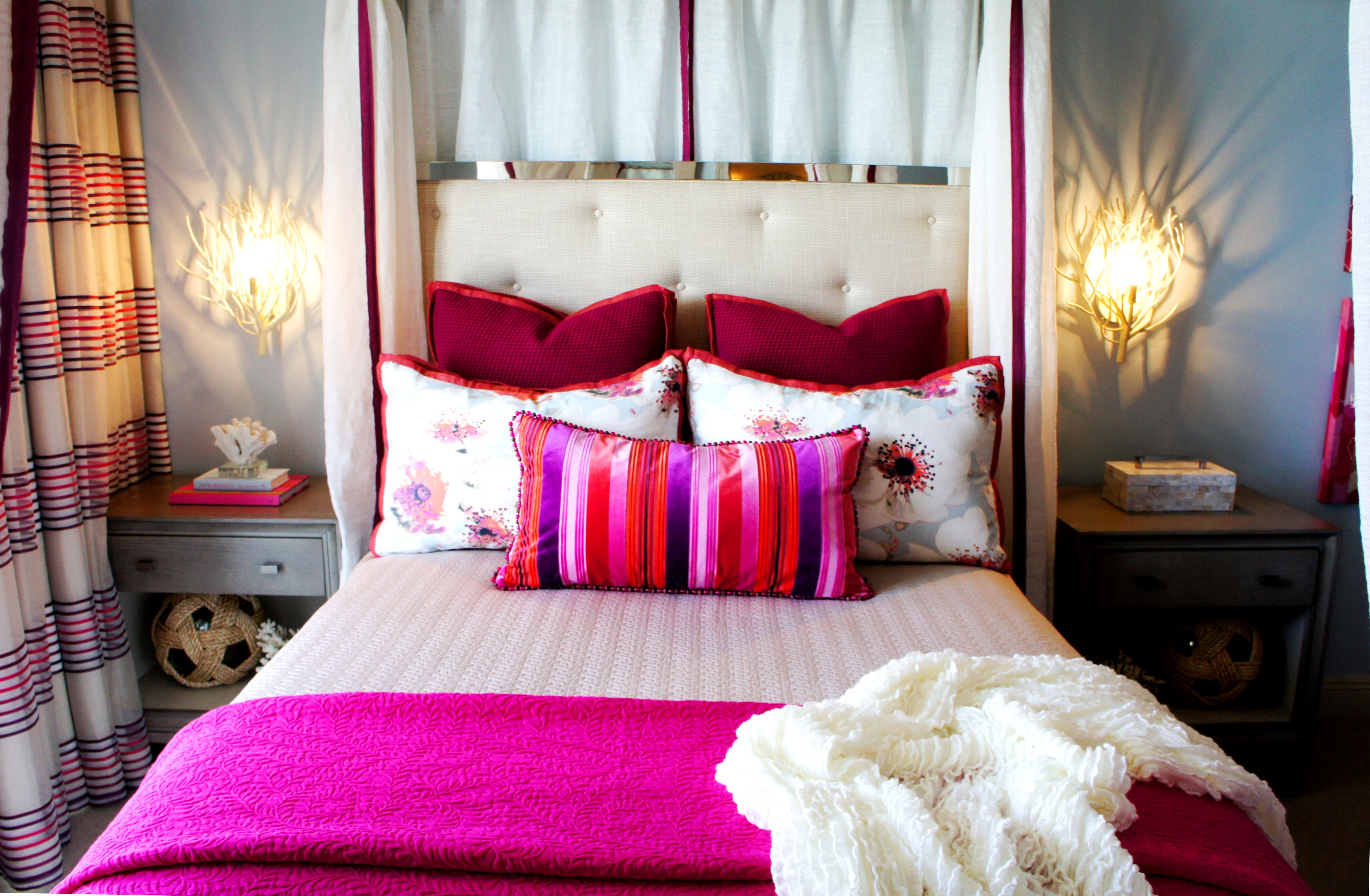
Flanking the bed are two gray nightstands, and some cream Eventide Wall Sconces by Currey and Company. Not only do these sconces look ethereal and free up the nightstands, but they also leave sculptural shadows on the wall, which I love!
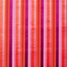
My inspiration began with this fabric, by Romo Fabrics:
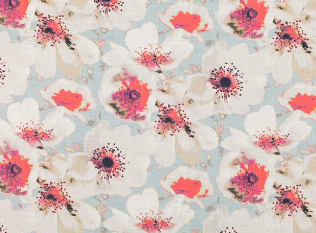
Eden Amaranth by Romo. I loved all the colors in this fabric, and so it became my color inspiration.
From this, I was able to envision the walls in the background blue color, as I knew this pale cool color would allow all the bright pinks and corals to shine!
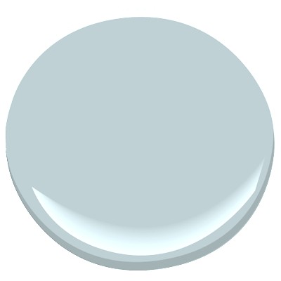
Benjamin Moore 1647 Silvery Blue
Other bedding fabrics followed suit:
Designers Guild Cordellina Peony cut velvet stripe

I love to mix textures, so when I found this thick, textured woven pink, I was excited. I knew it would look great as Euro pillows, behind my linen and velvet pillows.
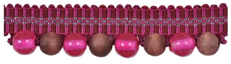
I used this adorable beaded trim on the striped accent pillow! It is by Kravet: Peace Magenta
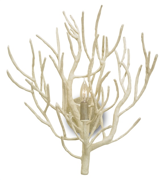
Finally, I wanted to show you a close-up of these fun, natural twig sconces by Currey and Company! “Eventide Sconce”
Designing this little room was a breath of fresh air! Being able to use pinks and corals freely had me feeling liberated as a designer! It was FUN, even though it was only a small room. I am now in the mood for Spring! Beautiful flowers, clear blue skies, and Easter dress shopping! Who is up for making me a dress out of this Eden Amaranth fabric? Anyone?

One thought on “A Princess Pad | Interior Design by Cara McBroom”